A food truck is more than a vehicle that sells food.
It’s a moving restaurant, a small business, and a brand all at the same time.
Your truck might park on a busy street, outside an office building, at a festival, or near a college campus. In each situation, your logo has only a few seconds to catch someone’s attention.
That’s why a food truck logo needs to do more than simply look good.
It needs to be easy to recognize, easy to read, memorable, and visible from a distance.
Whether you’re starting a burger truck, taco truck, coffee truck, dessert truck, or another mobile food business, the right logo can become one of your most valuable branding assets.
In this guide, we’ll look at how to create a food truck logo that fits your business and works in the real world.
Why Does a Food Truck Need a Good Logo?
A traditional restaurant has a fixed location.
A food truck doesn’t.
Your business moves from one place to another, which means your branding often needs to attract attention quickly.
People might see your truck while walking past it, driving by, scrolling through social media, or looking at a food delivery or event listing.
Your logo helps people recognize you across all of these situations.
A strong food truck logo can appear on:
- The truck itself
- Menus
- Food packaging
- Cups and bags
- Staff clothing
- Social media
- Business cards
- Stickers
- Websites
- Event banners
That’s why your logo should be designed as part of your overall brand rather than as an isolated graphic.
If you’re still building your brand identity, start with our guide How to Build a Restaurant Brand Customers Remember.
What Makes a Good Food Truck Logo?
A good food truck logo doesn’t need to be complicated.
In fact, simpler designs can often work better because people need to understand them quickly.
Your logo should ideally be:
Easy to See
Someone should be able to recognize it from a reasonable distance.
Easy to Read
Your business name shouldn’t disappear because of an overly decorative font.
Memorable
There should be something distinctive about the design that people can remember.
Relevant
The logo should make sense for your food and the personality of your business.
Flexible
It should work on the truck, website, packaging, social media, and printed materials.
Consistent
Your colors, fonts, and visual style should match the rest of your branding.
Adobe Express’s restaurant logo resources also emphasize choosing readable typography, appropriate imagery, colors, and a style that fits the type of food and brand.
1. Start With Your Food Truck’s Personality
Before choosing a font or drawing an icon, think about what your food truck represents.
Ask yourself:
- What type of food do I sell?
- Who are my customers?
- What makes my truck different?
- Is my brand fun or serious?
- Is it premium or affordable?
- Is the food traditional or modern?
- What should customers feel when they see my truck?
For example, a gourmet burger truck might want to look bold and confident.
A dessert truck could use playful colors and friendly typography.
A specialty coffee truck might prefer a more minimal and sophisticated appearance.
Your logo should support that personality.
2. Choose a Logo Style That Fits Your Truck
There are many different logo styles you can use.
Minimalist Logo
A minimalist logo uses simple shapes, limited colors, and clean typography.
This can work particularly well for modern food trucks, coffee trucks, healthy food businesses, and premium mobile food brands.
The biggest advantage is versatility.
A simple logo can look good on the truck as well as a small Instagram profile picture.
Bold Typography Logo
Sometimes the name itself can become the main design.
A bold typeface can work especially well for:
- Burger trucks
- BBQ trucks
- Pizza trucks
- Food trucks targeting younger customers
- Fast-casual concepts
You can also customize one or two letters to make the wordmark more unique.
Mascot Logo
A mascot can give your food truck a personality.
It could be:
- A chef
- An animal
- A food character
- A cartoon-style person
- A custom character
Mascots can be especially effective for family-friendly or playful food trucks.
The character can also appear on your menus, packaging, social media, and merchandise.
Food Icon Logo
A food-related icon can immediately tell people what kind of business you operate.
For example:
A taco truck could use a taco-inspired symbol.
A coffee truck could use a cup or coffee bean.
A dessert truck could use a cupcake, donut, or other custom illustration.
But avoid using generic icons without customization.
A standard fork, spoon, or chef hat may communicate “food,” but it won’t necessarily make your business memorable.
Canva’s food and beverage logo inspiration also shows how food businesses can use recognizable imagery while creating distinctive visual identities.
3. Make Your Logo Visible From a Distance
This is one of the biggest differences between a food truck logo and a logo designed mainly for a website.
Your truck can be viewed from across a street or parking area.
That means your logo needs to work at a distance.
Avoid:
- Very thin lettering
- Tiny details
- Extremely complicated illustrations
- Low-contrast colors
- Long blocks of text
Instead, consider:
- Bold shapes
- Clear typography
- Strong contrast
- Simple symbols
- Large recognizable elements
Before finalizing your logo, place it on a mockup of your truck and look at it from a distance.
If you can’t read it, customers probably won’t either.
4. Choose Colors That Stand Out
Color is especially important for food trucks because your logo needs to work against the truck’s paint, surroundings, and other visual elements.
Think about the color of the actual vehicle.
A bright red logo might disappear on a red truck.
A dark logo may not work well on a black or dark-colored vehicle.
Before choosing your palette, think about contrast.
For example:
Dark Green + Cream
could work well for a fresh or organic food truck.
Black + Yellow
could create a bold, energetic appearance.
Red + White
could work for a casual fast-food concept.
Pink + Cream
could suit a dessert or bakery truck.
If you’re unsure about your color palette, read our guide How to Choose the Right Colors for a Food Brand Logo.
You can also explore Canva’s logo inspiration for ideas about different color and logo combinations.
5. Pick a Font People Can Read Quickly
Your food truck name needs to be easy to read.
Remember that customers may see your logo while walking past the truck or from across a parking lot.
That’s not the best situation for a complicated script font.
A bold sans-serif can work well for a modern or energetic truck.
A handwritten font may be better for a bakery or artisan food concept.
A serif font could work for a premium or traditional food business.
The font should match your brand personality while remaining readable.
For more guidance, check out How to Choose the Best Font for Your Food Brand Logo.
6. Think About the Shape of Your Truck
Your logo isn’t going to sit on a blank white page.
It will be placed on a large moving vehicle with doors, windows, wheels, serving counters, handles, and other physical elements.
This matters.
A horizontal logo might work beautifully along the side of a truck.
A circular logo may work better near the front or back.
A simplified icon can work well on the truck’s social media profile or smaller branded items.
Think about where the logo will actually go before finalizing its shape.
You may even want to create several versions.
Primary Logo
Your complete logo with the business name.
Compact Logo
A simplified version for smaller spaces.
Icon
A symbol that can be used on social media and packaging.
One-Color Version
Useful for printing, stickers, uniforms, and other applications.
7. Make the Logo Work With Your Menu
Your logo shouldn’t feel disconnected from the food you sell.
If your truck specializes in Mexican food, for example, the visual identity can reflect the personality of the cuisine without relying on stereotypes.
A burger truck might use bold typography and a custom burger shape.
A coffee truck could use elegant lettering and a simple coffee-inspired symbol.
A dessert truck might use playful typography and a custom illustration.
Your logo should give customers a small visual clue about what kind of experience they can expect.
For more inspiration, see our article 10 Creative Restaurant Logo Ideas to Make Your Brand Stand Out.
8. Don’t Forget Packaging
A food truck usually needs more than a truck design.
Customers may take their food away in:
- Boxes
- Paper bags
- Cups
- Wrappers
- Containers
- Stickers
Your logo needs to work on all of these.
A complicated logo that looks great on the side of the truck might become difficult to reproduce on a small sticker.
That’s why simplicity and flexibility matter.
Test your logo on different packaging sizes before you commit to the final version.
9. Think About Social Media
Food trucks depend heavily on visibility.
People want to know:
Where is the truck today?
What’s on the menu?
What time are you open?
Where will you be tomorrow?
Your logo will appear alongside all of this information.
It may be used as your:
- Instagram profile image
- Facebook profile image
- Website logo
- Social media watermark
- Event listing image
- Delivery profile image
Your logo should still be recognizable when reduced to a small square.
This is another reason to create a simplified logo or icon version.
10. Create a Logo That Can Grow With the Business
Maybe today you operate one food truck.
But what happens if the business grows?
You might eventually:
- Add another truck
- Open a restaurant
- Sell packaged products
- Launch merchandise
- Start catering
- Expand into another city
Your logo shouldn’t be so specific that it becomes useless when the business grows.
For example, if your long-term plan is to open restaurants, avoid designing a logo that only makes sense when printed on a truck.
Build a brand identity that can move with your business.
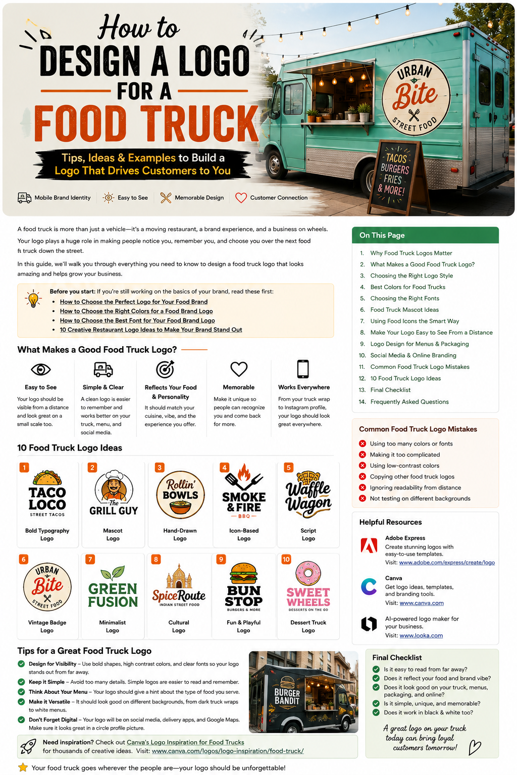
10 Food Truck Logo Ideas
If you’re still looking for inspiration, here are ten directions you could explore.
1. Bold Burger Logo
Large typography combined with a simple burger shape.
2. Taco Mascot
A friendly character combined with a taco-inspired visual.
3. Vintage Coffee Truck
Classic typography with a circular badge.
4. Minimalist Healthy Food Logo
Clean lettering with a simple leaf or ingredient symbol.
5. Hand-Drawn Pizza Logo
A casual illustration combined with handwritten typography.
6. Dessert Truck Logo
Playful lettering with a custom donut, cupcake, or ice cream symbol.
7. BBQ Truck Logo
Strong typography with a flame or grill-inspired icon.
8. Premium Food Truck Logo
Minimal black-and-white design with refined typography.
9. Cultural Food Logo
A thoughtful visual identity inspired by the cuisine and story of the business.
10. Monogram Food Truck Logo
A custom combination of the business initials that can be used as a compact brand symbol.
These ideas are starting points, not designs that need to be copied.
The goal is to find a direction that makes sense for your own business.
Common Food Truck Logo Mistakes
Making the Logo Too Complicated
A food truck logo needs to be understood quickly.
Too many details can work against you.
Using Too Many Fonts
One strong typeface is often better than several competing styles.
Choosing Low-Contrast Colors
If the logo blends into the truck, customers may not notice it.
Making the Name Too Small
Your business name should remain readable from a reasonable distance.
Copying Another Food Truck
Researching competitors is smart.
Copying their branding is not.
Ignoring the Vehicle Design
The logo should work with the shape and color of the actual truck.
Designing Only for Instagram
Your logo needs to work in the physical world as well as online.
How to Test Your Food Truck Logo
Before printing anything, test the logo in several situations.
Put it on:
A truck mockup
Can you see it clearly from a distance?
A menu
Does the design look professional?
A food box
Does the logo remain recognizable?
A social media profile
Can you still recognize it when it’s small?
A dark background
Does the contrast work?
A black-and-white version
Does the logo still have a strong shape?
This simple testing process can reveal problems before you spend money on printing and branding.
If you want to experiment with restaurant and food logo concepts, Adobe Express’s restaurant logo maker provides restaurant-specific templates and customization options.
Adobe Express also offers a broader collection of food logo templates that can be useful for exploring different visual directions.
Final Food Truck Logo Checklist
Before you finalize your logo, ask:
✓ Is it easy to see from a distance?
✓ Is the business name easy to read?
✓ Does it match the food I sell?
✓ Does it reflect my brand personality?
✓ Does it stand out from competitors?
✓ Does it work on my actual truck?
✓ Does it work on packaging?
✓ Does it work on social media?
✓ Does it work in black and white?
✓ Can I use it if my business grows?
If the answer is yes to most of these questions, you’re in a good position to move forward.
Final Thoughts
Designing a food truck logo is about more than making something attractive.
Your logo needs to work in the real world.
It needs to catch attention on a busy street, remain readable on your truck, look good on packaging, and still be recognizable when someone sees it on Instagram later.
Start with your brand personality.
Think about your food.
Understand your customers.
Choose readable typography.
Use colors that create enough contrast.
Keep the design simple.
Then test it everywhere you expect customers to see it.
A great food truck logo doesn’t need to shout.
It just needs to be clear, memorable, and unmistakably yours.
And as your food truck grows, your logo can become more than a graphic on a vehicle—it can become the symbol customers look for when they’re hungry and ready to come back.
