Think about some of the brands you recognize instantly.
Sometimes you don’t even need to see the name.
You see the symbol, and your brain already knows the brand.
That’s the real power of a strong logo.
For a food business, creating a symbol that can eventually stand on its own can be extremely valuable. It can appear on a coffee cup, food box, social media profile, storefront, sticker, delivery bag, or app icon without needing the full business name every time.
But there is an important catch:
A logo should not lose its identity just because the text is removed.
A successful text-free logo needs to be simple, meaningful, distinctive, and easy to recognize.
So how do you create one?
Let’s take a practical look.
What Is a Logo Without the Brand Name?
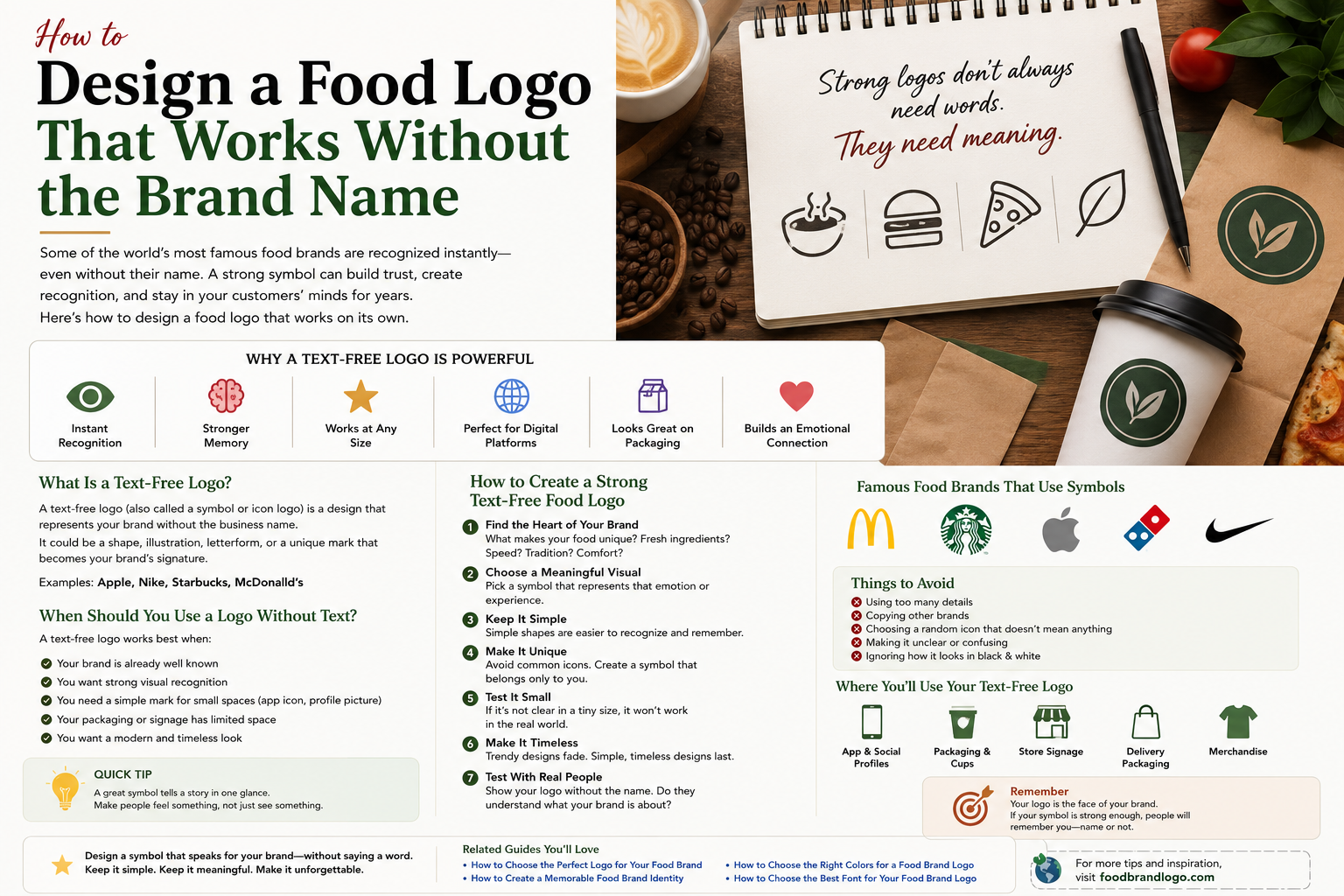
A text-free logo is a visual symbol that represents a brand without spelling out its name.
You might also hear terms such as:
- Symbol logo
- Icon logo
- Brand mark
- Pictorial mark
- Graphic mark
Instead of relying on the business name, the symbol becomes the visual shortcut for the brand.
For a food business, this could be an abstract food-related shape, a custom illustration, a unique character, or even a simple symbol connected to the company’s story.
The important part is that it shouldn’t feel like a random food icon.
It should eventually become associated with your specific brand.
Why Can a Text-Free Logo Be Powerful?
A symbol can communicate quickly.
Customers don’t always stop to read a logo. They may see it for only a second while walking past a storefront or scrolling through social media.
A strong symbol can work particularly well because it can be:
- Recognized quickly
- Used at very small sizes
- Printed on packaging
- Used as a profile image
- Added to merchandise
- Placed on app icons
- Used as a social media watermark
It can also give a mature brand more flexibility.
For example, the full logo might be used on a storefront while the symbol alone appears on a coffee cup or social media avatar.
When Should You Use a Logo Without Text?
Not every new food business should immediately remove its name.
In fact, most new businesses benefit from showing the name while customers are still learning who they are.
A symbol-only version becomes more useful when:
Your Brand Is Already Recognizable
If customers already know the business, they have less need to read the name.
You Need a Small Logo
A full wordmark can become difficult to read on a tiny profile picture or sticker.
Your Packaging Has Limited Space
A simple symbol can work beautifully on cups, labels, bags, and small product areas.
You Want a Strong Social Media Icon
A distinctive symbol can make a better profile image than a long business name.
You Want a Flexible Brand System
You can use the full logo in some places and the symbol in others.
The trick is not to remove the name too early.
Recognition has to come before independence.
Start With the Story Behind Your Food Brand
The biggest mistake is starting with an icon.
Someone opens a logo editor, searches for “burger,” “pizza,” or “coffee,” chooses an attractive image, and puts it beside the business name.
The result may look fine.
But it probably isn’t memorable.
Instead, start with your brand.
Ask:
What makes this food business different?
Maybe it’s:
- Family recipes
- Fresh ingredients
- Speed
- Tradition
- Premium quality
- Local ingredients
- A particular cooking method
- A unique customer experience
That idea can become the foundation of your symbol.
A meaningful symbol is usually easier to remember than a decorative one.
Choose One Strong Visual Idea
A common mistake in food logo design is trying to communicate everything at once.
For example, a restaurant logo might contain:
A burger + fries + chef hat + fork + plate + flames + text + slogan.
Nothing has room to become memorable.
Instead, choose one main idea.
For a burger brand, it could be a custom burger shape.
For a bakery, perhaps a distinctive wheat symbol.
For a coffee brand, maybe a custom bean.
For a healthy food business, an abstract leaf might work.
But don’t stop at the obvious symbol.
The next step is making it yours.
Make a Common Food Symbol Uncommon
Food symbols are everywhere.
Coffee beans.
Pizza slices.
Burger shapes.
Wheat.
Forks.
Spoons.
Chef hats.
Using one doesn’t automatically make a logo bad.
The problem is using the same generic version everyone else is using.
Instead, try changing the visual idea.
For example, you could:
- Turn the symbol into a letter
- Use negative space
- Create an unusual silhouette
- Combine two ideas
- Simplify the shape
- Draw a custom illustration
- Build a symbol from the brand initials
The goal is to create something customers haven’t seen a hundred times before.
Keep the Shape Simple
This is especially important if you want your symbol to work without text.
A complicated logo can look impressive when it’s large.
Then you shrink it.
Suddenly, all the small details disappear.
A good symbol should still have a recognizable shape when reduced.
Try looking at your logo from a distance.
Then make it very small.
If you can still identify the main idea, that’s a good sign.
Use Negative Space
Negative space is one of the easiest ways to make a simple symbol more interesting.
Instead of drawing everything directly, you allow the empty space inside or around a shape to create another image.
For example, a food logo might contain:
- A fork hidden inside a letter
- A spoon inside a food shape
- A flame created from empty space
- A leaf hidden inside a coffee bean
- A second symbol created by the gap between two shapes
The trick is not to make the viewer work too hard.
If people need ten seconds to understand the hidden image, it may be too complicated.
A good negative-space idea usually creates a small moment of discovery.
Think About Recognition, Not Just Beauty
This is an important distinction.
A logo can be beautiful and still be forgettable.
Another logo might be incredibly simple but instantly recognizable.
When testing a text-free logo, don’t ask only:
“Does this look good?”
Ask:
“Would I recognize this again tomorrow?”
That’s a much more useful question.
Famous Brands Show the Power of Symbols
Some well-known brands have developed symbols that can function independently from their names.
For example, McDonald’s Golden Arches can be recognized without the word “McDonald’s.” Starbucks has also developed a recognizable siren symbol, while Domino’s uses its distinctive domino mark.
This doesn’t mean a new food business should copy those approaches.
It demonstrates something more important:
A symbol becomes powerful through repeated exposure and consistent use.
The symbol becomes connected to the experiences customers have with the brand.
For more background on how major food brands have developed their visual identities, you can explore our McDonald’s logo history and Starbucks logo history articles.
Design the Symbol With Your Logo System in Mind
A professional brand doesn’t necessarily have only one logo.
You may eventually need:
Primary Logo
Your full business name and symbol.
Secondary Logo
A simplified version for specific applications.
Symbol Mark
The icon or symbol by itself.
Small Icon
A simplified version for very small spaces.
For example:
Storefront: Full logo
Menu: Full logo
Coffee cup: Symbol
Instagram profile: Symbol
Website favicon: Simplified symbol
This gives you much more flexibility.
Test the Logo at Different Sizes
Don’t wait until the design is finished to test it.
Try it at:
Large size
Does it look balanced?
Medium size
Can you still understand the symbol?
Small size
Does the main shape remain recognizable?
Tiny size
Does it still work as an icon?
If the logo completely falls apart at small sizes, simplify it.
Test It in Black and White
Color can make almost any logo look better.
That’s why black-and-white testing is useful.
Remove all the colors and look at the shape.
Does it still work?
If the symbol only looks good because of a particular color combination, the design may need more work.
This doesn’t mean every logo has to be equally attractive in black and white.
It means the underlying shape should be strong enough to stand on its own.
Make Sure It Works on Packaging
Food brands have an advantage here.
They have lots of physical surfaces where a symbol can appear.
Think about:
- Burger boxes
- Pizza boxes
- Coffee cups
- Takeaway bags
- Food containers
- Stickers
- Labels
- Napkins
- Delivery packaging
A symbol can become a small signature on each of these items.
Imagine a customer seeing the same symbol on their cup, food box, receipt, and social media page.
That repetition builds recognition.
Use the Symbol on Social Media
Social media is another place where a text-free logo can be useful.
Profile images are usually small.
A long business name may become difficult to read.
A simple symbol can fill the space much more effectively.
You can also use the symbol as:
- A watermark
- A post decoration
- A Story element
- A highlight icon
- A video mark
- A promotional graphic
The important thing is consistency.
Don’t change the symbol’s appearance every time you use it.
Don’t Remove the Brand Name Too Soon
This is probably the most important warning in the entire article.
If you’re a new food business, people don’t know your symbol yet.
Showing a mysterious icon without the name won’t automatically create recognition.
During the early stage, use the symbol together with the business name.
Over time, customers begin to connect the symbol with your brand.
Only then does the symbol have a better chance of standing alone.
Think of it as teaching customers a visual language.
First:
Symbol + Name
Then:
Symbol becomes familiar
Eventually:
Symbol can work alone
Common Mistakes to Avoid
Using a Generic Icon
A stock pizza slice isn’t automatically a brand identity.
Adding Too Many Details
Small details disappear quickly.
Copying a Famous Brand
Take inspiration from principles, not another company’s visual identity.
Making the Symbol Too Literal
Sometimes an abstract idea can be more distinctive than an obvious food illustration.
Ignoring the Brand Story
A beautiful symbol with no connection to the business can feel random.
Removing the Name Too Early
New brands usually need the name to build recognition.
Designing Only for One Size
Your logo will probably appear in many different places.
How to Test Your Symbol With Real People
Here’s a simple test you can do before finalizing the logo.
Show the symbol to someone for about five seconds.
Then hide it.
Ask:
“What do you remember?”
Then ask:
“What type of business do you think it belongs to?”
Finally:
“Can you draw or describe the shape you just saw?”
You don’t need everyone to give the same answer.
You’re looking for a pattern.
If nobody remembers the symbol, it may be too complicated or generic.
If people remember its basic shape, you’re moving in the right direction.
Tools You Can Use to Experiment
You don’t need expensive software just to explore ideas.
Canva’s Logo Maker provides templates, drag-and-drop editing, and AI-assisted logo creation that can be useful for experimenting with different symbol concepts.
Adobe Express Logo Maker also lets you experiment with icons, styles, fonts, and different logo variations before creating a final design.
The important thing is to use these tools to explore ideas rather than simply choosing the first template that looks attractive.
A Simple Formula for a Strong Food Symbol
If you’re stuck, start with this process:
1. Identify Your Brand Idea
What makes your food business special?
2. Find One Visual Concept
Choose one idea that represents it.
3. Remove Unnecessary Details
Simplify the shape.
4. Add One Distinctive Feature
Make it yours.
5. Test It Small
Check whether the shape survives reduction.
6. Test It Without Color
Make sure the basic form is strong.
7. Test It With Real People
Find out what they actually remember.
8. Use It Consistently
Repeat it across your brand.
That’s how a simple symbol can gradually become recognizable.
Final Checklist
Before using a text-free food logo, ask:
✓ Is the symbol simple?
✓ Does it have a connection to the brand?
✓ Is it different from generic food icons?
✓ Is it recognizable at small sizes?
✓ Does it work without color?
✓ Does it work on packaging?
✓ Does it work on social media?
✓ Can customers remember its basic shape?
✓ Does it work alongside the full logo?
✓ Have real people tested it?
If the answer to most of these questions is yes, your symbol has a much stronger foundation.
Final Thoughts
A food logo doesn’t always need words to make an impression.
But getting to that point takes more than removing the business name.
The symbol has to earn recognition.
Start with your brand story.
Choose one meaningful idea.
Keep the shape simple.
Make it distinctive.
Test it at different sizes.
Use it consistently.
And most importantly, give customers time to learn it.
A text-free logo isn’t a shortcut.
It’s the result of building enough recognition that the symbol can eventually speak for the brand on its own.
The best symbol doesn’t simply show customers what you sell. It gives them something they can remember.
