10 Creative Restaurant Logo Ideas to Make Your Brand Stand Out
When someone sees your restaurant for the first time, your logo may be one of the first things they notice.
It might be on the sign outside your restaurant, at the top of your menu, on a delivery bag, or on an Instagram profile. Before a customer tastes your food, your logo has already started telling them something about your business.
Is the restaurant modern or traditional?
Casual or premium?
Fun or sophisticated?
Local or international?
That’s why a restaurant logo is more than just a decorative graphic. It is part of the identity customers use to recognize and remember your business.
But finding the right restaurant logo idea isn’t always easy.
There are countless styles, colors, fonts, icons, and layouts to choose from. The trick is not to find the most complicated design. It’s to find a design that feels right for your restaurant.
In this guide, we’ll explore 10 creative restaurant logo ideas that can help you find the right direction for your brand.
What Makes a Good Restaurant Logo?
Before looking at different styles, it’s worth understanding what makes a restaurant logo effective.
A good logo should be:
- Easy to recognize
- Relevant to the restaurant
- Simple enough to remember
- Readable at different sizes
- Flexible across digital and printed materials
- Different enough from competitors
- Consistent with the restaurant’s personality
Your logo may eventually appear on menus, packaging, uniforms, social media, websites, signs, advertisements, and delivery platforms.
Adobe’s logo design guidance similarly recommends focusing on recognizability, relevance, usability, and brand personality rather than simply making a logo visually interesting.
If you’re still working on the basics of your restaurant identity, you can start with our guide: How to Build a Restaurant Brand Customers Remember
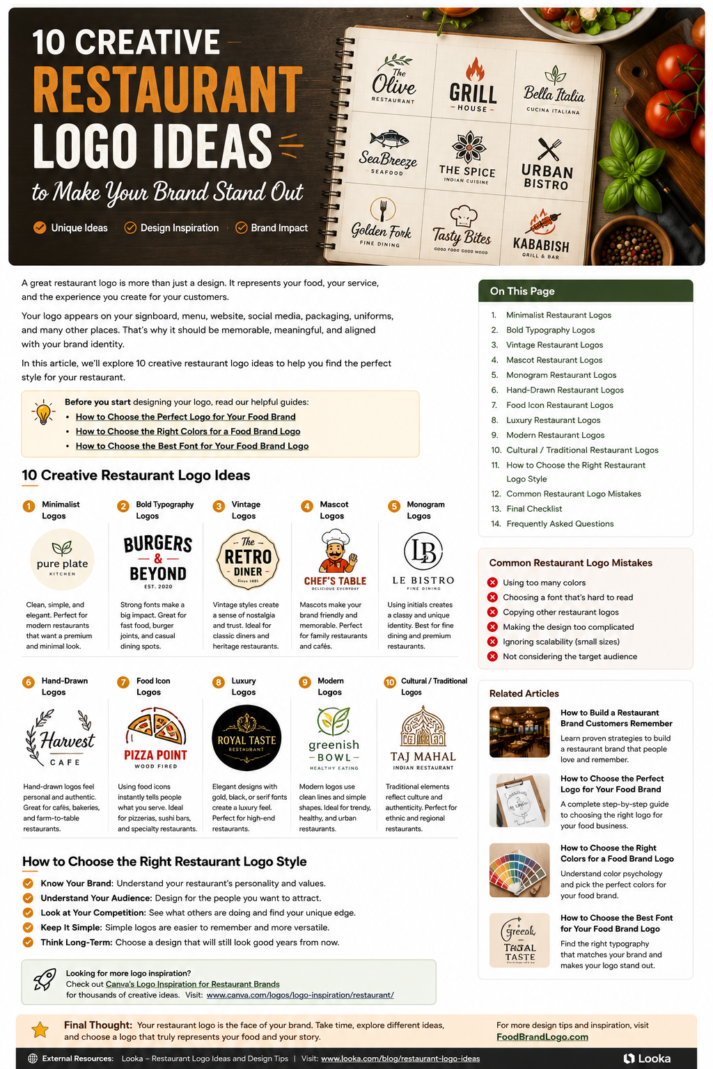
10 Creative Restaurant Logo Ideas
1. Minimalist Restaurant Logos
Sometimes a simple logo can make the strongest impression.
Minimalist restaurant logos usually use a limited number of colors, simple shapes, and clean typography.
There isn’t much unnecessary decoration.
This style can work especially well for:
- Modern restaurants
- Healthy food businesses
- Cafés
- Premium restaurants
- Contemporary food brands
For example, a restaurant might use its name in a clean typeface with a small custom symbol instead of using a detailed food illustration.
The advantage is flexibility.
A simple logo can often look just as good on a large storefront sign as it does on a small social media profile.
But remember: minimalist doesn’t mean generic.
The design still needs something that makes it belong specifically to your restaurant.
2. Bold Typography Logos
What if you don’t use a food icon at all?
You can build the entire logo around the restaurant name.
Bold typography can be especially effective for:
- Burger restaurants
- Food trucks
- Fast-casual restaurants
- BBQ businesses
- Casual dining brands
A strong typeface can give a restaurant an energetic and confident personality.
You can also customize a letter or add a small visual detail related to the food.
For example, instead of putting a burger illustration next to the restaurant name, a designer could subtly incorporate a bun or flame shape into one of the letters.
That creates a connection with the food without making the logo feel predictable.
3. Vintage Restaurant Logos
Vintage-inspired logos can give a restaurant an immediate sense of tradition.
This style often uses:
- Badge shapes
- Classic typography
- Decorative borders
- Muted colors
- Traditional illustrations
- Established-looking layouts
Vintage logos can work particularly well for:
- Diners
- BBQ restaurants
- Family-owned restaurants
- Traditional bakeries
- Heritage food businesses
One reason this style can be effective is that it can make a new restaurant feel like it has a story behind it.
However, don’t add vintage elements simply because they look cool.
The style should make sense for the experience you’re offering.
4. Mascot Restaurant Logos
A mascot can give your restaurant a personality that customers can easily recognize.
The mascot might be:
- A chef
- An animal
- A food character
- A fictional person
- A playful illustration
Mascot logos can work especially well for restaurants that want to feel friendly, fun, or family-oriented.
They’re also useful beyond the logo itself.
The character can appear on packaging, menus, social media, merchandise, stickers, and advertising.
For example, a family restaurant could create a friendly chef character and use different expressions of that character throughout its marketing.
The important thing is to keep the mascot recognizable.
Too many tiny details can disappear when the logo is printed at a small size.
5. Monogram Restaurant Logos
Sometimes the restaurant’s full name is simply too long for a clean logo.
That’s where a monogram can help.
A monogram uses one or more initials as the main visual element.
For example:
LB
could represent:
Le Bistro
The letters can then be arranged inside a circle, square, badge, or custom shape.
This style can be particularly effective for:
- Fine-dining restaurants
- Hotels and restaurants
- Premium cafés
- Catering companies
- Restaurant groups
A well-designed monogram can feel sophisticated while also being easy to use on menus, napkins, uniforms, and social media.
6. Hand-Drawn Restaurant Logos
Hand-drawn logos can create a warm and personal feeling.
They can be a natural fit for:
- Cafés
- Bakeries
- Artisan restaurants
- Family-owned businesses
- Farm-to-table restaurants
- Homemade food brands
Imagine a small neighborhood café using a hand-drawn coffee cup combined with a handwritten name.
It immediately feels more personal than a generic corporate logo.
The key is balance.
You want the logo to feel handmade without making the business name difficult to read.
A little imperfection can add personality. Too much can make the design look unfinished.
7. Food Icon Restaurant Logos
Food icons are probably one of the most obvious choices for restaurant branding.
A pizza restaurant can use a pizza-related symbol.
A seafood restaurant might use a fish.
A bakery could use bread or wheat.
A coffee shop might use a coffee-related symbol.
But there’s a problem.
These symbols are used everywhere.
If you simply place a generic fork, spoon, chef hat, or burger beside your restaurant name, there’s a good chance your logo won’t be particularly memorable.
Instead, try to give the icon a unique twist.
For example:
- Turn an ingredient into a letter
- Create an abstract version of the food
- Combine two relevant shapes
- Use negative space
- Create a custom illustration
Canva’s restaurant and food logo resources emphasize that a logo should help a business communicate what it does while still creating a recognizable identity.
For more inspiration, check out our article: 10 Best Food Logo Design Ideas to Inspire Your Brand
8. Luxury Restaurant Logos
If your restaurant is positioned as premium, your logo should support that positioning.
Luxury restaurant logos often use:
- Elegant typography
- Minimal layouts
- Black or dark colors
- Gold or metallic accents
- Refined symbols
- Generous spacing
You don’t need to use gold to make a logo feel luxurious.
Sometimes a simple black-and-white wordmark can look more premium than a complicated design with several colors.
The important thing is restraint.
A luxury logo should feel intentional rather than overloaded.
This style is especially useful for:
- Fine dining
- Steak houses
- Luxury hotels
- Gourmet restaurants
- Premium catering businesses
9. Modern Restaurant Logos
Modern restaurant logos usually focus on clean shapes, contemporary typography, and simple visual systems.
They can work well for:
- Urban restaurants
- Healthy food brands
- Modern cafés
- Fusion restaurants
- Food delivery businesses
A modern logo doesn’t necessarily need to follow every current design trend.
In fact, the best modern logos often combine contemporary design with enough simplicity to remain useful for years.
Canva’s logo inspiration resources include minimalist, typographic, geometric, and food-related approaches, which can be useful when researching different directions before designing your own identity.
10. Cultural or Traditional Restaurant Logos
A restaurant’s cultural background can also become an important part of its visual identity.
For example, a restaurant serving Indian, Mexican, Japanese, Middle Eastern, Italian, or other regional cuisine may use visual elements inspired by its heritage.
This can include:
- Traditional patterns
- Cultural symbols
- Regional architecture
- Authentic typography
- Traditional colors
- Ingredient illustrations
But this approach needs to be handled thoughtfully.
Avoid adding random cultural symbols simply because they look decorative.
The design should feel connected to the actual restaurant, its food, and the experience it provides.
When done well, cultural branding can make a restaurant feel distinctive and authentic.
How to Choose the Right Restaurant Logo Style
Now that you’ve seen ten different approaches, you might be wondering:
Which one should you choose?
Start with your restaurant rather than the logo.
Know Your Brand
What does your restaurant stand for?
Is it:
- Casual?
- Premium?
- Traditional?
- Modern?
- Family-friendly?
- Healthy?
- Fun?
- Authentic?
Write down three to five words that describe your brand.
Those words can become a useful guide when evaluating logo concepts.
Adobe’s current logo guide recommends defining the brand’s audience, values, personality, and competitive position before making visual decisions.
Understand Your Audience
Think about the people you want to attract.
A family restaurant doesn’t necessarily need the same visual identity as an expensive fine-dining restaurant.
Likewise, a trendy café targeting young professionals may need a different approach from a traditional neighborhood restaurant.
Your logo should make sense to the people you want to serve.
Look at Your Competition
Before finalizing your logo, research other restaurants in your category.
Look at:
- Their logos
- Colors
- Fonts
- Symbols
- Packaging
- Signage
- Social media
Don’t copy them.
Instead, look for patterns.
If every restaurant in your area uses the same red circular logo with a fork inside it, creating another version probably won’t help you stand out.
Research should help you understand the category and find opportunities to differentiate your brand.
Canva also recommends researching competitors and avoiding overused design elements when developing a logo concept.
Keep Your Restaurant Logo Simple
One of the biggest mistakes restaurant owners make is trying to put their entire story into the logo.
You don’t need:
- Five icons
- Six colors
- A long tagline
- Multiple illustrations
- Every ingredient in the menu
Your logo should communicate the brand without becoming a miniature advertisement.
A simple design is also easier to use.
It can be printed, embroidered, displayed digitally, placed on packaging, and resized without losing its identity.
For a deeper look at choosing your logo, read: How to Choose the Perfect Logo for Your Food Brand
Don’t Forget Colors and Fonts
Your logo style isn’t only about the icon.
Color and typography can completely change how the design feels.
A bold typeface with red may feel energetic.
A refined serif with black and gold may feel premium.
A handwritten font with warm brown and cream may feel handcrafted.
That’s why your logo should be considered as a complete visual system.
If you’re working on your restaurant’s color palette, read: How to Choose the Right Colors for a Food Brand Logo
And for typography: How to Choose the Best Font for Your Food Brand Logo
Common Restaurant Logo Mistakes
Using Too Many Colors
A complicated color palette can make the logo difficult to reproduce consistently.
Choosing a Font That’s Hard to Read
A stylish font isn’t useful if customers can’t understand your restaurant name.
Copying Another Restaurant
Your logo should create recognition, not confusion.
Using Generic Food Icons
A fork and knife may communicate “restaurant,” but they don’t necessarily communicate your restaurant.
Making the Logo Too Detailed
Tiny details can disappear when the logo is reduced.
Ignoring the Target Audience
A logo should make sense for the customers you’re trying to attract.
Designing Only for Your Website
Think about packaging, menus, signs, uniforms, social media, and printed materials too.
Adobe’s restaurant logo guidance specifically recommends considering readability, food/business fit, colors, imagery, and different applications when developing a restaurant logo.
A Simple Restaurant Logo Checklist
Before you finalize your design, ask yourself:
✓ Does the logo match my restaurant’s personality?
✓ Is the restaurant name easy to read?
✓ Is the design easy to remember?
✓ Does it look different from competitors?
✓ Does it work at small sizes?
✓ Does it look good in black and white?
✓ Can I use it on packaging?
✓ Does it work on social media?
✓ Does it fit my target audience?
✓ Will it still look appropriate several years from now?
If most of the answers are yes, you’re probably heading in the right direction.
Final Thoughts
There isn’t one perfect restaurant logo style.
A minimalist logo may be ideal for one restaurant, while a mascot, vintage badge, or bold wordmark may be much better for another.
The most important thing is that the design fits your restaurant and gives customers something they can recognize and remember.
Start by understanding your brand.
Research your competitors.
Think about your customers.
Choose a style that matches your personality.
Then make sure your typography, colors, and logo work together.
Your restaurant logo doesn’t have to explain everything about your business.
It simply needs to create a strong visual starting point for your brand.
A memorable restaurant logo isn’t about doing more. It’s about choosing the right elements and making them work together.
For more food branding ideas, logo inspiration, and practical design guides, explore FoodBrandLogo.com.10 Creative Restaurant Logo Ideas to Make Your Brand Stand Out
When someone sees your restaurant for the first time, your logo may be one of the first things they notice.
It might be on the sign outside your restaurant, at the top of your menu, on a delivery bag, or on an Instagram profile. Before a customer tastes your food, your logo has already started telling them something about your business.
Is the restaurant modern or traditional?
Casual or premium?
Fun or sophisticated?
Local or international?
That’s why a restaurant logo is more than just a decorative graphic. It is part of the identity customers use to recognize and remember your business.
But finding the right restaurant logo idea isn’t always easy.
There are countless styles, colors, fonts, icons, and layouts to choose from. The trick is not to find the most complicated design. It’s to find a design that feels right for your restaurant.
In this guide, we’ll explore 10 creative restaurant logo ideas that can help you find the right direction for your brand.
What Makes a Good Restaurant Logo?
Before looking at different styles, it’s worth understanding what makes a restaurant logo effective.
A good logo should be:
- Easy to recognize
- Relevant to the restaurant
- Simple enough to remember
- Readable at different sizes
- Flexible across digital and printed materials
- Different enough from competitors
- Consistent with the restaurant’s personality
Your logo may eventually appear on menus, packaging, uniforms, social media, websites, signs, advertisements, and delivery platforms.
Adobe’s logo design guidance similarly recommends focusing on recognizability, relevance, usability, and brand personality rather than simply making a logo visually interesting.
If you’re still working on the basics of your restaurant identity, you can start with our guide: How to Build a Restaurant Brand Customers Remember
10 Creative Restaurant Logo Ideas
1. Minimalist Restaurant Logos
Sometimes a simple logo can make the strongest impression.
Minimalist restaurant logos usually use a limited number of colors, simple shapes, and clean typography.
There isn’t much unnecessary decoration.
This style can work especially well for:
- Modern restaurants
- Healthy food businesses
- Cafés
- Premium restaurants
- Contemporary food brands
For example, a restaurant might use its name in a clean typeface with a small custom symbol instead of using a detailed food illustration.
The advantage is flexibility.
A simple logo can often look just as good on a large storefront sign as it does on a small social media profile.
But remember: minimalist doesn’t mean generic.
The design still needs something that makes it belong specifically to your restaurant.
2. Bold Typography Logos
What if you don’t use a food icon at all?
You can build the entire logo around the restaurant name.
Bold typography can be especially effective for:
- Burger restaurants
- Food trucks
- Fast-casual restaurants
- BBQ businesses
- Casual dining brands
A strong typeface can give a restaurant an energetic and confident personality.
You can also customize a letter or add a small visual detail related to the food.
For example, instead of putting a burger illustration next to the restaurant name, a designer could subtly incorporate a bun or flame shape into one of the letters.
That creates a connection with the food without making the logo feel predictable.
3. Vintage Restaurant Logos
Vintage-inspired logos can give a restaurant an immediate sense of tradition.
This style often uses:
- Badge shapes
- Classic typography
- Decorative borders
- Muted colors
- Traditional illustrations
- Established-looking layouts
Vintage logos can work particularly well for:
- Diners
- BBQ restaurants
- Family-owned restaurants
- Traditional bakeries
- Heritage food businesses
One reason this style can be effective is that it can make a new restaurant feel like it has a story behind it.
However, don’t add vintage elements simply because they look cool.
The style should make sense for the experience you’re offering.
4. Mascot Restaurant Logos
A mascot can give your restaurant a personality that customers can easily recognize.
The mascot might be:
- A chef
- An animal
- A food character
- A fictional person
- A playful illustration
Mascot logos can work especially well for restaurants that want to feel friendly, fun, or family-oriented.
They’re also useful beyond the logo itself.
The character can appear on packaging, menus, social media, merchandise, stickers, and advertising.
For example, a family restaurant could create a friendly chef character and use different expressions of that character throughout its marketing.
The important thing is to keep the mascot recognizable.
Too many tiny details can disappear when the logo is printed at a small size.
5. Monogram Restaurant Logos
Sometimes the restaurant’s full name is simply too long for a clean logo.
That’s where a monogram can help.
A monogram uses one or more initials as the main visual element.
For example:
LB
could represent:
Le Bistro
The letters can then be arranged inside a circle, square, badge, or custom shape.
This style can be particularly effective for:
- Fine-dining restaurants
- Hotels and restaurants
- Premium cafés
- Catering companies
- Restaurant groups
A well-designed monogram can feel sophisticated while also being easy to use on menus, napkins, uniforms, and social media.
6. Hand-Drawn Restaurant Logos
Hand-drawn logos can create a warm and personal feeling.
They can be a natural fit for:
- Cafés
- Bakeries
- Artisan restaurants
- Family-owned businesses
- Farm-to-table restaurants
- Homemade food brands
Imagine a small neighborhood café using a hand-drawn coffee cup combined with a handwritten name.
It immediately feels more personal than a generic corporate logo.
The key is balance.
You want the logo to feel handmade without making the business name difficult to read.
A little imperfection can add personality. Too much can make the design look unfinished.
7. Food Icon Restaurant Logos
Food icons are probably one of the most obvious choices for restaurant branding.
A pizza restaurant can use a pizza-related symbol.
A seafood restaurant might use a fish.
A bakery could use bread or wheat.
A coffee shop might use a coffee-related symbol.
But there’s a problem.
These symbols are used everywhere.
If you simply place a generic fork, spoon, chef hat, or burger beside your restaurant name, there’s a good chance your logo won’t be particularly memorable.
Instead, try to give the icon a unique twist.
For example:
- Turn an ingredient into a letter
- Create an abstract version of the food
- Combine two relevant shapes
- Use negative space
- Create a custom illustration
Canva’s restaurant and food logo resources emphasize that a logo should help a business communicate what it does while still creating a recognizable identity.
For more inspiration, check out our article: 10 Best Food Logo Design Ideas to Inspire Your Brand
8. Luxury Restaurant Logos
If your restaurant is positioned as premium, your logo should support that positioning.
Luxury restaurant logos often use:
- Elegant typography
- Minimal layouts
- Black or dark colors
- Gold or metallic accents
- Refined symbols
- Generous spacing
You don’t need to use gold to make a logo feel luxurious.
Sometimes a simple black-and-white wordmark can look more premium than a complicated design with several colors.
The important thing is restraint.
A luxury logo should feel intentional rather than overloaded.
This style is especially useful for:
- Fine dining
- Steak houses
- Luxury hotels
- Gourmet restaurants
- Premium catering businesses
9. Modern Restaurant Logos
Modern restaurant logos usually focus on clean shapes, contemporary typography, and simple visual systems.
They can work well for:
- Urban restaurants
- Healthy food brands
- Modern cafés
- Fusion restaurants
- Food delivery businesses
A modern logo doesn’t necessarily need to follow every current design trend.
In fact, the best modern logos often combine contemporary design with enough simplicity to remain useful for years.
Canva’s logo inspiration resources include minimalist, typographic, geometric, and food-related approaches, which can be useful when researching different directions before designing your own identity.
10. Cultural or Traditional Restaurant Logos
A restaurant’s cultural background can also become an important part of its visual identity.
For example, a restaurant serving Indian, Mexican, Japanese, Middle Eastern, Italian, or other regional cuisine may use visual elements inspired by its heritage.
This can include:
- Traditional patterns
- Cultural symbols
- Regional architecture
- Authentic typography
- Traditional colors
- Ingredient illustrations
But this approach needs to be handled thoughtfully.
Avoid adding random cultural symbols simply because they look decorative.
The design should feel connected to the actual restaurant, its food, and the experience it provides.
When done well, cultural branding can make a restaurant feel distinctive and authentic.
How to Choose the Right Restaurant Logo Style
Now that you’ve seen ten different approaches, you might be wondering:
Which one should you choose?
Start with your restaurant rather than the logo.
Know Your Brand
What does your restaurant stand for?
Is it:
- Casual?
- Premium?
- Traditional?
- Modern?
- Family-friendly?
- Healthy?
- Fun?
- Authentic?
Write down three to five words that describe your brand.
Those words can become a useful guide when evaluating logo concepts.
Adobe’s current logo guide recommends defining the brand’s audience, values, personality, and competitive position before making visual decisions.
Understand Your Audience
Think about the people you want to attract.
A family restaurant doesn’t necessarily need the same visual identity as an expensive fine-dining restaurant.
Likewise, a trendy café targeting young professionals may need a different approach from a traditional neighborhood restaurant.
Your logo should make sense to the people you want to serve.
Look at Your Competition
Before finalizing your logo, research other restaurants in your category.
Look at:
- Their logos
- Colors
- Fonts
- Symbols
- Packaging
- Signage
- Social media
Don’t copy them.
Instead, look for patterns.
If every restaurant in your area uses the same red circular logo with a fork inside it, creating another version probably won’t help you stand out.
Research should help you understand the category and find opportunities to differentiate your brand.
Canva also recommends researching competitors and avoiding overused design elements when developing a logo concept.
Keep Your Restaurant Logo Simple
One of the biggest mistakes restaurant owners make is trying to put their entire story into the logo.
You don’t need:
- Five icons
- Six colors
- A long tagline
- Multiple illustrations
- Every ingredient in the menu
Your logo should communicate the brand without becoming a miniature advertisement.
A simple design is also easier to use.
It can be printed, embroidered, displayed digitally, placed on packaging, and resized without losing its identity.
For a deeper look at choosing your logo, read: How to Choose the Perfect Logo for Your Food Brand
Don’t Forget Colors and Fonts
Your logo style isn’t only about the icon.
Color and typography can completely change how the design feels.
A bold typeface with red may feel energetic.
A refined serif with black and gold may feel premium.
A handwritten font with warm brown and cream may feel handcrafted.
That’s why your logo should be considered as a complete visual system.
If you’re working on your restaurant’s color palette, read: How to Choose the Right Colors for a Food Brand Logo
And for typography: How to Choose the Best Font for Your Food Brand Logo
Common Restaurant Logo Mistakes
Using Too Many Colors
A complicated color palette can make the logo difficult to reproduce consistently.
Choosing a Font That’s Hard to Read
A stylish font isn’t useful if customers can’t understand your restaurant name.
Copying Another Restaurant
Your logo should create recognition, not confusion.
Using Generic Food Icons
A fork and knife may communicate “restaurant,” but they don’t necessarily communicate your restaurant.
Making the Logo Too Detailed
Tiny details can disappear when the logo is reduced.
Ignoring the Target Audience
A logo should make sense for the customers you’re trying to attract.
Designing Only for Your Website
Think about packaging, menus, signs, uniforms, social media, and printed materials too.
Adobe’s restaurant logo guidance specifically recommends considering readability, food/business fit, colors, imagery, and different applications when developing a restaurant logo.
A Simple Restaurant Logo Checklist
Before you finalize your design, ask yourself:
✓ Does the logo match my restaurant’s personality?
✓ Is the restaurant name easy to read?
✓ Is the design easy to remember?
✓ Does it look different from competitors?
✓ Does it work at small sizes?
✓ Does it look good in black and white?
✓ Can I use it on packaging?
✓ Does it work on social media?
✓ Does it fit my target audience?
✓ Will it still look appropriate several years from now?
If most of the answers are yes, you’re probably heading in the right direction.
Final Thoughts
There isn’t one perfect restaurant logo style.
A minimalist logo may be ideal for one restaurant, while a mascot, vintage badge, or bold wordmark may be much better for another.
The most important thing is that the design fits your restaurant and gives customers something they can recognize and remember.
Start by understanding your brand.
Research your competitors.
Think about your customers.
Choose a style that matches your personality.
Then make sure your typography, colors, and logo work together.
Your restaurant logo doesn’t have to explain everything about your business.
It simply needs to create a strong visual starting point for your brand.
A memorable restaurant logo isn’t about doing more. It’s about choosing the right elements and making them work together.
For more food branding ideas, logo inspiration, and practical design guides, explore FoodBrandLogo.com.When someone sees your restaurant for the first time, your logo may be one of the first things they notice.
It might be on the sign outside your restaurant, at the top of your menu, on a delivery bag, or on an Instagram profile. Before a customer tastes your food, your logo has already started telling them something about your business.
Is the restaurant modern or traditional?
Casual or premium?
Fun or sophisticated?
Local or international?
That’s why a restaurant logo is more than just a decorative graphic. It is part of the identity customers use to recognize and remember your business.
But finding the right restaurant logo idea isn’t always easy.
There are countless styles, colors, fonts, icons, and layouts to choose from. The trick is not to find the most complicated design. It’s to find a design that feels right for your restaurant.
In this guide, we’ll explore 10 creative restaurant logo ideas that can help you find the right direction for your brand.
What Makes a Good Restaurant Logo?
Before looking at different styles, it’s worth understanding what makes a restaurant logo effective.
A good logo should be:
- Easy to recognize
- Relevant to the restaurant
- Simple enough to remember
- Readable at different sizes
- Flexible across digital and printed materials
- Different enough from competitors
- Consistent with the restaurant’s personality
Your logo may eventually appear on menus, packaging, uniforms, social media, websites, signs, advertisements, and delivery platforms.
Adobe’s logo design guidance similarly recommends focusing on recognizability, relevance, usability, and brand personality rather than simply making a logo visually interesting.
If you’re still working on the basics of your restaurant identity, you can start with our guide: How to Build a Restaurant Brand Customers Remember
10 Creative Restaurant Logo Ideas
1. Minimalist Restaurant Logos
Sometimes a simple logo can make the strongest impression.
Minimalist restaurant logos usually use a limited number of colors, simple shapes, and clean typography.
There isn’t much unnecessary decoration.
This style can work especially well for:
- Modern restaurants
- Healthy food businesses
- Cafés
- Premium restaurants
- Contemporary food brands
For example, a restaurant might use its name in a clean typeface with a small custom symbol instead of using a detailed food illustration.
The advantage is flexibility.
A simple logo can often look just as good on a large storefront sign as it does on a small social media profile.
But remember: minimalist doesn’t mean generic.
The design still needs something that makes it belong specifically to your restaurant.
2. Bold Typography Logos
What if you don’t use a food icon at all?
You can build the entire logo around the restaurant name.
Bold typography can be especially effective for:
- Burger restaurants
- Food trucks
- Fast-casual restaurants
- BBQ businesses
- Casual dining brands
A strong typeface can give a restaurant an energetic and confident personality.
You can also customize a letter or add a small visual detail related to the food.
For example, instead of putting a burger illustration next to the restaurant name, a designer could subtly incorporate a bun or flame shape into one of the letters.
That creates a connection with the food without making the logo feel predictable.
3. Vintage Restaurant Logos
Vintage-inspired logos can give a restaurant an immediate sense of tradition.
This style often uses:
- Badge shapes
- Classic typography
- Decorative borders
- Muted colors
- Traditional illustrations
- Established-looking layouts
Vintage logos can work particularly well for:
- Diners
- BBQ restaurants
- Family-owned restaurants
- Traditional bakeries
- Heritage food businesses
One reason this style can be effective is that it can make a new restaurant feel like it has a story behind it.
However, don’t add vintage elements simply because they look cool.
The style should make sense for the experience you’re offering.
4. Mascot Restaurant Logos
A mascot can give your restaurant a personality that customers can easily recognize.
The mascot might be:
- A chef
- An animal
- A food character
- A fictional person
- A playful illustration
Mascot logos can work especially well for restaurants that want to feel friendly, fun, or family-oriented.
They’re also useful beyond the logo itself.
The character can appear on packaging, menus, social media, merchandise, stickers, and advertising.
For example, a family restaurant could create a friendly chef character and use different expressions of that character throughout its marketing.
The important thing is to keep the mascot recognizable.
Too many tiny details can disappear when the logo is printed at a small size.
5. Monogram Restaurant Logos
Sometimes the restaurant’s full name is simply too long for a clean logo.
That’s where a monogram can help.
A monogram uses one or more initials as the main visual element.
For example:
LB
could represent:
Le Bistro
The letters can then be arranged inside a circle, square, badge, or custom shape.
This style can be particularly effective for:
- Fine-dining restaurants
- Hotels and restaurants
- Premium cafés
- Catering companies
- Restaurant groups
A well-designed monogram can feel sophisticated while also being easy to use on menus, napkins, uniforms, and social media.
6. Hand-Drawn Restaurant Logos
Hand-drawn logos can create a warm and personal feeling.
They can be a natural fit for:
- Cafés
- Bakeries
- Artisan restaurants
- Family-owned businesses
- Farm-to-table restaurants
- Homemade food brands
Imagine a small neighborhood café using a hand-drawn coffee cup combined with a handwritten name.
It immediately feels more personal than a generic corporate logo.
The key is balance.
You want the logo to feel handmade without making the business name difficult to read.
A little imperfection can add personality. Too much can make the design look unfinished.
7. Food Icon Restaurant Logos
Food icons are probably one of the most obvious choices for restaurant branding.
A pizza restaurant can use a pizza-related symbol.
A seafood restaurant might use a fish.
A bakery could use bread or wheat.
A coffee shop might use a coffee-related symbol.
But there’s a problem.
These symbols are used everywhere.
If you simply place a generic fork, spoon, chef hat, or burger beside your restaurant name, there’s a good chance your logo won’t be particularly memorable.
Instead, try to give the icon a unique twist.
For example:
- Turn an ingredient into a letter
- Create an abstract version of the food
- Combine two relevant shapes
- Use negative space
- Create a custom illustration
Canva’s restaurant and food logo resources emphasize that a logo should help a business communicate what it does while still creating a recognizable identity.
For more inspiration, check out our article: 10 Best Food Logo Design Ideas to Inspire Your Brand
8. Luxury Restaurant Logos
If your restaurant is positioned as premium, your logo should support that positioning.
Luxury restaurant logos often use:
- Elegant typography
- Minimal layouts
- Black or dark colors
- Gold or metallic accents
- Refined symbols
- Generous spacing
You don’t need to use gold to make a logo feel luxurious.
Sometimes a simple black-and-white wordmark can look more premium than a complicated design with several colors.
The important thing is restraint.
A luxury logo should feel intentional rather than overloaded.
This style is especially useful for:
- Fine dining
- Steak houses
- Luxury hotels
- Gourmet restaurants
- Premium catering businesses
9. Modern Restaurant Logos
Modern restaurant logos usually focus on clean shapes, contemporary typography, and simple visual systems.
They can work well for:
- Urban restaurants
- Healthy food brands
- Modern cafés
- Fusion restaurants
- Food delivery businesses
A modern logo doesn’t necessarily need to follow every current design trend.
In fact, the best modern logos often combine contemporary design with enough simplicity to remain useful for years.
Canva’s logo inspiration resources include minimalist, typographic, geometric, and food-related approaches, which can be useful when researching different directions before designing your own identity.
10. Cultural or Traditional Restaurant Logos
A restaurant’s cultural background can also become an important part of its visual identity.
For example, a restaurant serving Indian, Mexican, Japanese, Middle Eastern, Italian, or other regional cuisine may use visual elements inspired by its heritage.
This can include:
- Traditional patterns
- Cultural symbols
- Regional architecture
- Authentic typography
- Traditional colors
- Ingredient illustrations
But this approach needs to be handled thoughtfully.
Avoid adding random cultural symbols simply because they look decorative.
The design should feel connected to the actual restaurant, its food, and the experience it provides.
When done well, cultural branding can make a restaurant feel distinctive and authentic.
How to Choose the Right Restaurant Logo Style
Now that you’ve seen ten different approaches, you might be wondering:
Which one should you choose?
Start with your restaurant rather than the logo.
Know Your Brand
What does your restaurant stand for?
Is it:
- Casual?
- Premium?
- Traditional?
- Modern?
- Family-friendly?
- Healthy?
- Fun?
- Authentic?
Write down three to five words that describe your brand.
Those words can become a useful guide when evaluating logo concepts.
Adobe’s current logo guide recommends defining the brand’s audience, values, personality, and competitive position before making visual decisions.
Understand Your Audience
Think about the people you want to attract.
A family restaurant doesn’t necessarily need the same visual identity as an expensive fine-dining restaurant.
Likewise, a trendy café targeting young professionals may need a different approach from a traditional neighborhood restaurant.
Your logo should make sense to the people you want to serve.
Look at Your Competition
Before finalizing your logo, research other restaurants in your category.
Look at:
- Their logos
- Colors
- Fonts
- Symbols
- Packaging
- Signage
- Social media
Don’t copy them.
Instead, look for patterns.
If every restaurant in your area uses the same red circular logo with a fork inside it, creating another version probably won’t help you stand out.
Research should help you understand the category and find opportunities to differentiate your brand.
Canva also recommends researching competitors and avoiding overused design elements when developing a logo concept.
Keep Your Restaurant Logo Simple
One of the biggest mistakes restaurant owners make is trying to put their entire story into the logo.
You don’t need:
- Five icons
- Six colors
- A long tagline
- Multiple illustrations
- Every ingredient in the menu
Your logo should communicate the brand without becoming a miniature advertisement.
A simple design is also easier to use.
It can be printed, embroidered, displayed digitally, placed on packaging, and resized without losing its identity.
For a deeper look at choosing your logo, read: How to Choose the Perfect Logo for Your Food Brand
Don’t Forget Colors and Fonts
Your logo style isn’t only about the icon.
Color and typography can completely change how the design feels.
A bold typeface with red may feel energetic.
A refined serif with black and gold may feel premium.
A handwritten font with warm brown and cream may feel handcrafted.
That’s why your logo should be considered as a complete visual system.
If you’re working on your restaurant’s color palette, read: How to Choose the Right Colors for a Food Brand Logo
And for typography: How to Choose the Best Font for Your Food Brand Logo
Common Restaurant Logo Mistakes
Using Too Many Colors
A complicated color palette can make the logo difficult to reproduce consistently.
Choosing a Font That’s Hard to Read
A stylish font isn’t useful if customers can’t understand your restaurant name.
Copying Another Restaurant
Your logo should create recognition, not confusion.
Using Generic Food Icons
A fork and knife may communicate “restaurant,” but they don’t necessarily communicate your restaurant.
Making the Logo Too Detailed
Tiny details can disappear when the logo is reduced.
Ignoring the Target Audience
A logo should make sense for the customers you’re trying to attract.
Designing Only for Your Website
Think about packaging, menus, signs, uniforms, social media, and printed materials too.
Adobe’s restaurant logo guidance specifically recommends considering readability, food/business fit, colors, imagery, and different applications when developing a restaurant logo.
A Simple Restaurant Logo Checklist
Before you finalize your design, ask yourself:
✓ Does the logo match my restaurant’s personality?
✓ Is the restaurant name easy to read?
✓ Is the design easy to remember?
✓ Does it look different from competitors?
✓ Does it work at small sizes?
✓ Does it look good in black and white?
✓ Can I use it on packaging?
✓ Does it work on social media?
✓ Does it fit my target audience?
✓ Will it still look appropriate several years from now?
If most of the answers are yes, you’re probably heading in the right direction.
Final Thoughts
There isn’t one perfect restaurant logo style.
A minimalist logo may be ideal for one restaurant, while a mascot, vintage badge, or bold wordmark may be much better for another.
The most important thing is that the design fits your restaurant and gives customers something they can recognize and remember.
Start by understanding your brand.
Research your competitors.
Think about your customers.
Choose a style that matches your personality.
Then make sure your typography, colors, and logo work together.
Your restaurant logo doesn’t have to explain everything about your business.
It simply needs to create a strong visual starting point for your brand.
A memorable restaurant logo isn’t about doing more. It’s about choosing the right elements and making them work together.
For more food branding ideas, logo inspiration, and practical design guides, explore FoodBrandLogo.com.
