When people see a food brand for the first time, they don’t always read the name immediately.
Often, they notice the color first.
A bright red logo can feel energetic and exciting. Green can suggest freshness or natural ingredients. Black can create a premium look, while warm orange or yellow can make a brand feel friendly and welcoming.
That doesn’t mean there is one “perfect” color for every food business.
The right color depends on your brand, your customers, your products, and the feeling you want people to associate with your business.
In this guide, we’ll look at how to choose colors for a food brand logo without making the process unnecessarily complicated.
Why Color Matters in Food Branding
Your logo is only one part of your brand, but color can help make that logo easier to recognize.
Think about how quickly you can identify certain famous food brands just from their colors. Over time, repeated exposure helps people connect a particular color combination with a specific company.
Color can also influence the personality of a brand.
For example, a healthy food business may want a fresh and natural appearance, while a fast-food restaurant might prefer something energetic and attention-grabbing.
The important thing is consistency.
If you choose a color palette, use it consistently across your logo, website, packaging, menus, social media, and other branded materials.
For a broader look at building a memorable restaurant identity, you can also read our guide: How to Build a Restaurant Brand Customers Remember.
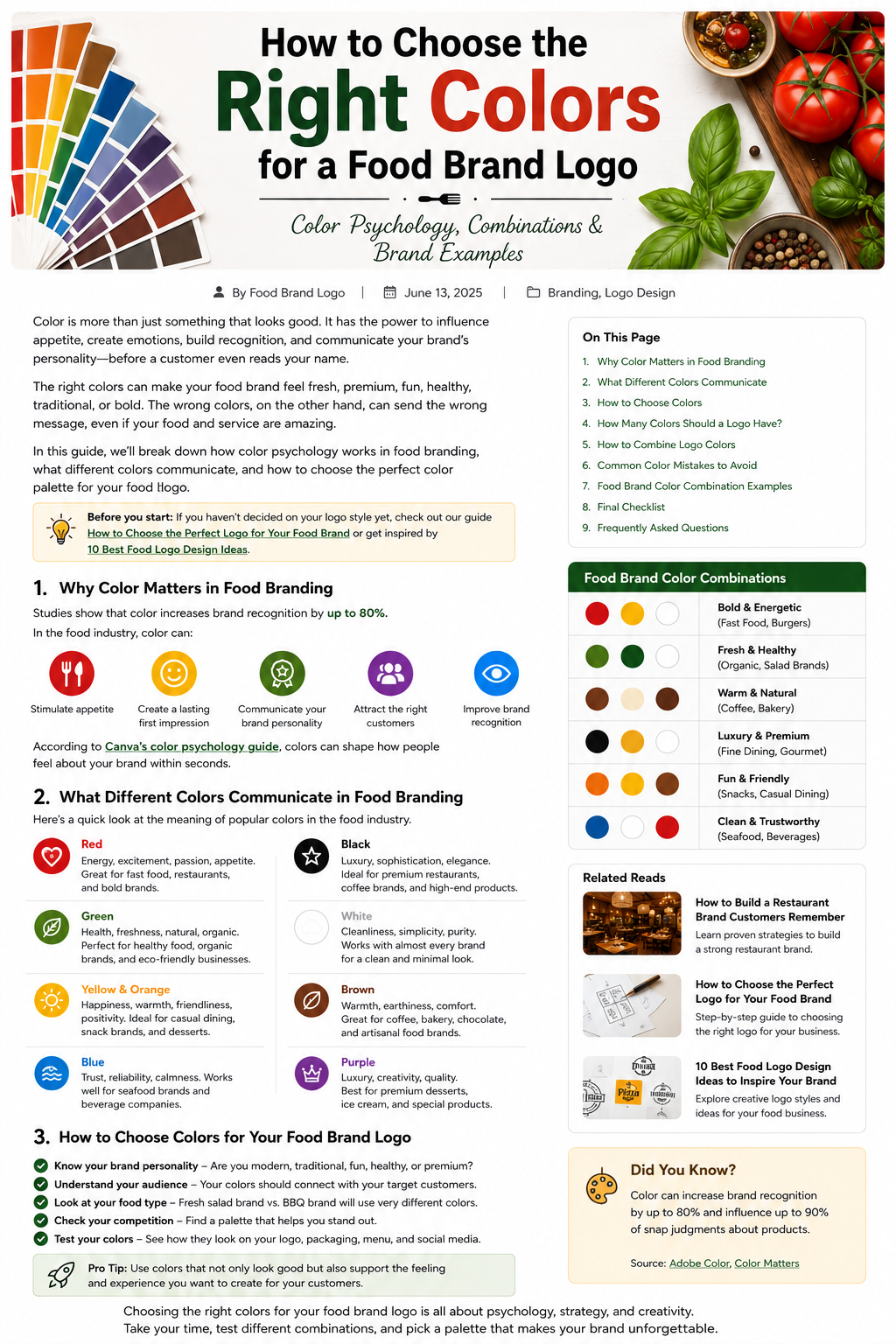
What Different Colors Can Communicate
Color meanings aren’t fixed rules. Culture, context, industry, and the colors used alongside each other can all change how a color feels.
Still, some general associations can be useful when you’re starting your food brand logo.
Red: Energy and Excitement
Red is one of the most noticeable colors in food branding.
It can create feelings of energy, excitement, warmth, and passion.
That’s one reason you often see red used by restaurants, fast-food businesses, snack companies, and food brands that want to feel bold.
Red can work particularly well for:
- Fast-food restaurants
- Burger brands
- Pizza businesses
- Spicy food brands
- Snack companies
The downside is that red is very common in the food industry.
If you choose it, try to make your overall logo distinctive rather than relying on the color alone.
Green: Freshness and Nature
Green is often associated with nature, freshness, health, and organic ingredients.
It can be a natural choice for:
- Organic food brands
- Vegan restaurants
- Salad businesses
- Juice bars
- Healthy meal companies
- Natural food products
Different shades can create very different impressions.
A bright green may feel fresh and energetic, while a darker green can feel more natural, premium, or traditional.
Don’t assume that every healthy food brand needs green, though. Your typography, photography, packaging, and overall identity should support the same message.
Yellow and Orange: Warm and Friendly
Yellow and orange can create a cheerful and welcoming feeling.
They can work well for casual food businesses that want to appear approachable and energetic.
These colors can be suitable for:
- Cafés
- Bakeries
- Fast-casual restaurants
- Dessert brands
- Snack companies
- Family restaurants
Because bright yellow and orange can be visually strong, they often work better when balanced with a neutral color such as white, cream, black, or dark brown.
Black: Premium and Sophisticated
Black can give a food brand a completely different personality.
It can feel:
- Premium
- Elegant
- Modern
- Sophisticated
- Bold
Black is particularly useful for high-end restaurants, coffee brands, gourmet food products, and luxury packaging.
One advantage of black is that it can work beautifully with almost any accent color.
A black-and-white logo can also look clean and timeless.
White: Clean and Simple
White is often used as a supporting color rather than the main color.
It can communicate simplicity, cleanliness, freshness, and minimalism.
White works especially well when combined with a stronger brand color.
For example:
Green + White can create a fresh and natural feeling.
Black + White can feel sophisticated and modern.
Red + White can feel energetic and clean.
The surrounding colors and design elements matter just as much as white itself.
Brown: Warm and Traditional
Brown can be a great choice for food businesses that want to communicate warmth, comfort, or natural ingredients.
It can work particularly well for:
- Coffee shops
- Bakeries
- Chocolate brands
- Artisan food businesses
- Traditional restaurants
Brown can also pair naturally with cream, beige, orange, or green.
For a bakery or coffee brand, a warm brown and cream palette can create a welcoming and handcrafted appearance.
Blue: Trust and Reliability
Blue isn’t as dominant in food branding as red, yellow, or green, but that can actually make it an interesting choice.
Blue can communicate:
- Trust
- Reliability
- Calmness
- Cleanliness
- Professionalism
It can work particularly well for seafood businesses, beverage companies, or food brands that want a clean and dependable appearance.
However, very cool shades of blue may not always create the warm, appetizing feeling that some restaurants want.
That’s why the exact shade and combination are important.
How to Choose Colors for Your Food Brand Logo
Knowing what different colors can communicate is helpful, but the real question is:
Which colors are right for your business?
Start with your brand personality.
1. Define Your Brand Personality
Write down three to five words that describe your business.
For example:
Modern — Healthy — Fresh — Friendly
Or:
Premium — Traditional — Elegant — Sophisticated
Then look for colors that support those qualities.
Don’t choose a color simply because you personally like it.
Your favorite color may not be the best color for your target audience or business positioning.
2. Think About Your Customers
Who are you trying to attract?
A children’s snack brand may need a very different palette from a premium steakhouse.
A vegan café may want to communicate something different from a late-night burger restaurant.
Your customers should influence your visual choices.
Ask yourself:
What kind of feeling would make my target customer interested in this brand?
3. Consider Your Food
Your actual product can also provide inspiration.
A coffee brand might naturally work with:
- Brown
- Cream
- Black
- Warm beige
A fresh juice brand might explore:
- Green
- Orange
- Yellow
- Natural tones
A premium chocolate brand might consider:
- Dark brown
- Black
- Cream
- Gold accents
These aren’t rules.
They’re starting points.
The goal is to create a visual identity that feels connected to what you sell without becoming too predictable.
4. Look at Your Competitors
Before settling on a palette, look at other businesses in your category.
Make a list of 10–20 competitors and look at their logos.
Ask:
- Which colors appear repeatedly?
- Are most competitors using red?
- Is green becoming common in your niche?
- Are premium brands using mostly black and neutral colors?
- Is there an opportunity for your business to look different?
You don’t want to copy your competitors.
You also don’t want to accidentally create a logo that looks almost identical to five other restaurants in your area.
Research can help you find the right balance between fitting the industry and standing apart from it.
How Many Colors Should a Food Logo Have?
There isn’t a strict rule, but keeping your logo palette relatively simple usually makes branding easier.
For many businesses, starting with:
1 primary color + 1 supporting color + neutral
is a practical approach.
For example:
Green + Cream + Black
or
Red + White + Dark Gray
or
Brown + Beige + White
A simple palette is easier to reproduce on:
- Packaging
- Menus
- Websites
- Social media
- Storefronts
- Uniforms
- Business cards
You can always introduce additional supporting colors elsewhere in your visual identity without putting every color into the logo itself.
How to Combine Food Brand Colors
Choosing individual colors is only half the job.
You also need to think about how those colors work together.
Here are a few combinations to consider:
Red + Cream
Warm, energetic, and approachable.
A good direction for casual restaurants, burger brands, and traditional food businesses.
Green + White
Fresh, clean, and natural.
A natural fit for healthy, organic, vegan, or salad-focused brands.
Black + Gold
Premium and sophisticated.
Useful for upscale restaurants, gourmet products, and luxury food packaging.
Brown + Cream
Warm, comfortable, and traditional.
A strong option for bakeries, cafés, and chocolate brands.
Orange + Yellow
Friendly, cheerful, and energetic.
Can work well for casual restaurants, snacks, and family-oriented food businesses.
Blue + White
Clean, professional, and trustworthy.
Could suit seafood businesses, beverage companies, and modern food brands.
Don’t Forget About Contrast
A beautiful color palette isn’t useful if customers can’t read the logo.
This becomes especially important when text is placed over a colored background.
For example, light yellow text on a white background may look attractive in a design mockup but become difficult to read in practice.
Always test your logo:
- On white
- On dark backgrounds
- At small sizes
- On packaging
- On mobile screens
- In black and white
The Adobe Color tool can also be useful when experimenting with palettes and checking different color combinations.
For more logo inspiration, you can also explore Canva’s logo inspiration resources.
Common Food Logo Color Mistakes
Using Too Many Colors
Adding more colors doesn’t automatically make a logo more interesting.
It can make the design harder to recognize and harder to reproduce consistently.
Choosing Colors Only Because They’re Popular
A trendy color may look great today and feel dated a few years later.
Think about your brand first.
Ignoring Your Competitors
If every competitor uses almost the same red and yellow combination, using the exact same approach may make your brand harder to distinguish.
Forgetting About Different Backgrounds
Your logo should work on both light and dark backgrounds whenever possible.
Sacrificing Readability
Never choose a color combination that makes your business name difficult to read simply because the colors look attractive together.
Test Your Colors Before You Commit
Before finalizing your food brand logo, create a few different versions.
For example:
Option A: Red + Cream
Option B: Dark Green + White
Option C: Black + Gold
Then place each version on realistic examples:
- Restaurant sign
- Food box
- Coffee cup
- Website
- Instagram profile
- Menu
- Delivery bag
Sometimes a color combination looks great on a computer screen but doesn’t work nearly as well on actual packaging.
Testing in context can save you from making an expensive branding decision later.
If you’re still deciding which logo style to use, our guide How to Choose the Perfect Logo for Your Food Brand can help you choose the design direction first.
You can also see different approaches in 10 Best Food Logo Design Ideas to Inspire Your Brand.
Final Checklist
Before choosing your food brand colors, ask yourself:
✓ Do these colors match my brand personality?
✓ Will my target customers connect with them?
✓ Do they fit the type of food I sell?
✓ Do they help me stand out from competitors?
✓ Is my logo easy to read?
✓ Does it work on light and dark backgrounds?
✓ Does it look good at a small size?
✓ Can I use the colors consistently across my branding?
If the answer is yes, you’re probably moving in the right direction.
Final Thoughts
Choosing colors for a food brand logo isn’t about finding a magic color that guarantees success.
It’s about creating a visual identity that feels right for your business and recognizable to your customers.
Start with your brand personality.
Think about your audience.
Study your competitors.
Choose a simple palette.
Then test it in real situations before making the final decision.
And remember, your logo doesn’t exist by itself.
The colors you choose should also work across your website, packaging, menu, social media, signage, and other parts of the customer experience.
When everything works together, your food brand becomes easier to recognize—and much easier to remember.
The best food brand colors aren’t simply attractive. They tell customers something about who you are.

3 Comments
Pingback: How to Create a Memorable Food Brand Identity - foodbrandlogo
Pingback: 10 Creative Restaurant Logo Ideas to Make Your Brand Stand Out - foodbrandlogo
Pingback: How to Choose the Best Font for Your Food Brand Logo - foodbrandlogo