
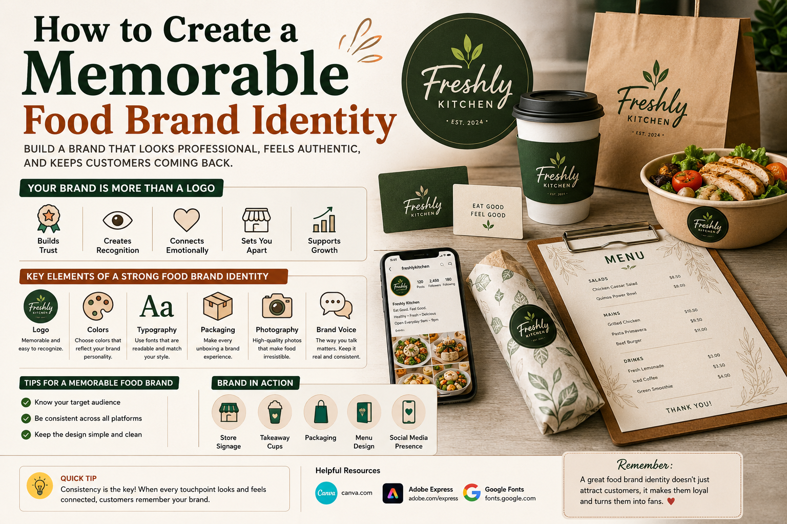
When people think about a food business, they usually think about the food first.
But before they taste anything, they see the brand.
They see the logo on the sign, the colors on the menu, the packaging on the counter, and the photos on social media. All of those little details work together to create an impression.
That’s what a food brand identity is.
It’s not just a logo.
A strong food brand identity gives your business a recognizable personality and helps customers remember you after they’ve finished their meal.
Whether you’re building a restaurant, bakery, café, food truck, catering business, or packaged food brand, a consistent identity can make your business look more professional and easier to recognize.
Here’s how to build one.
What Is a Food Brand Identity?
A food brand identity is the visual and verbal way your business presents itself to customers.
It can include:
- Logo
- Colors
- Fonts
- Packaging
- Menus
- Photography
- Store signage
- Social media graphics
- Website design
- Brand voice
- Overall visual style
Think about it this way:
Your logo is one part of your brand.
Your brand identity is the bigger picture.
For example, imagine a small coffee shop with a simple logo, warm colors, handwritten menu boards, kraft-paper cups, and friendly social media posts.
None of those elements works alone.
Together, they create a personality customers can recognize.
Why Does Food Branding Matter?
Food is highly visual.
People often decide what to try based on what something looks like before they know anything about the actual product.
A consistent brand can help you:
- Look more professional
- Build recognition
- Stand out from competitors
- Create customer trust
- Make your packaging recognizable
- Improve your social media presence
- Give customers a consistent experience
Your brand identity can also make a small business feel more established.
You don’t need a huge restaurant chain to have a professional brand.
A small bakery or food truck can have just as much personality if its visual elements are thoughtfully designed.
Start With Your Brand Personality
Before choosing colors or fonts, decide what your food business should feel like.
Ask yourself:
What should customers think when they see my brand?
Maybe you want it to feel:
- Friendly
- Traditional
- Modern
- Premium
- Fun
- Healthy
- Homemade
- Authentic
- Bold
- Sophisticated
Choose around three to five words that describe the personality you want.
For example:
Fresh — Natural — Friendly — Modern
or:
Traditional — Warm — Homemade — Family-Friendly
These words become a useful guide when making branding decisions.
If an element doesn’t match the personality, reconsider it.
Create a Logo That Fits the Brand
Your logo is often the most recognizable part of your food brand.
But a good logo doesn’t need to explain everything you sell.
It needs to give customers a visual symbol they can remember.
When designing your logo, think about:
- Simplicity
- Readability
- Color
- Typography
- Symbolism
- Scalability
Your logo should work on a large storefront as well as a small social media profile.
If you’re still working on your logo, our guide How to Choose the Perfect Logo for Your Food Brand can help you make the right decisions.
Choose a Consistent Color Palette
Once your logo is ready, your colors should become part of the wider brand identity.
You don’t need ten different colors.
A simple palette of two or three main colors can be much easier to manage.
For example:
Warm & Traditional
Brown + Cream + Dark Red
Fresh & Natural
Green + Beige + White
Modern & Premium
Black + Cream + Gold
Playful & Friendly
Pink + Yellow + White
The colors you choose should work across your:
- Website
- Packaging
- Menu
- Social media
- Signage
- Business cards
We’ve already covered this in more detail in How to Choose the Right Colors for a Food Brand Logo.
The important thing here is consistency.
If your packaging is green and cream but your Instagram suddenly uses five completely different colors, the brand can start to feel disconnected.
Choose Fonts Carefully
Typography is easy to underestimate.
But the right font can completely change how a food brand feels.
A serif font can create a traditional or sophisticated appearance.
A clean sans-serif can feel modern.
A handwritten font can make a small bakery feel personal.
A bold display font can give a fast-food brand more energy.
Try not to use too many fonts.
Usually, one primary typeface and one supporting font are enough.
You can learn more about this in How to Choose the Best Font for Your Food Brand Logo.
For additional typography research, Google Fonts is a useful resource with a large collection of freely available typefaces.
Make Your Packaging Part of the Brand
Imagine ordering a meal from two different restaurants.
One arrives in a plain container with no recognizable branding.
The other arrives in attractive packaging with a consistent logo, colors, typography, and small details.
The second experience can feel much more memorable.
Packaging gives food businesses another opportunity to communicate their identity.
Think about:
- Boxes
- Cups
- Paper bags
- Wrappers
- Stickers
- Labels
- Napkins
- Delivery packaging
Even a small sticker with your logo can make plain packaging feel more connected to your brand.
The key is not to make everything complicated.
Sometimes a simple logo and consistent color palette are enough.
Don’t Ignore Your Menu
Your menu is part of your brand too.
A restaurant might have a beautiful logo but then use a completely unrelated menu design.
That creates inconsistency.
Your menu should use the same general:
- Colors
- Fonts
- Logo
- Photography style
- Visual tone
If your brand is premium, the menu should feel premium.
If your brand is playful, the menu can have more personality.
If your brand is focused on simplicity and healthy food, a clean menu design may work better.
Every customer touchpoint should feel like it belongs to the same business.
Build a Consistent Social Media Look
For many food businesses, social media is where potential customers discover the brand.
Your Instagram or Facebook page should feel connected to your physical business.
Think about:
- Profile image
- Post templates
- Food photography
- Colors
- Typography
- Captions
- Stories
- Promotional graphics
You don’t need every post to look identical.
That can actually make the page feel boring.
Instead, create a recognizable visual system.
For example, you could use the same two brand colors across graphics while allowing your food photography to change naturally.
Use Food Photography That Matches Your Brand
Great food photography can make people hungry.
But the style of the photography should also fit your brand.
A luxury restaurant might use clean, carefully styled images.
A casual burger shop might prefer bold, close-up food photography.
A bakery could use warm, natural photos showing pastries, bread, and the baking process.
Think about:
Lighting
Backgrounds
Composition
Editing
Props
Try to create a visual style that customers can recognize even before they see your logo.
Develop a Brand Voice
Brand identity isn’t only visual.
The way you communicate matters too.
A family restaurant might use friendly, conversational language.
A premium food brand might use more refined language.
A playful dessert business might use humor.
For example, instead of simply saying:
“New chocolate cake available.”
a playful bakery might say:
“We made a chocolate cake that might disappear faster than you expect.”
The words don’t need to be complicated.
They simply need to sound like your brand.
Make Every Customer Touchpoint Consistent
Your customer might discover your business through Instagram.
Then visit your website.
Then see your storefront.
Then order food.
Then receive the packaging.
If every stage looks completely different, the customer may not immediately connect everything to the same brand.
Try to keep the following elements consistent:
Logo → Colors → Fonts → Photography → Packaging → Website → Social Media
This doesn’t mean everything needs to look identical.
It means everything should feel related.
Study What Successful Food Brands Do
You don’t need to copy large brands, but studying them can teach you a lot.
Look at how established food companies use:
- Logos
- Colors
- Packaging
- Typography
- Photography
- Advertising
- Social media
Adobe’s brand identity resources can also help explain how different brand elements work together.
For design inspiration, Canva’s branding resources are another useful place to explore how businesses create consistent visual identities.
Use these resources to understand principles—not to copy another company’s branding.
Common Food Branding Mistakes
Changing the Logo Too Often
Customers need time to recognize a brand.
Constantly changing your logo can make recognition harder.
Using Too Many Colors
A complicated color palette can make your brand look inconsistent.
Using Random Fonts
Different fonts across your website, menu, and packaging can make the brand feel unorganized.
Ignoring Packaging
Your packaging is often directly in front of the customer.
Use it as a branding opportunity.
Copying Competitors
Research is useful, but your brand needs its own personality.
Focusing Only on the Logo
A logo is important, but it’s only one part of your brand identity.
Inconsistent Social Media
If your website looks premium but your social media graphics look completely unrelated, customers may struggle to understand the brand.
How to Build a Simple Food Brand Style Guide
You don’t need a huge branding document.
A simple one-page style guide can be enough when you’re starting.
Include:
Logo
Your main logo and simplified version.
Colors
List your primary and secondary colors.
Fonts
Choose your main heading and body fonts.
Photography
Describe the type of food photography you want.
Brand Voice
Write down a few words describing how the business communicates.
Examples
Include examples of packaging, menus, social media graphics, or signage.
This small document can help you maintain consistency as your business grows.
How to Know If Your Food Brand Identity Is Working
Ask someone who doesn’t know your business to look at your branding.
Show them your:
- Logo
- Packaging
- Website
- Social media page
Then ask:
“What kind of food business do you think this is?”
and:
“What three words would you use to describe this brand?”
Their answers can reveal whether your branding communicates the message you intended.
You can also compare your branding with competitors.
Don’t ask only which one looks prettier.
Ask which brand is easier to recognize and remember.
That’s usually more useful.
Final Food Brand Identity Checklist
Before considering your branding complete, check:
✓ Do I have a recognizable logo?
✓ Are my colors consistent?
✓ Are my fonts consistent?
✓ Does my packaging match my brand?
✓ Does my menu look connected to the rest of the business?
✓ Does my social media have a recognizable style?
✓ Does my photography match my brand personality?
✓ Does my communication sound consistent?
✓ Does my branding stand out from competitors?
✓ Can I maintain this identity as my business grows?
If most of these answers are yes, you’re building a solid foundation.
Final Thoughts
A memorable food brand doesn’t happen because of one great logo.
It happens when many small details work together.
The logo, colors, fonts, packaging, menu, photography, website, and social media should all tell the same story.
You don’t need an enormous budget to achieve that.
Start with a clear personality.
Choose a simple visual direction.
Keep your colors and typography consistent.
Then apply those decisions everywhere customers interact with your business.
Over time, those repeated visual details can become something much more valuable than a logo.
They can become a brand customers recognize before they even read the name.
That’s what makes a food brand memorable.