
A coffee shop is more than a place to grab a cup of coffee.
For many people, it’s where they start the morning, meet friends, work for a few hours, or simply take a break from a busy day.
That experience is part of your brand.
And your logo is often one of the first things customers notice.
It might be on your storefront, coffee cup, menu, takeaway bag, website, or Instagram profile. A good coffee shop logo can help people recognize your business and remember it the next time they’re looking for coffee.
But creating a good logo isn’t simply about putting a coffee cup next to your business name.
The design needs to reflect your coffee shop’s personality, appeal to your target customers, and work across different places and sizes.
In this guide, we’ll look at how to design a coffee shop logo that feels professional, memorable, and right for your brand.
Why Does a Coffee Shop Need a Strong Logo?
Coffee is a competitive business.
In many cities, customers can find several cafés within just a few minutes.
Your logo gives people a visual way to recognize your coffee shop.
A strong logo can appear on:
- Storefront signage
- Coffee cups
- Takeaway bags
- Menus
- Staff uniforms
- Loyalty cards
- Social media
- Your website
- Stickers
- Merchandise
When the same logo appears consistently across these places, customers begin to associate the visual identity with your coffee shop.
That’s why your logo should be treated as an important part of your brand rather than just another graphic.
If you’re still working on your food brand identity, start with our guide How to Choose the Perfect Logo for Your Food Brand.
What Makes a Good Coffee Shop Logo?
There isn’t one perfect coffee logo style.
A small neighborhood café may need a different look from a luxury coffee house or a modern specialty coffee brand.
However, a strong coffee shop logo should usually be:
- Easy to recognize
- Easy to read
- Simple enough to remember
- Appropriate for the brand
- Distinctive from competitors
- Flexible across different sizes
- Suitable for print and digital use
Adobe Express also recommends keeping coffee shop logos simple, making the business name legible, and choosing visual elements that communicate the brand’s personality.
The goal isn’t to create the most complicated logo.
The goal is to create one that customers can recognize quickly.
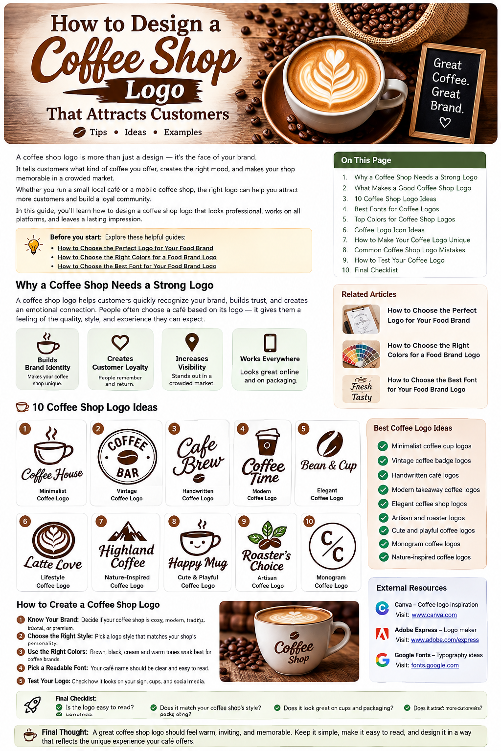
10 Coffee Shop Logo Ideas
1. Minimalist Coffee Logo
A minimalist logo can be an excellent choice for a modern café.
It might use:
- A simple coffee cup
- A coffee bean
- Clean typography
- One or two colors
- Plenty of empty space
The result can feel modern and professional without being overly designed.
This style works particularly well for specialty coffee shops, urban cafés, and businesses that want a clean visual identity.
2. Vintage Coffee Shop Logo
Vintage-style logos can make a coffee shop feel established and traditional.
Common elements include:
- Circular badges
- Classic typography
- Coffee bean illustrations
- Decorative borders
- Traditional colors
This style can work well for cafés that want to communicate craftsmanship, tradition, or a classic coffee-house atmosphere.
But don’t make the logo look old just for the sake of it.
The vintage style should support the personality of the business.
3. Handwritten Coffee Logo
A handwritten logo can make a coffee shop feel warm and personal.
This can be a good choice for:
- Small independent cafés
- Artisan coffee shops
- Neighborhood cafés
- Cozy coffee houses
A handwritten business name combined with a simple coffee symbol can create a friendly appearance.
Just make sure the lettering remains readable.
A beautiful script font isn’t helpful if customers can’t figure out what your café is called.
4. Modern Takeaway Coffee Logo
Some coffee businesses are focused heavily on takeaway customers.
For these businesses, a simple logo can work particularly well on:
- Paper cups
- Cup sleeves
- Delivery packaging
- Social media
- Mobile ordering platforms
A bold wordmark combined with a simple cup or bean icon can create a recognizable visual identity.
Because takeaway cups are often viewed quickly, the design should remain clear and uncluttered.
5. Coffee Bean Logo
A coffee bean is one of the most recognizable symbols in coffee branding.
But it’s also extremely common.
If you use a coffee bean, try to make your version distinctive.
For example, you could:
- Turn the bean into a letter
- Combine two beans into a symbol
- Use negative space
- Create a custom bean illustration
- Combine a bean with the initials of the café
The goal is to make the symbol feel like your brand, not just a generic coffee icon.
6. Elegant Coffee Shop Logo
A premium coffee shop may benefit from a more sophisticated logo.
This could include:
- Refined typography
- Minimal symbols
- Neutral colors
- Generous spacing
- A simple monogram
This style can work particularly well for specialty coffee shops, upscale cafés, hotel cafés, and premium coffee brands.
You don’t need lots of decoration to communicate quality.
Often, restraint creates a stronger premium feeling.
7. Cute and Friendly Coffee Logo
Not every coffee shop needs to look serious.
A playful logo can work well for cafés that want to feel approachable and fun.
You could use:
- A smiling coffee cup
- A friendly mascot
- Rounded typography
- Warm colors
- Simple illustrations
This approach can be especially effective for cafés targeting families, students, or younger customers.
8. Nature-Inspired Coffee Logo
If your coffee shop focuses on natural ingredients, sustainability, or an outdoor-inspired atmosphere, a nature-based logo could make sense.
Possible elements include:
- Leaves
- Mountains
- Trees
- Coffee beans
- Organic shapes
Earthy colors such as green, beige, brown, and cream can support this type of identity.
But make sure the visual style reflects your actual business.
Don’t use leaves simply because they look attractive.
9. Artisan Coffee Logo
Specialty coffee businesses often want to communicate craftsmanship.
An artisan-style logo could combine:
- Coffee beans
- Roasting imagery
- Hand-drawn elements
- Traditional typography
- Custom illustrations
The design should communicate that the coffee is carefully selected, roasted, or prepared.
This can help position the business as something more specialized than a generic café.
10. Monogram Coffee Logo
If your coffee shop has a long name, a monogram can create a cleaner identity.
For example:
CB
could represent:
Central Brew
The initials could be placed inside a circle, square, badge, or custom symbol.
A monogram can also work well as a secondary logo for:
- Coffee cups
- Merchandise
- Social media
- Loyalty cards
- Stamps
How to Create a Coffee Shop Logo
Step 1: Understand Your Brand
Before designing anything, define the personality of your coffee shop.
Ask yourself:
- Is the café modern?
- Is it traditional?
- Is it cozy?
- Is it premium?
- Is it playful?
- Is it focused on specialty coffee?
- Is it designed for takeaway customers?
Write down three to five words that describe the brand.
For example:
Warm — Local — Handmade — Friendly
Or:
Modern — Premium — Minimal — Sophisticated
Those words can guide your design decisions.
Step 2: Understand Your Customers
Think about who you want walking through the door.
Are your customers:
- Students?
- Office workers?
- Families?
- Tourists?
- Coffee enthusiasts?
- Remote workers?
- Premium coffee buyers?
Your logo should make sense to your target audience.
A playful café aimed at students may need a completely different visual identity from an upscale specialty coffee shop.
Step 3: Choose the Right Colors
Coffee branding often uses colors associated with warmth and comfort.
Popular choices include:
- Brown
- Cream
- Beige
- Black
- Green
- Terracotta
- Dark red
But you don’t have to use brown just because you sell coffee.
A bright or unexpected color palette can sometimes help a coffee brand stand out.
For more guidance, read our article How to Choose the Right Colors for a Food Brand Logo.
The important thing is that your colors match the personality of the business.
Step 4: Choose a Readable Font
Typography can completely change how a coffee shop feels.
A serif font can feel classic.
A sans-serif can feel modern.
A handwritten font can feel personal.
A bold display font can feel energetic.
Whatever style you choose, make sure the coffee shop name remains easy to read.
For more typography guidance, read How to Choose the Best Font for Your Food Brand Logo.
You can also explore Google Fonts when researching different typography options.
Step 5: Choose a Symbol
A coffee logo doesn’t always need an icon.
You could create:
Wordmark
The business name is the main design.
Symbol
A simple coffee-related icon represents the brand.
Combination Mark
The name and symbol are used together.
Monogram
The initials become the main visual element.
Choose the approach that makes the most sense for your business.
Step 6: Make the Logo Unique
This is where many coffee shop logos struggle.
Coffee cups and beans are obvious choices.
But if every café uses the same cup icon, customers won’t have much reason to remember one over another.
Try adding a custom element.
For example:
- Turn a coffee bean into a letter
- Create a unique cup shape
- Use a custom illustration
- Combine two symbols
- Create an interesting negative-space design
- Use a distinctive type treatment
A small unique detail can make a big difference.
Step 7: Think About Where the Logo Will Appear
Don’t design the logo only for your website.
Imagine it on:
Coffee cups
Can customers recognize it immediately?
Storefront signage
Can people read it from a distance?
Social media
Does it work inside a small profile picture?
Packaging
Does it remain clear when printed?
Merchandise
Would it look good on a T-shirt or coffee mug?
Your logo needs to survive all of these situations.
Adobe Express’s coffee-logo resources specifically recommend thinking about how the logo will appear across different screens and marketing materials.
How to Make Your Coffee Shop Logo Memorable
A memorable logo doesn’t necessarily have lots of details.
Instead, it usually has a strong and recognizable idea.
Try to focus on one main visual concept.
For example:
A custom coffee bean + unique typography
can be stronger than:
Coffee cup + beans + leaves + steam + spoon + tagline + five colors.
Give the design room to breathe.
Simple doesn’t mean boring.
Simple can be memorable.
Common Coffee Shop Logo Mistakes
Using the Same Coffee Cup Icon Everyone Uses
A generic icon may communicate coffee but not your unique brand.
Using Too Many Fonts
Two carefully selected fonts are usually better than five competing styles.
Making the Logo Difficult to Read
Customers shouldn’t have to study your logo to understand the business name.
Using Too Many Colors
A complicated palette can make branding harder to maintain.
Ignoring the Storefront
Your logo needs to work in the physical environment.
Designing Only for Instagram
Your coffee shop exists in the real world too.
Copying Competitors
Research is useful.
Copying isn’t.
Look at competitors to understand the market and then find your own visual direction.
How to Test Your Coffee Shop Logo
Before printing hundreds of cups or putting a sign above the door, test the design.
Test It Small
Reduce the logo to the size of a social media profile image.
Can you still recognize it?
Test It Large
Place it on a storefront mockup.
Does it remain clear?
Test Different Backgrounds
Try light and dark backgrounds.
Test Black and White
A strong logo should still have a recognizable shape without color.
Test Packaging
Place it on a takeaway cup or paper bag.
Does it look natural?
Ask Real People
Show the logo to several people who don’t know the design process.
Ask:
“What kind of business does this logo make you think of?”
Their answers can reveal whether your visual message is working.
Helpful Coffee Logo Resources
If you want to explore different design directions before creating your final logo, established design platforms can be useful for research and experimentation.
Canva has coffee-logo templates and examples that can help you explore different styles, from minimalist and vintage designs to more colorful café concepts.
Explore Canva Coffee Logo Templates
Adobe Express offers dedicated coffee-shop logo templates and customization tools, including different fonts, icons, colors, and layouts.
Explore Adobe Express Coffee Shop Logo Templates
These resources are best used for inspiration and experimentation. Your final logo should still be distinctive to your own coffee shop.
Coffee Shop Logo Checklist
Before finalizing your design, ask:
✓ Is the coffee shop name easy to read?
✓ Does the logo match the personality of the café?
✓ Is it recognizable at a small size?
✓ Does it work on coffee cups?
✓ Does it work on storefront signage?
✓ Does it look good on social media?
✓ Is it different from competitors?
✓ Are the colors appropriate?
✓ Is the typography readable?
✓ Can the logo grow with the business?
If you can answer yes to most of these questions, you’re on the right track.
Final Thoughts
A great coffee shop logo doesn’t have to show everything your café offers.
It doesn’t need a coffee cup, bean, leaf, steam, and five different fonts all at once.
Instead, focus on creating a visual identity that feels connected to your business.
Understand your customers.
Define your personality.
Choose a suitable style.
Use readable typography.
Pick colors carefully.
Add one memorable visual element.
Then test the logo everywhere customers will see it.
Your coffee shop may serve thousands of cups over the years.
A good logo can help make sure customers remember where that coffee came from.
The best coffee shop logo isn’t simply attractive—it gives your café a personality customers can recognize and remember.