
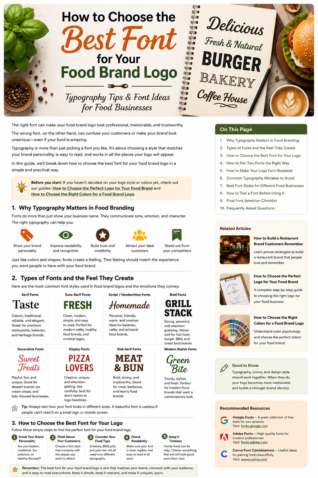
How to Choose the Best Font for Your Food Brand Logo
Choosing a font for a food brand logo might seem like a small design decision, but it can completely change how people see your business.
The right typeface can make a restaurant feel modern, a bakery feel handmade, or a premium food brand feel elegant. The wrong one can make even a great business look confusing, outdated, or difficult to remember.
And there are thousands of fonts to choose from.
So how do you know which one is right?
The answer isn’t simply to find the font that looks the prettiest. You need to choose a typeface that fits your brand personality, target customers, food category, and the places where your logo will be used.
Let’s look at how to make that decision.
Why Typography Matters in Food Branding
Your logo is often one of the first things customers see.
Before they taste your food or visit your restaurant, they may see your name on a storefront, delivery app, Instagram profile, menu, food package, or website.
Typography helps shape that first impression.
A bold font can make a brand feel confident and energetic.
A traditional serif can make it feel established and sophisticated.
A handwritten font can create a warm, homemade feeling.
A clean sans-serif can make a brand appear modern and straightforward.
That’s why choosing a font shouldn’t be treated as an afterthought.
Your typography should support the same personality as the rest of your visual identity.
If you haven’t chosen your overall logo direction yet, start with our guide How to Choose the Perfect Logo for Your Food Brand.
Types of Fonts and the Feeling They Create
There are many ways to classify typefaces, but a few categories are especially useful when designing food logos.
1. Serif Fonts
Serif fonts have small decorative strokes at the ends of letters.
They can create a feeling of:
- Tradition
- Elegance
- Reliability
- Heritage
- Quality
Serif fonts can be a strong choice for:
- Fine-dining restaurants
- Traditional restaurants
- Bakeries
- Gourmet food brands
- Heritage food companies
A serif logo can feel established without necessarily looking old-fashioned.
The exact typeface matters, though. Some serifs are elegant and refined, while others are bold and casual.
2. Sans-Serif Fonts
Sans-serif fonts don’t have those decorative strokes.
They’re generally clean, simple, and easy to recognize.
They can work particularly well for:
- Modern restaurants
- Cafés
- Healthy food brands
- Food delivery companies
- Contemporary food products
If your brand personality is modern, fresh, clean, or minimal, a sans-serif can be a good starting point.
One advantage of this style is flexibility. A clean typeface can often work across packaging, websites, menus, signage, and social media without feeling out of place.
3. Script and Handwritten Fonts
Script fonts can look like handwriting or calligraphy.
They can give a food brand a more personal and expressive feeling.
They can work nicely for:
- Bakeries
- Dessert brands
- Artisan food businesses
- Coffee shops
- Homemade food brands
But script fonts need to be handled carefully.
A highly decorative script may look beautiful when displayed large but become difficult to read when the logo is reduced.
If customers have to guess what your restaurant is called, the design isn’t doing its job.
4. Bold Fonts
Bold typefaces are designed to get attention.
They can work well for food businesses that want to appear:
- Strong
- Energetic
- Confident
- Fun
- Modern
They can be particularly effective for:
- Burger restaurants
- BBQ brands
- Food trucks
- Fast-casual restaurants
- Snack brands
A bold font can also help a short brand name stand out on packaging or signage.
Just avoid making every part of the logo equally heavy. Good typography still needs visual hierarchy.
5. Decorative Fonts
Decorative fonts have a stronger visual personality.
They may have unusual shapes, playful details, or a distinctive theme.
These fonts can work for certain food businesses, especially when the concept itself is playful or highly specific.
For example, a dessert shop aimed at children might be able to use a much more playful typeface than a professional catering company.
The key is knowing when enough is enough.
A decorative font should add personality—not make the logo difficult to understand.
How to Choose the Best Font for Your Food Logo
Now comes the important part.
Instead of scrolling through hundreds of fonts and choosing one at random, follow a simple process.
1. Start With Your Brand Personality
Write down three or four words that describe your business.
For example:
Modern — Fresh — Healthy — Friendly
Or:
Premium — Traditional — Elegant — Sophisticated
Or:
Fun — Bold — Casual — Energetic
Now look for fonts that support those qualities.
A very formal typeface probably won’t be the best match for a playful burger restaurant.
Likewise, an extremely playful font may not fit a luxury restaurant.
The font should feel like it belongs to the business.
2. Think About Your Customers
Your target audience matters just as much as your own preference.
Imagine two businesses:
Business A: A premium chocolate company selling expensive gift boxes.
Business B: A colorful snack brand aimed at teenagers.
Both sell food, but they probably need very different typography.
For Business A, an elegant serif or sophisticated display font might make sense.
For Business B, a bold, playful, or contemporary typeface could be more appropriate.
Ask yourself:
What kind of customer am I trying to attract?
Then choose typography that speaks to that audience.
3. Consider the Type of Food You Sell
Your product can also guide your font selection.
A bakery might benefit from warm or handcrafted typography.
A modern salad restaurant might use clean, minimal lettering.
A BBQ restaurant could use strong, bold typography.
A luxury coffee brand might use refined serif lettering.
These aren’t strict rules.
You don’t have to use a certain font just because you’re selling a particular type of food.
The purpose is to create a natural connection between your product and your visual identity.
How to Pair Two Fonts the Right Way
Sometimes one font isn’t enough.
You might use one typeface for the restaurant name and another for a tagline or supporting text.
But don’t combine fonts just because they look different.
They should complement each other.
A simple approach is to combine contrasting styles.
For example:
Elegant Serif + Clean Sans-Serif
or
Bold Sans-Serif + Simple Sans-Serif
or
Handwritten Font + Clean Sans-Serif
The first font can provide personality while the second keeps supporting information readable.
If you’re using two fonts, make sure they have clearly different roles.
Otherwise, the logo can start to look messy.
Make Readability Your Priority
This is one of the most important rules in logo typography.
Your logo needs to be readable.
It might look excellent when displayed at a large size on your computer, but what happens when you shrink it?
Try viewing your logo as:
- A social media profile picture
- A small sticker
- A delivery app icon
- A coffee cup
- A food box
- A website header
- A small menu label
If the business name becomes difficult to read, reconsider the font.
This is particularly important with script and decorative typefaces.
A logo doesn’t have to be plain to be readable, but readability should always come before unnecessary decoration.
Think About Where Your Logo Will Be Used
A restaurant logo doesn’t live in one place.
It can appear on almost anything connected to the business.
For example:
- Storefront signs
- Menus
- Food packaging
- Delivery bags
- Social media
- Websites
- Business cards
- Staff uniforms
- Stickers
- Merchandise
That means your font needs to work across different sizes and surfaces.
A typeface that works beautifully on a large sign may not work on a tiny packaging label.
Before choosing your final font, test it in realistic situations.
This is also why logo design should be considered alongside the rest of your visual identity.
For inspiration, you can read our guide 10 Best Food Logo Design Ideas to Inspire Your Brand.
Don’t Choose a Font Just Because It’s Trending
Design trends change quickly.
A font style can suddenly become popular because dozens of brands start using it.
That doesn’t mean it’s right for your business.
Your food brand may still be around five or ten years from now.
So instead of asking:
“Is this font trendy?”
ask:
“Does this font fit my brand?”
A timeless and appropriate typeface will usually serve your business better than a font chosen only because it’s popular this year.
Where Can You Find Good Fonts?
There are many places where designers can explore typefaces.
One useful resource is Google Fonts, where you can browse a large collection of fonts and preview different styles.
Another option is Adobe Fonts. Adobe currently provides thousands of fonts through its service, with options to browse by categories and styles.
Adobe also provides font licensing information, which is worth checking before using a typeface commercially.
You don’t need an expensive font to create a professional food logo.
What matters more is how well the typeface fits the brand and how effectively you use it.
Common Food Logo Typography Mistakes
Using Too Many Fonts
A logo usually doesn’t need several different typefaces.
Too many fonts can make the design look unorganized.
Choosing Style Over Readability
A beautiful font is useless if customers can’t understand the business name.
Copying Another Brand
It’s fine to study successful brands.
It’s not a good idea to create a logo that looks almost identical to a competitor.
Using Extremely Thin Fonts
Very thin lettering can disappear when the logo is printed small or viewed on certain screens.
Overusing Script Fonts
Handwritten fonts can add personality, but they can also become difficult to read when overused.
Ignoring the Brand Personality
A font may look great on its own but still be completely wrong for your business.
Always judge the font in the context of your brand.
Best Font Styles for Different Food Businesses
Here’s a simple starting point:
| Food Business | Font Style to Consider |
|---|---|
| Fine-dining restaurant | Elegant Serif |
| Modern café | Clean Sans-Serif |
| Bakery | Serif or Handwritten |
| Burger restaurant | Bold Sans-Serif |
| BBQ restaurant | Bold or Slab Serif |
| Vegan restaurant | Clean Sans-Serif |
| Artisan food brand | Handwritten or Serif |
| Dessert shop | Playful or Decorative |
| Premium chocolate brand | Elegant Serif |
| Food truck | Bold Display Font |
These are starting points, not strict rules.
A creative brand can always break the expected pattern if the result still makes sense.
How to Test a Font Before Using It
Before committing to a typeface, create a few versions of your logo.
For example:
Version A: Serif
Version B: Sans-Serif
Version C: Bold Display
Version D: Handwritten
Then compare them side by side.
Ask:
- Which one feels most like my brand?
- Which one is easiest to remember?
- Which one is easiest to read?
- Which one looks best at a small size?
- Which one works best with my colors?
- Which one looks different from competitors?
You can also ask a few people who represent your target customers what they think.
Don’t simply ask which one they “like.”
Ask what kind of business each logo makes them think of.
That can give you much more useful feedback.
Your Font Should Work With Your Colors
Typography doesn’t exist separately from color.
The two need to work together.
For example, an elegant serif combined with black and gold may create a premium appearance.
A bold sans-serif combined with red may feel energetic.
A handwritten font combined with warm brown and cream can create a handcrafted bakery feeling.
This is why your logo should be judged as a complete design rather than as a font alone.
If you’re working on your color palette, read How to Choose the Right Colors for a Food Brand Logo.
Final Font Selection Checklist
Before choosing your final typeface, ask:
✓ Does the font match my brand personality?
✓ Is it easy to read?
✓ Does it suit my target customers?
✓ Does it fit my type of food business?
✓ Does it work at small sizes?
✓ Does it look good with my logo colors?
✓ Does it work on packaging and signage?
✓ Does it look different enough from competitors?
✓ Will it still feel appropriate a few years from now?
✓ Can I use it consistently across my branding?
If most of the answers are yes, you’re probably on the right track.
Final Thoughts
Choosing a font for your food brand logo isn’t about finding the fanciest typeface.
It’s about finding a style that feels natural for your business.
A good font should communicate personality, remain readable, work across different applications, and help customers recognize your brand.
Start with your brand personality.
Think about your audience.
Consider your food category.
Test different font styles.
Then see how the typography works with your colors and overall logo design.
Most importantly, don’t rush the decision.
A logo may represent your food business for years, so it’s worth spending time finding typography that feels right.
The best food brand font isn’t necessarily the most beautiful one. It’s the one that makes your brand feel unmistakably yours.Choosing a font for a food brand logo might seem like a small design decision, but it can completely change how people see your business.
The right typeface can make a restaurant feel modern, a bakery feel handmade, or a premium food brand feel elegant. The wrong one can make even a great business look confusing, outdated, or difficult to remember.
And there are thousands of fonts to choose from.
So how do you know which one is right?
The answer isn’t simply to find the font that looks the prettiest. You need to choose a typeface that fits your brand personality, target customers, food category, and the places where your logo will be used.
Let’s look at how to make that decision.
Why Typography Matters in Food Branding
Your logo is often one of the first things customers see.
Before they taste your food or visit your restaurant, they may see your name on a storefront, delivery app, Instagram profile, menu, food package, or website.
Typography helps shape that first impression.
A bold font can make a brand feel confident and energetic.
A traditional serif can make it feel established and sophisticated.
A handwritten font can create a warm, homemade feeling.
A clean sans-serif can make a brand appear modern and straightforward.
That’s why choosing a font shouldn’t be treated as an afterthought.
Your typography should support the same personality as the rest of your visual identity.
If you haven’t chosen your overall logo direction yet, start with our guide How to Choose the Perfect Logo for Your Food Brand.
Types of Fonts and the Feeling They Create
There are many ways to classify typefaces, but a few categories are especially useful when designing food logos.
1. Serif Fonts
Serif fonts have small decorative strokes at the ends of letters.
They can create a feeling of:
- Tradition
- Elegance
- Reliability
- Heritage
- Quality
Serif fonts can be a strong choice for:
- Fine-dining restaurants
- Traditional restaurants
- Bakeries
- Gourmet food brands
- Heritage food companies
A serif logo can feel established without necessarily looking old-fashioned.
The exact typeface matters, though. Some serifs are elegant and refined, while others are bold and casual.
2. Sans-Serif Fonts
Sans-serif fonts don’t have those decorative strokes.
They’re generally clean, simple, and easy to recognize.
They can work particularly well for:
- Modern restaurants
- Cafés
- Healthy food brands
- Food delivery companies
- Contemporary food products
If your brand personality is modern, fresh, clean, or minimal, a sans-serif can be a good starting point.
One advantage of this style is flexibility. A clean typeface can often work across packaging, websites, menus, signage, and social media without feeling out of place.
3. Script and Handwritten Fonts
Script fonts can look like handwriting or calligraphy.
They can give a food brand a more personal and expressive feeling.
They can work nicely for:
- Bakeries
- Dessert brands
- Artisan food businesses
- Coffee shops
- Homemade food brands
But script fonts need to be handled carefully.
A highly decorative script may look beautiful when displayed large but become difficult to read when the logo is reduced.
If customers have to guess what your restaurant is called, the design isn’t doing its job.
4. Bold Fonts
Bold typefaces are designed to get attention.
They can work well for food businesses that want to appear:
- Strong
- Energetic
- Confident
- Fun
- Modern
They can be particularly effective for:
- Burger restaurants
- BBQ brands
- Food trucks
- Fast-casual restaurants
- Snack brands
A bold font can also help a short brand name stand out on packaging or signage.
Just avoid making every part of the logo equally heavy. Good typography still needs visual hierarchy.
5. Decorative Fonts
Decorative fonts have a stronger visual personality.
They may have unusual shapes, playful details, or a distinctive theme.
These fonts can work for certain food businesses, especially when the concept itself is playful or highly specific.
For example, a dessert shop aimed at children might be able to use a much more playful typeface than a professional catering company.
The key is knowing when enough is enough.
A decorative font should add personality—not make the logo difficult to understand.
How to Choose the Best Font for Your Food Logo
Now comes the important part.
Instead of scrolling through hundreds of fonts and choosing one at random, follow a simple process.
1. Start With Your Brand Personality
Write down three or four words that describe your business.
For example:
Modern — Fresh — Healthy — Friendly
Or:
Premium — Traditional — Elegant — Sophisticated
Or:
Fun — Bold — Casual — Energetic
Now look for fonts that support those qualities.
A very formal typeface probably won’t be the best match for a playful burger restaurant.
Likewise, an extremely playful font may not fit a luxury restaurant.
The font should feel like it belongs to the business.
2. Think About Your Customers
Your target audience matters just as much as your own preference.
Imagine two businesses:
Business A: A premium chocolate company selling expensive gift boxes.
Business B: A colorful snack brand aimed at teenagers.
Both sell food, but they probably need very different typography.
For Business A, an elegant serif or sophisticated display font might make sense.
For Business B, a bold, playful, or contemporary typeface could be more appropriate.
Ask yourself:
What kind of customer am I trying to attract?
Then choose typography that speaks to that audience.
3. Consider the Type of Food You Sell
Your product can also guide your font selection.
A bakery might benefit from warm or handcrafted typography.
A modern salad restaurant might use clean, minimal lettering.
A BBQ restaurant could use strong, bold typography.
A luxury coffee brand might use refined serif lettering.
These aren’t strict rules.
You don’t have to use a certain font just because you’re selling a particular type of food.
The purpose is to create a natural connection between your product and your visual identity.
How to Pair Two Fonts the Right Way
Sometimes one font isn’t enough.
You might use one typeface for the restaurant name and another for a tagline or supporting text.
But don’t combine fonts just because they look different.
They should complement each other.
A simple approach is to combine contrasting styles.
For example:
Elegant Serif + Clean Sans-Serif
or
Bold Sans-Serif + Simple Sans-Serif
or
Handwritten Font + Clean Sans-Serif
The first font can provide personality while the second keeps supporting information readable.
If you’re using two fonts, make sure they have clearly different roles.
Otherwise, the logo can start to look messy.
Make Readability Your Priority
This is one of the most important rules in logo typography.
Your logo needs to be readable.
It might look excellent when displayed at a large size on your computer, but what happens when you shrink it?
Try viewing your logo as:
- A social media profile picture
- A small sticker
- A delivery app icon
- A coffee cup
- A food box
- A website header
- A small menu label
If the business name becomes difficult to read, reconsider the font.
This is particularly important with script and decorative typefaces.
A logo doesn’t have to be plain to be readable, but readability should always come before unnecessary decoration.
Think About Where Your Logo Will Be Used
A restaurant logo doesn’t live in one place.
It can appear on almost anything connected to the business.
For example:
- Storefront signs
- Menus
- Food packaging
- Delivery bags
- Social media
- Websites
- Business cards
- Staff uniforms
- Stickers
- Merchandise
That means your font needs to work across different sizes and surfaces.
A typeface that works beautifully on a large sign may not work on a tiny packaging label.
Before choosing your final font, test it in realistic situations.
This is also why logo design should be considered alongside the rest of your visual identity.
For inspiration, you can read our guide 10 Best Food Logo Design Ideas to Inspire Your Brand.
Don’t Choose a Font Just Because It’s Trending
Design trends change quickly.
A font style can suddenly become popular because dozens of brands start using it.
That doesn’t mean it’s right for your business.
Your food brand may still be around five or ten years from now.
So instead of asking:
“Is this font trendy?”
ask:
“Does this font fit my brand?”
A timeless and appropriate typeface will usually serve your business better than a font chosen only because it’s popular this year.
Where Can You Find Good Fonts?
There are many places where designers can explore typefaces.
One useful resource is Google Fonts, where you can browse a large collection of fonts and preview different styles.
Another option is Adobe Fonts. Adobe currently provides thousands of fonts through its service, with options to browse by categories and styles.
Adobe also provides font licensing information, which is worth checking before using a typeface commercially.
You don’t need an expensive font to create a professional food logo.
What matters more is how well the typeface fits the brand and how effectively you use it.
Common Food Logo Typography Mistakes
Using Too Many Fonts
A logo usually doesn’t need several different typefaces.
Too many fonts can make the design look unorganized.
Choosing Style Over Readability
A beautiful font is useless if customers can’t understand the business name.
Copying Another Brand
It’s fine to study successful brands.
It’s not a good idea to create a logo that looks almost identical to a competitor.
Using Extremely Thin Fonts
Very thin lettering can disappear when the logo is printed small or viewed on certain screens.
Overusing Script Fonts
Handwritten fonts can add personality, but they can also become difficult to read when overused.
Ignoring the Brand Personality
A font may look great on its own but still be completely wrong for your business.
Always judge the font in the context of your brand.
Best Font Styles for Different Food Businesses
Here’s a simple starting point:
| Food Business | Font Style to Consider |
|---|---|
| Fine-dining restaurant | Elegant Serif |
| Modern café | Clean Sans-Serif |
| Bakery | Serif or Handwritten |
| Burger restaurant | Bold Sans-Serif |
| BBQ restaurant | Bold or Slab Serif |
| Vegan restaurant | Clean Sans-Serif |
| Artisan food brand | Handwritten or Serif |
| Dessert shop | Playful or Decorative |
| Premium chocolate brand | Elegant Serif |
| Food truck | Bold Display Font |
These are starting points, not strict rules.
A creative brand can always break the expected pattern if the result still makes sense.
How to Test a Font Before Using It
Before committing to a typeface, create a few versions of your logo.
For example:
Version A: Serif
Version B: Sans-Serif
Version C: Bold Display
Version D: Handwritten
Then compare them side by side.
Ask:
- Which one feels most like my brand?
- Which one is easiest to remember?
- Which one is easiest to read?
- Which one looks best at a small size?
- Which one works best with my colors?
- Which one looks different from competitors?
You can also ask a few people who represent your target customers what they think.
Don’t simply ask which one they “like.”
Ask what kind of business each logo makes them think of.
That can give you much more useful feedback.
Your Font Should Work With Your Colors
Typography doesn’t exist separately from color.
The two need to work together.
For example, an elegant serif combined with black and gold may create a premium appearance.
A bold sans-serif combined with red may feel energetic.
A handwritten font combined with warm brown and cream can create a handcrafted bakery feeling.
This is why your logo should be judged as a complete design rather than as a font alone.
If you’re working on your color palette, read How to Choose the Right Colors for a Food Brand Logo.
Final Font Selection Checklist
Before choosing your final typeface, ask:
✓ Does the font match my brand personality?
✓ Is it easy to read?
✓ Does it suit my target customers?
✓ Does it fit my type of food business?
✓ Does it work at small sizes?
✓ Does it look good with my logo colors?
✓ Does it work on packaging and signage?
✓ Does it look different enough from competitors?
✓ Will it still feel appropriate a few years from now?
✓ Can I use it consistently across my branding?
If most of the answers are yes, you’re probably on the right track.
Final Thoughts
Choosing a font for your food brand logo isn’t about finding the fanciest typeface.
It’s about finding a style that feels natural for your business.
A good font should communicate personality, remain readable, work across different applications, and help customers recognize your brand.
Start with your brand personality.
Think about your audience.
Consider your food category.
Test different font styles.
Then see how the typography works with your colors and overall logo design.
Most importantly, don’t rush the decision.
A logo may represent your food business for years, so it’s worth spending time finding typography that feels right.
The best food brand font isn’t necessarily the most beautiful one. It’s the one that makes your brand feel unmistakably yours.