
A great logo can make a food brand instantly recognizable.
Think about the restaurants, cafés, bakeries, and food products you see every day. Some logos are simple and quiet, while others are bold, colorful, or playful. The best ones have something in common: they give you an immediate feeling about the brand.
But coming up with the right logo idea isn’t always easy.
Should your logo be minimalist? Should you use a food icon? Would a mascot work better? Should you choose a vintage look or something more modern?
In this article, we’ll look at 10 food logo design ideas that can help you find the right direction for your own brand.
And remember, these are ideas to inspire your design—not templates you have to copy.
What Makes a Great Food Logo?
Before looking at different styles, it’s worth understanding what makes a logo work in the first place.
A strong food logo should generally be:
- Simple enough to remember
- Relevant to the food brand
- Easy to recognize
- Readable at different sizes
- Flexible across different platforms
- Appropriate for the target audience
A logo also needs to work beyond a website.
It might appear on packaging, menus, storefronts, delivery apps, social media, uniforms, and advertising.
Canva’s logo design guidance highlights principles such as balance, hierarchy, typography, and color as important parts of effective logo design.
So, with those basics in mind, let’s look at some food logo styles worth considering.
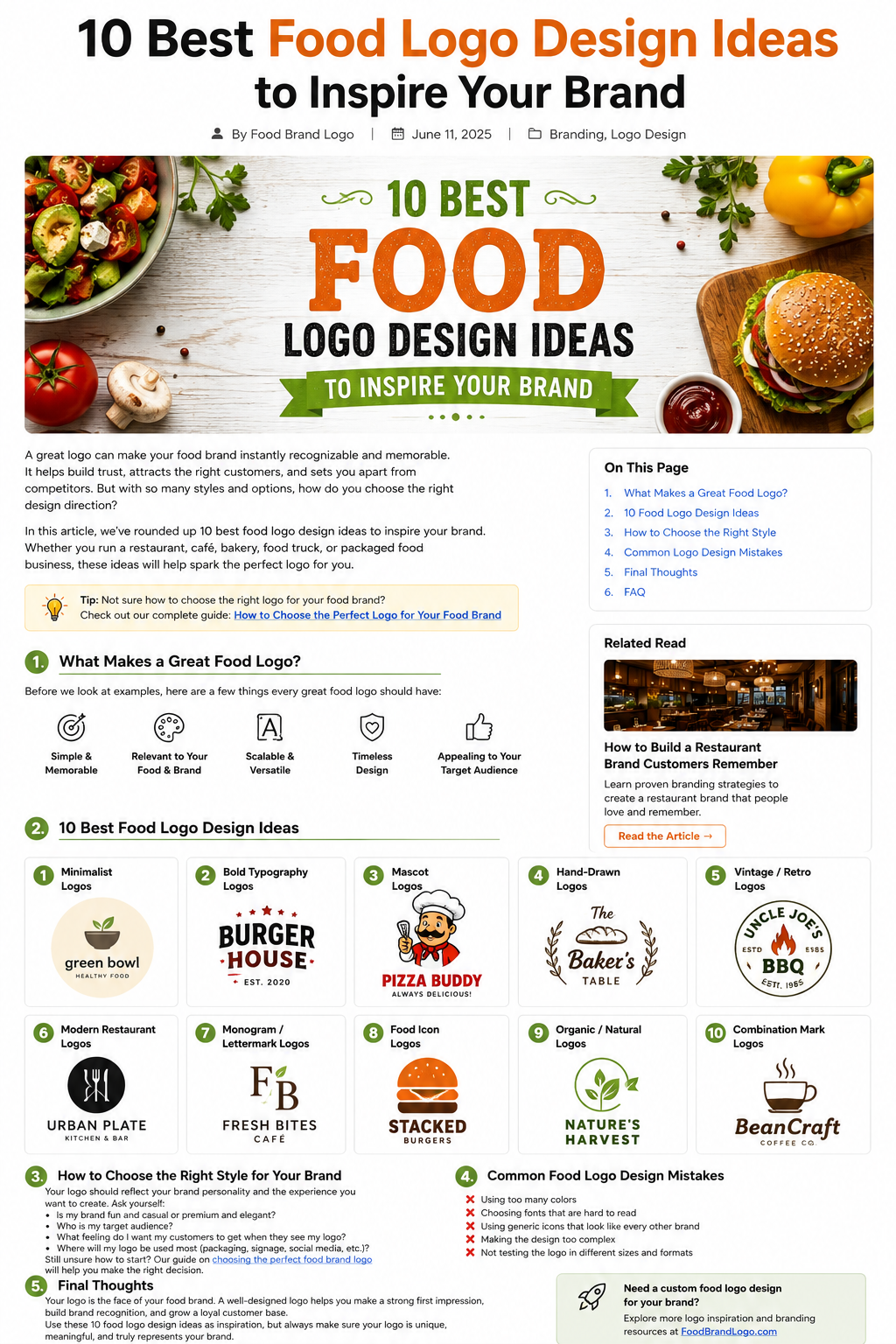
10 Food Logo Design Ideas
1. Minimalist Food Logos
Sometimes, less really is more.
A minimalist food logo uses a limited number of elements and avoids unnecessary decoration. It might combine a simple icon with clean typography or use the brand name on its own.
This style can work particularly well for:
- Healthy food brands
- Modern cafés
- Premium restaurants
- Organic food companies
- Meal-prep businesses
The advantage of minimalism is flexibility.
A simple logo is often easier to use on a small food package, social media profile, website, or business card.
But don’t confuse simple with boring.
The goal is to remove unnecessary elements while keeping enough personality to make the logo distinctive.
2. Bold Typography Logos
You don’t always need an illustration to create a strong food logo.
Sometimes the name itself can do the job.
Bold typography can work especially well for:
- Burger restaurants
- Food trucks
- Fast-casual restaurants
- Snack brands
- Coffee shops
A strong typeface can give the brand an energetic and confident personality.
You can also customize individual letters to create something more memorable.
For example, a burger restaurant might subtly incorporate a bun shape into a letter rather than placing a full burger illustration next to the name.
That small detail can make the design feel much more original.
3. Mascot Logos
Mascot logos give a food brand a recognizable character.
Think of a chef, animal, food character, or fictional personality that represents the business.
This approach can be especially effective for brands that want to feel:
- Friendly
- Fun
- Family-oriented
- Playful
- Energetic
A mascot can also give your brand more opportunities for marketing.
The character could appear on packaging, social media posts, menus, merchandise, and advertisements.
The important thing is to avoid making the illustration unnecessarily complicated.
A mascot should still be recognizable when it’s reduced to a smaller size.
4. Hand-Drawn Food Logos
Hand-drawn logos can give a brand a more personal and authentic feeling.
They’re often a natural fit for:
- Bakeries
- Local cafés
- Artisan food brands
- Farmers’ market businesses
- Homemade food companies
- Specialty restaurants
A hand-drawn logo can make a business feel less corporate and more personal.
For example, a small bakery might use a hand-drawn loaf of bread combined with a handwritten business name.
The result can feel warm and approachable.
Just make sure the final design remains readable. A handmade appearance shouldn’t mean customers have to struggle to understand the brand name.
5. Vintage and Retro Food Logos
Vintage-inspired logos can work beautifully for restaurants that want to communicate tradition or nostalgia.
This style often uses:
- Classic typography
- Badges and circular layouts
- Muted colors
- Decorative borders
- Traditional illustrations
It’s particularly suitable for:
- BBQ restaurants
- Diners
- Traditional bakeries
- Family restaurants
- Old-fashioned cafés
- Specialty food products
The key is to make the vintage style feel intentional.
You don’t necessarily need to make the entire logo look like it came from the 1950s. A few carefully chosen elements can create the feeling without making the design look outdated.
6. Modern Restaurant Logos
A modern food logo usually focuses on clean shapes, contemporary typography, and a simple visual system.
This can be a good choice for:
- Modern restaurants
- Coffee shops
- Food delivery brands
- Health-focused businesses
- Contemporary food products
Modern doesn’t have to mean complicated.
In fact, many modern identities rely on a small number of carefully designed elements.
Canva’s food and beverage logo inspiration includes examples of geometric, typographic, vintage, and combination-style food logos, showing just how many different directions a food brand can take.
7. Monogram and Lettermark Logos
If your business name is long, using the full name in your logo may make the design difficult to use.
That’s where a monogram or lettermark can help.
Instead of displaying the entire name, you use one or more initials as the main visual element.
For example:
FB
could represent:
Fresh Bites
The letters can then be customized with typography, shapes, or a small food-related detail.
This style can work especially well for premium restaurants, cafés, catering companies, and food businesses with longer names.
8. Food Icon Logos
Food icons are one of the most obvious directions for a food brand—and for good reason.
A recognizable food-related symbol can immediately communicate what your business is about.
Depending on the business, the icon could be:
- Burger
- Pizza
- Coffee cup
- Bread
- Leaf
- Fruit
- Bowl
- Spoon
- Chef hat
- Ingredient
But there’s an important warning:
Don’t use a generic icon just because it represents food.
If hundreds of restaurants are using the same fork-and-knife symbol, your logo probably won’t stand out.
Try to find a more distinctive way to represent your product.
For example, instead of simply drawing a pizza slice, you could incorporate the shape into a letter in your brand name.
That makes the design more connected to your actual identity.
9. Organic and Natural Food Logos
If your business focuses on organic, natural, healthy, or plant-based products, your logo can communicate those qualities visually.
Common design directions include:
- Leaves
- Natural shapes
- Earth-inspired colors
- Simple illustrations
- Organic typography
- Minimal layouts
This style can work well for:
- Organic food brands
- Vegan restaurants
- Health-food companies
- Juice bars
- Salad restaurants
- Natural products
But again, don’t rely on clichés alone.
A green leaf doesn’t automatically make a brand feel healthy.
The entire visual identity—including photography, packaging, typography, and messaging—should support the same idea.
10. Combination Mark Logos
A combination mark combines an icon with text.
For many new food businesses, this is one of the most practical approaches.
Customers can see the brand name while also becoming familiar with the visual symbol.
Over time, you may even be able to use the symbol by itself.
A combination mark can work across:
- Restaurant signs
- Menus
- Packaging
- Websites
- Social media
- Delivery bags
- Merchandise
Adobe Express’s food logo resources currently include hundreds of food-related logo templates and examples covering categories such as organic food, burgers, Italian food, Mexican food, vegan food, and more. It’s useful for exploring different visual directions before developing your own concept.
How to Choose the Right Food Logo Style
With ten different directions to choose from, you might be wondering which one is right for your business.
Start with your brand—not the logo.
Ask yourself:
What kind of food business am I building?
A premium restaurant may need a completely different identity from a casual food truck.
Who are my customers?
Your target audience should influence your visual choices.
What should people feel?
Do you want your brand to feel:
- Premium?
- Friendly?
- Healthy?
- Traditional?
- Fun?
- Modern?
- Handmade?
Where will the logo appear?
Think about your actual business.
Will the logo mainly appear on packaging? A storefront? Social media? Delivery apps? All of them?
Your answers will help narrow down the right direction.
If you’re still deciding what kind of logo fits your business, read our guide How to Choose the Perfect Logo for Your Food Brand.
Common Food Logo Design Mistakes
Even a good logo idea can become ineffective if the design goes too far.
Here are a few mistakes to watch out for.
Using Too Many Colors
Five or six colors can make a logo difficult to manage.
Start with a simple palette and expand only when there’s a good reason.
Choosing a Difficult Font
A decorative font may look beautiful in a design presentation but become almost impossible to read on a small food package.
Always test readability.
Copying Other Food Brands
Looking at competitors is useful.
Copying them isn’t.
Your logo should help customers distinguish your business from the competition.
Making the Design Too Complicated
A logo doesn’t need to tell your entire brand story.
Keep the main idea clear.
Ignoring Small Sizes
Always check how the logo looks as a small social media profile image or packaging label.
Designing Only for Digital Use
Your logo may eventually be printed, embroidered, stamped, engraved, or used on physical packaging.
Make sure it can handle different applications.
Final Thoughts
There are countless ways to design a food logo.
You can go minimalist, bold, playful, vintage, modern, hand-drawn, typographic, or use a custom food symbol.
But the best logo isn’t necessarily the most complicated or artistic one.
It’s the one that fits the brand and remains recognizable over time.
Use these ten ideas as a starting point.
Study what other successful food brands are doing, experiment with different directions, and then create something that belongs specifically to your business.
And remember: inspiration is useful, but your final logo should be original.
A memorable food brand isn’t built from a logo alone. Your logo, colors, typography, packaging, website, menu, and customer experience should all work together.
For a broader look at building a memorable restaurant identity, read How to Build a Restaurant Brand Customers Remember.
Your logo is the beginning of your food brand’s visual story—not the whole story.