
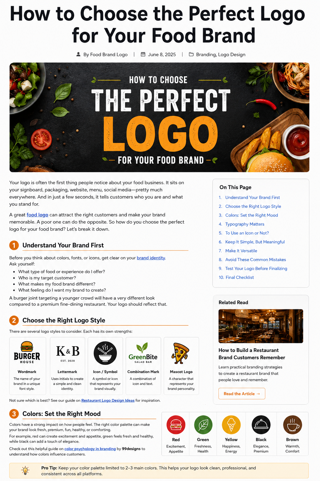
Your logo is often one of the first things people notice about your food business.
It might appear on your storefront, food packaging, website, menu, delivery bags, social media, or even a customer’s phone screen. In just a few seconds, it can influence what people think about your brand.
But choosing a food logo isn’t simply about picking a nice-looking burger, fork, chef hat, or attractive font.
The right logo should feel like your brand.
A casual burger restaurant, a premium bakery, a healthy meal-prep company, and a traditional family restaurant may all sell food, but they shouldn’t necessarily have the same visual identity.
So how do you choose a logo that actually fits your food brand?
Let’s break it down.
1. Understand Your Brand Before Choosing a Logo
Before thinking about colors, fonts, or icons, get clear about your brand.
Ask yourself a few simple questions:
- What type of food business do I have?
- Who are my ideal customers?
- What makes my business different?
- Is my brand casual, premium, traditional, modern, playful, or healthy?
- What should customers feel when they see my logo?
For example, a burger brand targeting college students might want a bold, energetic identity.
A luxury chocolate brand could take a completely different approach with elegant typography and a more refined color palette.
Your logo should reflect that difference.
This is also why it’s useful to define your brand identity before starting the design process. If you haven’t decided what your brand represents, choosing a logo becomes mostly guesswork.
If you’re still working on your overall restaurant branding, you can also read our previous guide: How to Build a Restaurant Brand Customers Remember.
2. Choose the Right Type of Food Logo
There isn’t just one type of logo.
Different logo styles can work for different food businesses, so think about what makes sense for your name, audience, and where you’ll use the logo.
Wordmark Logo
A wordmark uses the business name as the main visual element.
This can be a good choice if your food brand has a short, distinctive name.
Think about brands where the name itself has become the main visual identity.
Lettermark Logo
A lettermark uses initials instead of the complete business name.
This can be useful when your brand name is long but the initials are easy to remember.
Icon or Symbol Logo
This type of logo uses a visual symbol to represent the brand.
A food business might use an abstract food shape, ingredient, utensil, or another custom symbol.
The important word here is custom.
Using the same generic fork-and-knife icon that hundreds of restaurants already use won’t necessarily make your business memorable.
Combination Mark
A combination mark brings text and an icon together.
For many new food businesses, this can be a practical starting point because customers can see the brand name while also becoming familiar with the symbol.
Mascot Logo
Mascot logos use a character or illustrated personality.
They’re often a good fit for brands that want to feel fun, friendly, energetic, or family-oriented.
The best option depends on your business—not what’s currently trending.
3. Pick Colors That Match the Food Brand
Color can completely change how a logo feels.
A bright red logo can feel energetic and bold.
Green may suggest freshness, nature, or healthy ingredients.
Yellow and orange can create a warm and friendly feeling.
Black can give a food brand a more premium or sophisticated appearance.
But don’t choose colors simply because they’re associated with food.
Think about your specific positioning.
If you’re building a premium coffee brand, for example, using the same bright colors as a children’s snack brand may send the wrong message.
A good starting point is to choose one main color and one or two supporting colors.
Keeping the palette controlled also makes it easier to use your logo consistently across packaging, websites, social media, and printed materials.
For more information on logo colors and design fundamentals, Adobe’s logo design guide is a useful reference.
4. Don’t Underestimate Typography
The font you choose can make your food brand feel completely different.
A bold sans-serif can make a restaurant look modern and energetic.
A classic serif can create a more traditional or premium feeling.
A handwritten font can make a small bakery or café feel personal and handcrafted.
But there’s one thing that matters more than style:
Your logo needs to be easy to read.
This becomes especially important when your logo gets smaller.
Imagine your logo on:
- A delivery app
- An Instagram profile
- A small sticker
- A coffee cup
- A menu
- A website header
If customers can’t read the name at smaller sizes, the font choice isn’t working.
Adobe also recommends thinking about typography as part of the overall personality of a logo rather than treating the typeface as a purely decorative choice.
5. Should You Use a Food Icon?
This is one of the most common questions when creating a food logo.
The answer is: you don’t have to.
A pizza restaurant doesn’t automatically need a pizza slice.
A coffee shop doesn’t automatically need a coffee cup.
And a burger restaurant doesn’t necessarily need a burger illustration.
Sometimes a clever wordmark or abstract symbol can create a stronger identity than an obvious food icon.
If you do use an icon, try to give it some personality or originality.
Ask yourself:
If I removed my business name, would this symbol still have the potential to become recognizable?
If the answer is yes, you may have something worth developing.
6. Keep the Logo Simple—but Not Boring
There’s a difference between simple and generic.
A simple logo can be highly distinctive.
A generic logo simply looks like hundreds of other logos.
Your logo should have enough personality to make people notice it without becoming so complicated that people can’t remember it.
This is one reason professional logo guidance often emphasizes simplicity, recognition, versatility, and relevance.
Try removing unnecessary elements.
Do you really need three icons?
Do you need five colors?
Does the tagline need to be inside the logo?
Does every ingredient need to be represented visually?
Usually, the answer is no.
Give your main idea room to breathe.
7. Think About Where Your Logo Will Be Used
A logo isn’t created just for your website.
For a food business, it might eventually appear almost everywhere.
Think about:
- Restaurant signs
- Food boxes
- Paper bags
- Cups
- Menus
- Stickers
- Delivery apps
- Business cards
- Staff uniforms
- Merchandise
- Advertisements
This is why your logo needs to be flexible.
A design that looks fantastic on a large sign may become difficult to recognize as a tiny social media icon.
Adobe’s guidance similarly recommends testing logos across different sizes, backgrounds, and applications rather than judging them only in one presentation.
8. Make Sure It Looks Good in Black and White
Here’s a simple test that can tell you a lot about your logo.
Remove the colors.
Does the logo still work?
If the answer is no, don’t automatically assume the colors are the problem. The underlying shape, typography, or composition may need more work.
A strong logo should have a recognizable structure even without relying entirely on color.
This also makes it easier to use the logo in situations where full-color printing isn’t practical.
9. Research Other Food Brands Before You Decide
Before finalizing your logo, spend some time looking at other businesses in your category.
Look at:
- Restaurants
- Cafés
- Bakeries
- Food trucks
- Snack brands
- Meal-prep companies
- Beverage brands
Don’t copy them.
Study them.
Look for patterns.
Are most competitors using red?
Are they all using circular logos?
Are they relying heavily on food illustrations?
Are most of them using similar fonts?
This research can help you identify where your brand could look different.
A good logo doesn’t have to completely ignore industry conventions. It simply needs to give customers a reason to recognize your business.
10. Test the Logo Before You Finalize It
Before launching your new logo, show it to a few people who represent your target audience.
Don’t simply ask:
“Do you like it?”
That question usually isn’t very useful.
Instead, ask:
- What type of business do you think this is?
- What three words come to mind?
- What kind of customer do you think this brand targets?
- Does it feel premium, casual, fun, traditional, or modern?
- What do you remember about it after looking away?
Their answers can reveal whether your logo is communicating what you intended.
You don’t have to follow every opinion you receive.
You’re looking for patterns.
If everyone thinks your premium restaurant logo looks like a children’s snack brand, that’s probably worth paying attention to.
11. Don’t Design for a Trend That Will Disappear
Logo trends can be tempting.
A design may look amazing today because everyone is using a particular style.
But ask yourself whether you’ll still like it five years from now.
Your food brand may stay around much longer than the design trend that inspired your logo.
That’s why it’s usually better to focus on:
clarity + personality + relevance + versatility
rather than trying to make your logo look fashionable at all costs.
A logo should feel current without becoming completely dependent on a temporary trend.
12. Create Different Versions of Your Logo
One logo file isn’t always enough.
Your food brand may benefit from several versions, such as:
Primary Logo
Your main logo for websites, menus, and larger applications.
Simplified Logo
A cleaner version for smaller spaces.
Icon or Symbol
Useful for social media profiles, app icons, and small packaging.
One-Color Version
Useful for printing, stamps, embroidery, and situations where color isn’t available.
Having these variations makes your branding much easier to manage.
It also prevents you from forcing one version of the logo into every possible situation.
Common Food Logo Mistakes to Avoid
Even a good idea can become a weak logo if the execution goes too far.
Here are some mistakes worth avoiding:
Using Too Many Colors
A rainbow isn’t automatically a strong brand palette.
Choosing a Difficult Font
If customers can’t read the name, the font isn’t helping you.
Copying Competitors
Your logo should help people distinguish your business—not confuse it with another restaurant.
Adding Too Many Details
Tiny illustrations and complicated elements often disappear when the logo is reduced.
Following Every Trend
A logo should represent your business, not whatever design style happens to be popular this year.
Designing Only for a Website
Your logo needs to work on packaging, social media, signage, menus, and other real-world applications.
A Simple Food Logo Checklist
Before you finalize your logo, ask yourself:
✓ Does it represent my food brand?
✓ Is it easy to recognize?
✓ Is the business name readable?
✓ Does it look good at a small size?
✓ Does it work in black and white?
✓ Can I use it on packaging?
✓ Does it work on social media?
✓ Does it look different from my competitors?
✓ Will it still feel appropriate a few years from now?
✓ Can I create different versions for different uses?
If you can answer yes to most of these questions, you’re heading in the right direction.
Final Thoughts
Choosing the perfect logo for your food brand doesn’t mean finding the prettiest design.
It means finding a visual identity that fits your business, connects with your audience, and remains useful wherever your brand appears.
Start with your brand personality.
Understand your customers.
Research your competitors.
Choose a logo style that makes sense.
Keep your colors and typography under control.
Then test the design in real situations before you commit to it.
Most importantly, remember that a logo doesn’t become memorable simply because you launch it.
It becomes memorable because people see it again and again in a consistent way.
Your logo is only one part of your food brand—but it’s an important one.
If you’re building a food business from the ground up, start with a logo that gives your brand a strong foundation and enough flexibility to grow with you.
For more food logo ideas, branding guides, and inspiration, explore FoodBrandLogo.com.