McDonalds Logo Symbol, Meaning, Design Evolution, PNG, Brand And History (All Years)
Have you ever wondered why the McDonalds logo has golden arches? It turns out this magical symbol has a pretty cool story to tell. Are you curious to dive into the world of fries, burgers, and designs?
Well, get ready for a trip to explore the McDonald’s logo’s meaning, history, facts, slogans, tagline, color, shapes, designer name, and some hidden secrets of the world famous McDonald’s logo.
McDonalds Logo
McDonald’s is the largest fast food restaurant logo in the world alongside other KFC logo. It has 60 million happy customers every day and 35,000 McDonald’s branches in over 110 countries.
Its golden arches logo has a rich history, and its amazingly simple but unique design has a secret story. Before going to reveal its hidden story, let’s have a look at the history of McDonalds logo from old to new.
McDonald’s Meaning And History Evaluation
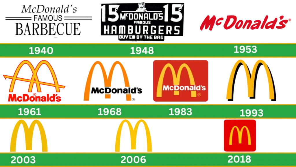
McDonald’s iconic golden arches feature is very interesting. McDonald’s is mostly known for its iconic logo rather than its mouth watering menu all over the world. In 1937, for the first time, Patrick McDonald launched the name “The AirDome.” This small drive-in restaurant opened in Monrovia, California.
It was the first restaurant in the family. Gradually, this restaurant reached its peak of success, and after 3 years, in 1940, his sons Maurice “Mac” and Richard “Dic” changed its name to McDonald’s Barbecue.
McDonald’s Logo Symbolism And Hidden Meaning
The golden arches of Mcd just don’t look like a pretty shiny picture, but McDonald’s icon represents the specialty of the logo. Iconic golden arches mean people are staying in a comfortable place. Where they spend time together and enjoy tasty moments after a blistering day of work. The meaning of McDonald’s symbol is the stability and strength of the brand. Another aim of this famous brand logo is to reinforce a smile and a happy and enjoyable dining experience.
Early Logo Before The Golden Arches
The Airdrome In 1937
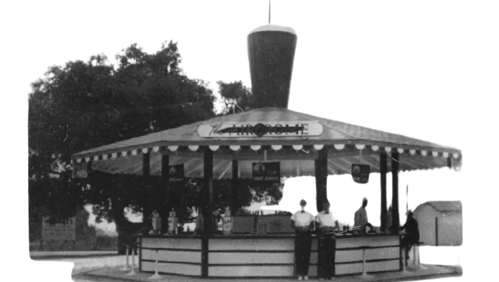
It was the first logo which was not more stylized. Simply designed, only capital letters were used and were not more colorful and attractive. Later on, it was converted into barbecue, famous in 1940.
McDonald’s Famous Barbecue (1940 – 1948)
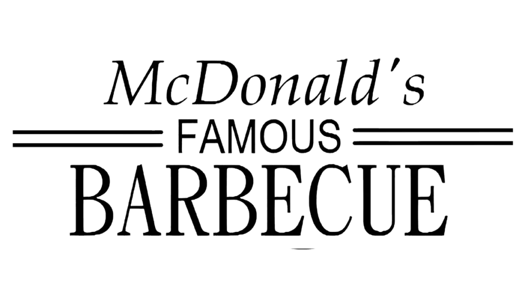
On May 15, 1940, the Mcdonald’s brothers introduced the McDonald’s famous barbecue original logo. As the name suggests, it serves barbecue items. This logo consists of three parts and executes all these words in different styles.
The upper word of Mcdonald’s is written in a fancy way, using serif font and italicizing the word. The second word Famous is in all capital letters using the font sans-serif. This word is placed in the middle, and two parallel lines are on the left side and 2 lines on the right side of the word.
The third word is barbecue, which represents the whole concept of the menu items. Barbecue, all the letters are capitalized and bold, large in size using a strict and solid serif font. This is located at the lower and main part of the logo.
McDonald’s Famous Hamburger Logo (1948-1953)
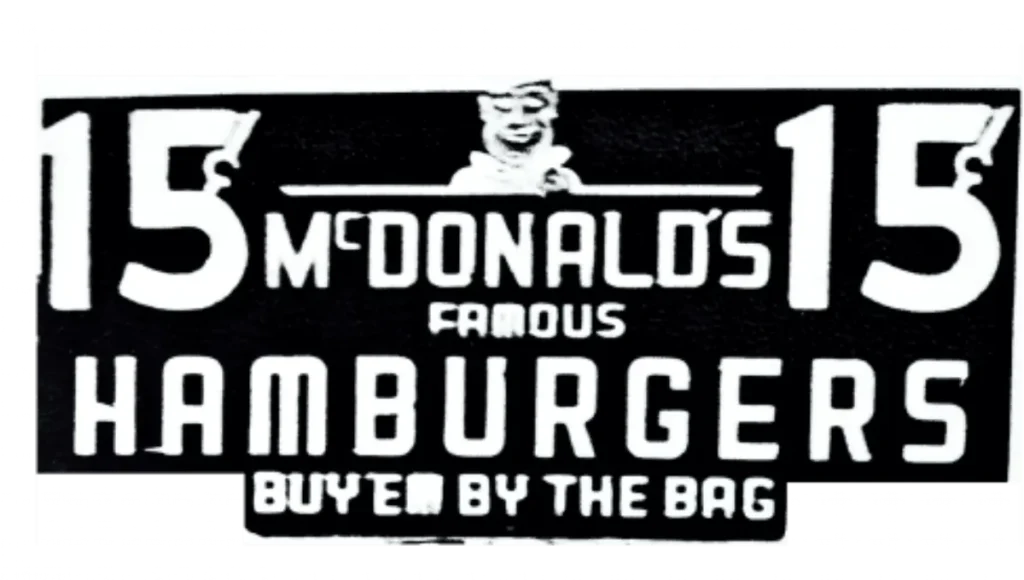
In 1948, Brother decided to level up the business. At that time, their hamburgers were known as a famous menu. So they decided to redesign it with the name Hamburger. This logo was written on the three words in white.
Black is used in the nameplate background. One chef image with a white background and a smiling face is placed at the top of the McDonald word. In this logo, the font is sans-serif. This logo was not long-lasting and lasted only for 5 years.
McDonald’s (1953)
Finally, it was the time when the company decided to change its name to McDonald’s. And the success story of the brand starts here. All the letters are filled with red, but we are away from the logo, which, we all know. All the letters of the logo are italicized and use a sans-serif typeface. This logo was attractive and simple, and it lasted 15 years with the company.
Enter The Gold Arches
In 1952, McDonald’s brothers decided to expand their business. They decide to open franchises in different locations. Brothers met with architects to design their logo. They want a simple arch.
The purpose of the arches is to draw attention to the restaurant, which attracts people to drive. Every McDonald’s branch after this opening has had the same double golden arch design for many years.
New Logo For New Era 1961-1968
In 1961, Stanley Meston and Richard McDonald (cofounders of McDonald’s) created the first emblem. The Golden Arches logo design inspired the architecture of the first version of the company restaurant.
Two arches cross each other, and the diagonal line concept comes through the arches of the first version. The emblem’s thin line is outlined with red colors. McDonald’s words are written in bold filled with red color and placed below the symbol.
Next Series of McDonald’s Logo 1968
This logo is simplified from the previous logo. In this logo, the diagonal line is removed, and the inner lines of these two arches are smaller. Which looks like an “M” shape.
Yellow color was used for the emblem, and black was used for the wordmark, which was placed inside the “M” slightly above the lower part. The typeface of the logo makes it more solid and visible. This logo is still in use on products and international restaurants.
McDonald’s Logo 1975
The new look of the logo describes the beauty of its visual identity. This logo is much brighter and more attractive, which grabs the attention of people. This logo was slightly changed from the previous one.
The golden emblem is located above the rectangle shape with red color and rounded corners. McDonald’s letters are colored white, which represents the friendlier and more welcoming.
This sign is more memorable, and the company still uses it. This logo, recognized readily in the world, brings a feeling of happiness, joy, and passion. simple but beautiful insignia is the identity of all the fast food legend logos.
McDonald’s Logo1992
After 17 years, the previous logo company again changed its logo. At this time, they removed the rectangle shape and redesigned it. A red shape like a trapezoid is under the golden arches, and the restaurant name in white is located inside it.
The black background is used around the shape, and some shades enhance the beauty of this logo. We often see various versions of this logo. Many signs were made to look like it and are still in use.
McDonald’s Logo1993
After one year, the logo was modified again. In this logo, there is no restaurant name used. Only the “M ” shape symbol without any letter or frame. Only minimalist emblems. First used in America and letter internationally.
At this time, there is no big change in the logo. Only shadows and 3D effects used. The company just changed its color to make it look modern, classic, and more trendy.
McDonald’s Logo (2023)
In the 2000s, they followed the same minimalist approach as in the 1900s and designed a new logo. Behind the golden arches, a shadow was used. And used a tagline with the pause of the symbol.
The first time its global computing was introduced was in 2003. The ‘ I’m lovin’ it’ campaign was developed by Heye and Partner, a German agency. McDonald’s launches from time to time slogans and taglines around the globe.
2006 Simple Arches
In 2006, a Flat yellow design was created. All the detail and text have been taken out to make the golden arches more streamlined. All the minimalist versions are widely used for domestic and international markets.
This cool and stylish look logo shows the company’s history makes people smile and reminds them of happy moments. This famous brand focuses on modernity and efficiency.
2018 Today
In 2018, the same yellow emblem stayed in the middle in a square shape with a red color and rounded corners. This logo shows the popularity of this fast food chain and proves people love it all around the world.
McDonald’s Logo 2024 Design Elements
In a hundred years of history, McDonald’s has changed its logo many times. The past logo looked very simple and different from what we see today. Over the last fifty years, the logo stayed quite similar and is still in use. So here we can see some important design elements that stayed the same.
Font
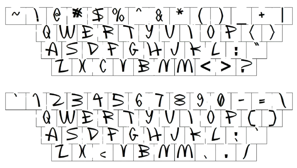
- Many people think the McDonalds logo is just one simple “M” symbol, but this is designed but not correct. The latest McDonalds logo was designed using sans serif font. It’s not a simple uppercase letter, but the lower letter “i” is hidden in it.
Color
- The McDonalds logo uses the color scheme of black and yellow/red. The background is typically red and golden arches are in yellow. The combination of yellow and red is used for colorful representation, and black is used for black and white visual context. The concept behind these color schemes is that red colors attract the brand and excite the appetite. yellow color is the symbol of happiness, good health, and being friendly. While Black color shows the brand’s authority, power, and confidence.
McDonalds Color Codes
| Color Name | Hex | RGB | CMYK | Pantone |
| Maximum Red | #d62718 | 214, 39, 24 | 0, 82, 89, 16 | PMS 187 C |
| Sunglow | #fdc92b | 227, 212, 173 | 0, 4, 20, 7 | PMS 116 C |
- Shapes: It’s clearly defined that McDonald’s has only one symbolic shape resembling “M.” This golden arched structure has a long, curved concept derived from the initial logo.
Mcdonald’s Logo Images and Formats
In the history of McDonald’s burger, different logos were designed with the use of technological advancements to make them trendy. With time, this brand has appeared in different formats.
Some modifications happened in color, size, and spacing between golden arches. Logo formats ranged from classic versions to stylized versions (png, jpg) but initially, these were not available in all these formats.
Hidden Story
The Golden Arches are more than just a design; they represent a welcoming gateway to the McDonald’s experience. According to some accounts, the arches were strategically placed to evoke a sense of invitation, making customers feel like they were walking into a friendly and familiar space. The design aimed to create a sense of comfort and trust, qualities that are essential in the fast-food industry.
Why is McDonald’s logo So effective?
- Simplicity: Golden arches are simple and easy to remember for all ages and all cultures and regions. These bold, recognizable logos are great examples of brand and design.
- Consistency: McDonald’s used the same logo for many years. This consistency makes it a more recognizable and more trustworthy brand.
- Associate with Brand value: Mcdonald’s is the leader of the global fast food company, and these golden arches have become synonymous with McDonald’s. The visual logo shows its qualities, speed, service, and reliability enhances its effectiveness and dominance its success.
- Cultural icon: McDonald’s has become a cultural icon. It has been seen in media like TV, movies, newspapers, and various ads. Because it’s seen so much. That’s why McDonalds does not spend more on advertising. Which helps keep the logo more popular and more effective.
Video
McDonalds Logo Facts You Didn’t Know
- Do you know McDonald’s is the one and largest fast food chain that buys tons of potatoes and large quantities of beef in the world?
- Golden Arch’s color ideas come from its golden menu items like fries and burgers.
- McDonald’s gets the credit for hiring the most employees on the planet. 1 in every 8 Americans is hired by McDonald’s. However McDonald’s is one of the world’s biggest employers.
- A true fact about Amazon founder Jeff Bezos is that he works at McDonald’s. According to globe-rich Jeff Bezos learned business ideas and grooming from Mcdonald’s when he was working there.
- McDonald’s also has the credit to distribute the toys for $ 1.5 billion annually.
- Another fact is that McDonald’s is the world’s largest retail property and generates approximately 82% of revenue from its rental franchisees.
- McDonald’s single-day income is $75 million while as KFC (Kentucky Fried Chicken) daily roughly revenue is $12. 6 million.
- The First Franchise owner is Ray Korc. After this, he opened many franchises in American cities.
- McDonald’s customizes its menu according to various countries religions and cultures. Which makes it unique in brand adaptability and local taste and culture.
- McDonald’s opened Hamburger University in Oak Brook, Illinois. It gives training about restaurant management and provides training on different food menus.
- To maintain the standard and value, McDonald’s hired those people who had the highest taste buds. They taste McDonald’s menu and are ready to serve. This is the reason you eat meals everywhere in the world; McDonald’s is found in equal taste.
- Queen Elizabeth opened a McDonald’s franchise near Buckingham Palace. These facts show the brand’s popularity all over the world.
- The world’s largest playplace record goes to McDonald’s. It has a 22-foot tall side for fun and gaming in Orlando, Florida, which means families have a good time when they visit.
- McDonald’s is not popular with everyone (especially in the USA), and the company has faced many legal battles over the years. Like blaming McDonald’s because its food causes fat in children.
- McDonald’s Secret Story Most historians agree that the American company White Castle, which sold hamburgers back in 1916, was the pioneer. McDonald’s followed their example and then went on to add fries, shakes, coffee, and Coca-Cola. Labeled fast food as it is prepared and served quickly.
- McDonald’s also has cute characters branding their main mascot Ronald McDonald is a favorite among kids, and even their baddies, the hamburger, are an entertaining distraction. Children love to host their birthday parties at McDonald’s.
- This is a great way for the company to market its brand by including meal deals showcasing mascots, introducing fun McDonald’s activities, and offering free merchandise. To party gores. Despite their incredible stronghold in the fast food market, McDonald’s is not popular with everyone (especially in the US), and for good reason.
- The company has faced many legal battles over the years. McDonalds logo is more recognizable around the world than the Holy Cross symbol for Christianity, which stands out when you are driving by the golden arches that are mind-blowing.
Conclusion
The McDonalds logo with its yellow golden arches is more than just a fast food sign. It shows the company’s journey from a small drive-in to the biggest fast food chain in the world. Over time, the logo has changed, but it always represents McDonald’s as a place you can trust for good, reliable food. The golden arches are known everywhere, making them a strong symbol of McDonald’s success.
