
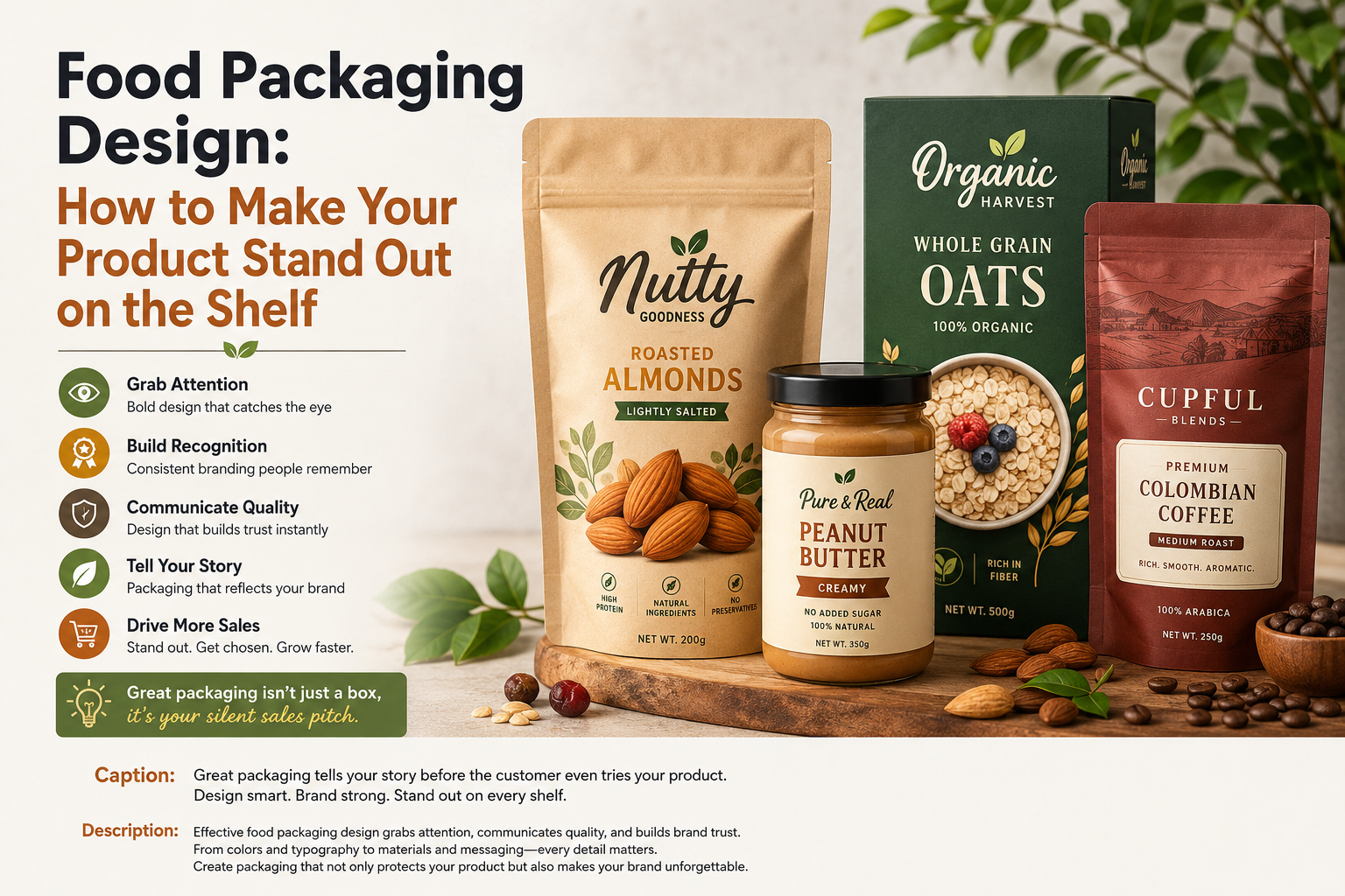
When customers walk through a grocery store, they may see hundreds of food products competing for attention. Before they read the ingredients or compare prices, they usually notice the packaging first.
That makes food packaging design much more than a way to protect a product. Good packaging communicates what your brand is, who the product is for, and why someone should pick it up.
For food businesses, especially new and growing brands, thoughtful packaging can help create recognition, communicate quality, and make a product easier to remember.
In this guide, we’ll explore the key elements of effective food packaging design and how you can create packaging that looks professional, attractive, and consistent with your brand.
What Is Food Packaging Design?
Food packaging design is the process of creating the visual and physical presentation of a food product.
It includes elements such as:
- Logo placement
- Colors
- Typography
- Product photography
- Illustrations
- Packaging shape
- Product information
- Brand messaging
- Materials and finishes
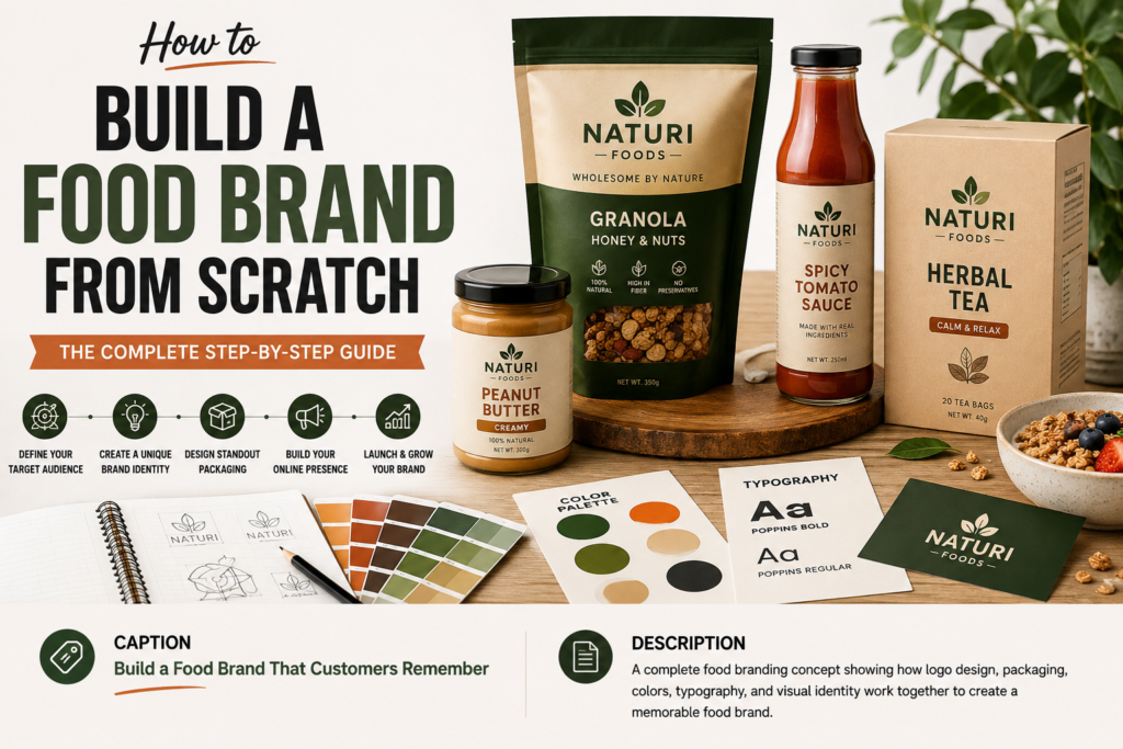
A strong package combines these elements into one recognizable visual identity.
Your packaging should not simply look attractive. It should help customers understand what the product is and what makes your brand different.
Why Food Packaging Design Matters
Imagine two similar products sitting next to each other on a store shelf.
One has a confusing label, too many colors, and several competing fonts. The other has a clear logo, attractive imagery, readable information, and a consistent color palette.
Even before tasting either product, the second package may feel more trustworthy and professional.
Effective packaging can help your food brand:
- Attract attention
- Build brand recognition
- Communicate product quality
- Make products easier to identify
- Create a consistent brand experience
- Stand out from competitors
- Support premium positioning
Packaging is often one of the most visible parts of a food brand, so it should work together with your logo and overall brand identity.
1. Start With Your Brand Identity
Before designing the package, define the personality of your food brand.
Ask yourself:
- Is the brand premium or affordable?
- Is it traditional or modern?
- Is it playful or sophisticated?
- Is the product natural, indulgent, healthy, or convenient?
- Who is the target customer?
Your answers should influence the entire packaging design.
For example, a premium chocolate brand might use elegant typography, restrained colors, and sophisticated photography.
A children’s snack brand could use brighter colors, playful illustrations, and friendly typography.
The important thing is consistency.
Your packaging should look like it belongs to the same brand as your website, logo, social media, and marketing materials.
2. Make Your Logo Easy to Recognize
Your logo is one of the most important elements of your food packaging.
Customers should be able to quickly identify the brand without searching around the package.
Place the logo where it can be seen clearly, but don’t allow it to compete with the product name or other important information.
A good food logo should also work at different sizes.
A logo that looks impressive on a large website banner may become difficult to recognize when printed on a small package.
This is why food brands should test their logo in different sizes and formats before finalizing the packaging.
3. Choose a Strong Color Palette
Color can have a major impact on how customers perceive a food product.
Different colors can communicate different qualities.
For example:
- Green can suggest freshness, nature, or natural ingredients.
- Red can create energy and visual impact.
- Yellow can feel cheerful and approachable.
- Black can communicate sophistication or premium positioning.
- Blue can suggest trust, freshness, or cleanliness.
- Orange can feel energetic, warm, and friendly.
However, using a color simply because it looks attractive is not enough.
Your colors should support your brand personality and help customers recognize your products.
A consistent color system also makes it easier to create multiple products under the same brand.
4. Use Typography That Customers Can Read
Typography should look good, but readability should come first.
Customers should be able to quickly identify:
- Brand name
- Product name
- Flavor
- Important product information
Avoid filling the package with too many different fonts.
A simple combination of one primary typeface and one supporting font is often enough.
Your typography should also match your brand personality.
A traditional food brand might benefit from classic serif typography, while a modern snack brand may work better with a clean sans-serif typeface.
5. Make the Product Name Clear
One of the biggest mistakes in food packaging is making the product difficult to understand.
Customers should not have to study the package to figure out what they are buying.
The product name should have a clear visual hierarchy.
For example:
Brand Name
Organic Almond Butter
Creamy • No Added Sugar
This structure immediately tells the customer what the product is.
Creative design is useful, but clarity should never be sacrificed for decoration.
6. Use Food Photography Carefully
High-quality food photography can make packaging much more appealing.
A good photograph can communicate taste, texture, freshness, and serving suggestions.
However, photography should support the product rather than overwhelm the design.
If the package contains too many images, patterns, icons, and text elements, the customer may not know where to look.
Choose one strong visual direction and build the design around it.
For some brands, professional photography works best.
For others, illustrations or simple graphic elements may create a stronger identity.
7. Create a Clear Visual Hierarchy
Not every element on your package should have the same visual importance.
A customer should naturally notice the most important information first.
A useful hierarchy might look like this:
1. Brand
2. Product
3. Main benefit or flavor
4. Supporting information
5. Details and required information
This makes the package easier to scan.
Think about the product from a distance. If a customer sees it from several feet away, can they immediately understand what it is?
If not, the design may need simplification.
8. Design for the Shelf, Not Just the Screen
A packaging design can look beautiful on a computer screen and still fail in a real store.
That’s because physical shelves introduce challenges that don’t appear in a design file.
Your product may be surrounded by dozens of competing packages.
It may be viewed from different angles and distances.
The lighting may also change how colors and text appear.
Before approving your final design, create realistic mockups and ask:
- Does the logo remain visible?
- Is the product name readable?
- Does the package stand out?
- Does it look like part of a recognizable brand family?
- Does it still work when placed beside competitors?
Testing the design in context can reveal problems that are difficult to see on a blank artboard.
9. Keep Different Products Consistent
If your brand sells multiple products, don’t design every package as if it belongs to a different company.
Instead, establish a consistent system.
You can change:
- Flavor colors
- Product names
- Product images
- Small graphic elements
while keeping important brand elements consistent.
For example, every product could use the same logo position, typography system, and overall layout.
This helps customers recognize your brand as they move through different products.
10. Don’t Overload the Package
More information doesn’t always make packaging better.
Too many:
- Fonts
- Colors
- Images
- Icons
- Badges
- Claims
- Decorative elements
can make a package feel crowded.
Good packaging design often comes down to knowing what to remove.
If an element doesn’t help communicate the product or strengthen the brand, consider whether it really needs to be there.
A clean design can often feel more professional and easier to understand.
11. Consider Packaging Materials
The visual design is only one part of food packaging.
The physical material can also influence how customers perceive the product.
Depending on the product, packaging may include:
- Glass jars
- Plastic containers
- Paper boxes
- Pouches
- Cans
- Bottles
- Flexible bags
Material selection should consider the product, durability, transportation, storage, customer expectations, and applicable food-packaging requirements.
A premium product may benefit from a high-quality finish, while a brand focused on convenience may prioritize lightweight and practical packaging.
12. Make the Packaging Match Your Brand Story
Strong food brands usually have something meaningful behind their visual identity.
Maybe the company focuses on:
- Family recipes
- Local ingredients
- Sustainability
- Traditional preparation
- Health-conscious products
- Premium ingredients
- Convenience
Your packaging can help communicate that story.
For example, a food brand built around traditional recipes might use heritage-inspired typography or illustrations.
A modern health-food company might choose a cleaner visual system with simple typography and natural imagery.
The goal is to make the design feel connected to the brand rather than randomly decorated.
Common Food Packaging Design Mistakes
Even attractive packaging can have problems.
Here are some common mistakes to avoid.
Using Too Many Fonts
Multiple typefaces can make the design feel inconsistent and difficult to read.
Making the Logo Too Small
If customers cannot easily recognize your logo, you’re losing an important branding opportunity.
Poor Contrast
Light text on a light background may look attractive in a design file but become difficult to read in real life.
Copying Competitors
Your packaging should help customers understand why your product is different.
Copying another brand’s visual identity can make your product look generic.
Ignoring Mobile and Digital Use
Customers may discover your product online before seeing it in a store.
Your packaging should still look recognizable in product photos, social media posts, and online stores.
Designing Without Testing
Always test the design at actual or realistic packaging sizes before production.
How to Make Food Packaging Look More Premium
A premium appearance doesn’t necessarily require an expensive design.
Focus on:
- Strong typography
- Consistent spacing
- Limited colors
- High-quality imagery
- Clear hierarchy
- Professional logo placement
- Appropriate materials
- Simple visual elements
Sometimes removing unnecessary design elements can make a package look more sophisticated.
Premium branding is often about control and consistency rather than adding more decoration.
A Simple Food Packaging Design Process
If you’re creating packaging for a new food product, follow this basic process.
Step 1: Define the Brand
Understand your audience, positioning, personality, and product.
Step 2: Create the Visual Identity
Establish your logo, colors, typography, and supporting graphics.
Step 3: Research the Competition
Study competing products to understand the category and identify opportunities to differentiate.
Step 4: Build the Packaging Concept
Create several design directions instead of immediately committing to the first idea.
Step 5: Test the Design
View the package at different sizes and alongside competing products.
Step 6: Refine the Details
Improve spacing, typography, colors, imagery, and information hierarchy.
Step 7: Prepare the Final Files
Make sure the artwork is correctly prepared for the chosen packaging method and printer.
Final Thoughts
Great food packaging design does more than make a product look attractive.
It helps customers recognize your brand, understand your product, and remember it after they leave the store.
The strongest packaging combines a memorable logo, purposeful colors, readable typography, clear messaging, and a consistent visual identity.
Whether you’re launching your first food product or redesigning an existing package, start with the brand rather than the decoration.
When every design decision has a purpose, your packaging can become one of the strongest tools for building a food brand people remember.
Frequently Asked Questions
What makes good food packaging design?
Good food packaging is clear, recognizable, visually appealing, and consistent with the brand. It should communicate the product quickly while standing out from competing products.
What colors are best for food packaging?
There is no single best color. The right choice depends on your brand, product, audience, and positioning. Colors should support the personality and message of the food brand.
Should a food package always include the logo?
Yes, the logo is an important part of brand recognition. It should be clearly visible without taking attention away from the product name and essential information.
How can small food businesses create better packaging?
Small businesses should focus on a strong logo, limited color palette, readable typography, clear product messaging, and consistent branding rather than trying to include too many design elements.
Why is packaging important for food brands?
Packaging can attract attention, communicate quality, build recognition, and differentiate a product from competitors. It also creates an important physical connection between customers and the brand.