Minute Maid Logo Symbol, History, PNG, Slogan And Tagline, Brand

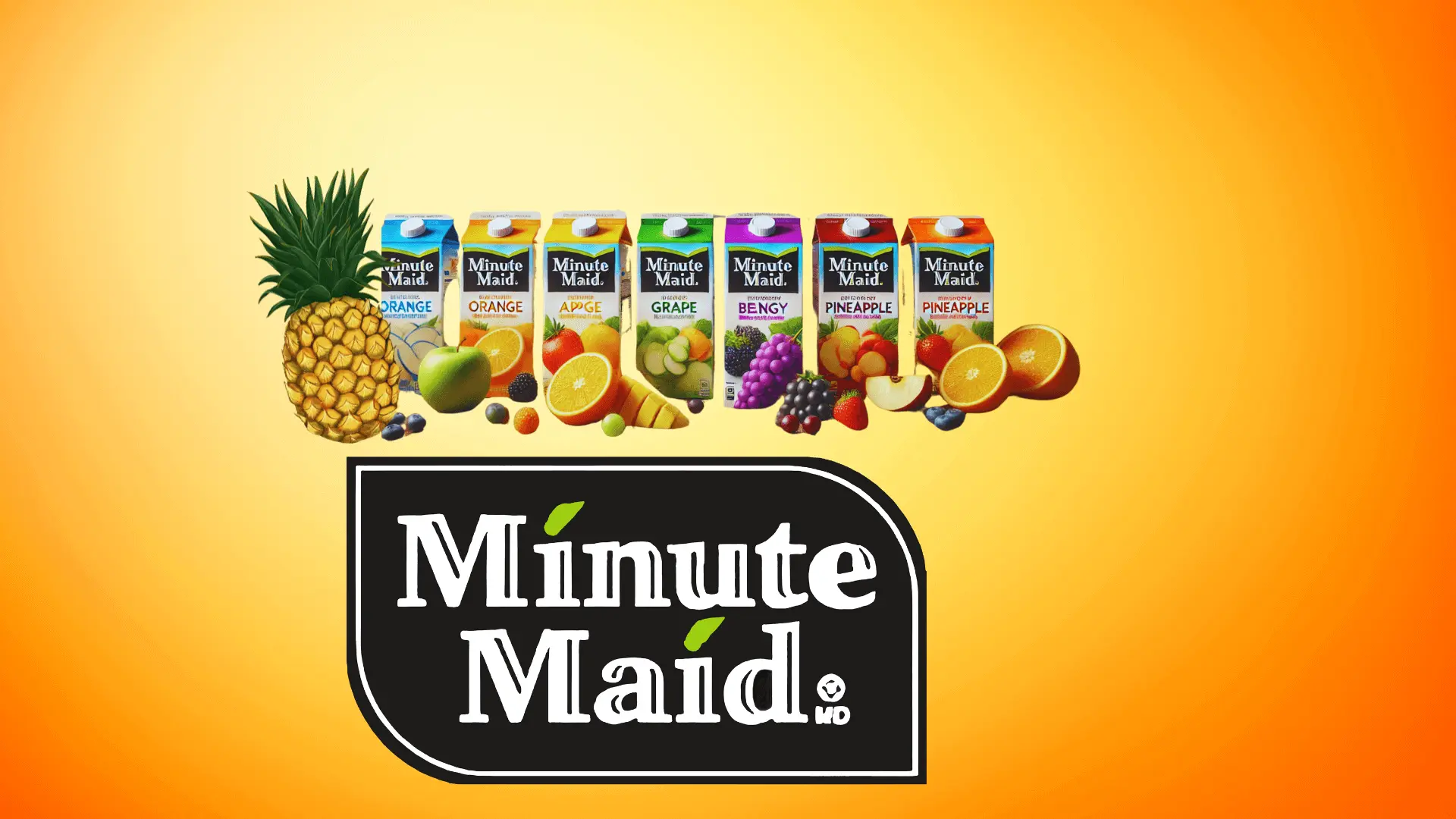
The Minute Maid logo is like a closed box with multiple juices. Minute Maid is an American leading brand in the juice and beverage industry. It was created in 1945 and owned by the famous cold drink company Coca-Cola. Minute Maid follows the same marketing and brand strategy as another Coca-Cola product Fanta. The brand distributes its frozen juices all over the world with unique names in each country.
In the current history the lable produces many kinds of soft drinks and lemonades. Let’s have a look at the details of Minute Maid old and new logo meaning, history, evolution, Font, color, shape, slogan, tagline and some interesting facts step by step.
Meaning And History
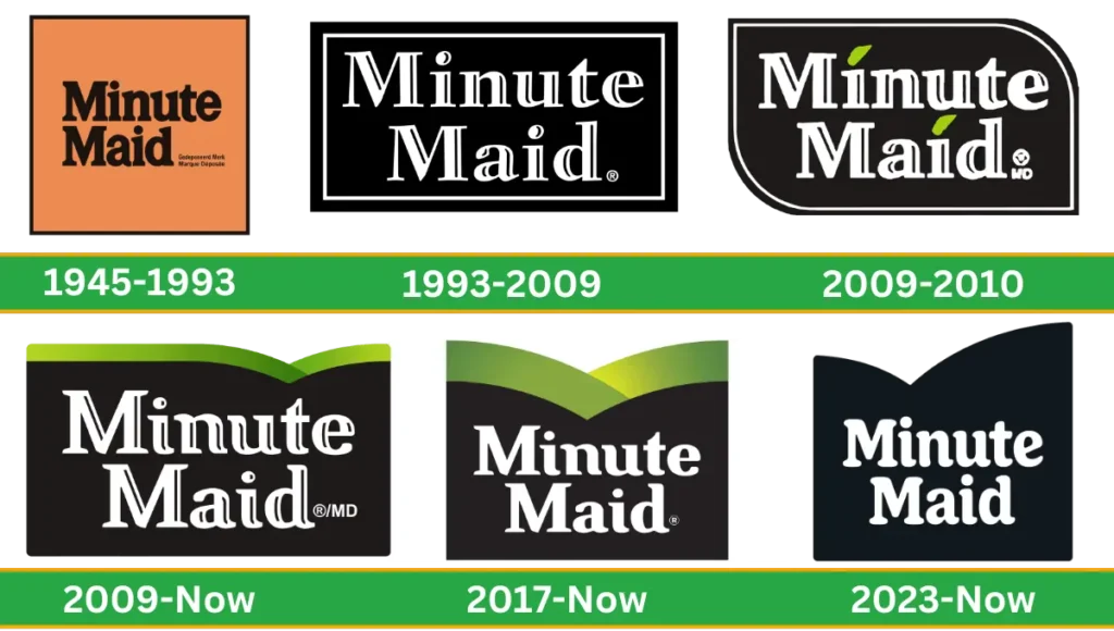
Minute Maid visual identity has revolved around the text-based with almost the same color palette throughout the brand’s history. However the very first logo was different and featured a unique design from the others.
1945-1993
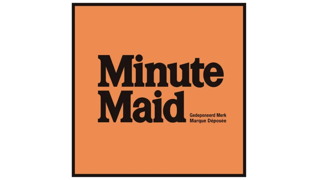
The original Minute Maid logo was like a square shape with a black color palette border which makes the logo image more attractive and looks pretty. The words of Minute Maid are written in black above the brown square.
The bold font generic serif-type brand name is divided into two lines and aligned on the left side. To the right of the second word, “Maid” letters “Gedeponeerd Merk” and “Marque Déposée” are located.
1993-2009
In 1993 the logo was made in simple design. The lettering was better aligned inside the shape. Black rectangle highlighted with a white border. To make the design more cheerful, the company used the font serif type and used black and white contracts to enhance the volume of the letters. Right side, on the second word of “Maid,” the trademark symbol “R” is placed.
2009-2010
In 2009, the shape of the logo and lettering were altered. Instead of a black rectangle, the creators of the logo draw the dynamic drop-like shape with two opposite rounded corners. Above both “i’s” green leaves make the version more stylish and point out the product ingredients: orange juice and lemonade.
2009-Present
Another experiment with the shape made the design fresher and more natural. Above the “i” round dot was added, and removed the white border frame. The smooth wave green layer over the wordmark makes the design stylish and symbolizes a softer and elegant rounded tail.
It represents the connection to the botanical theme. This logo remains in use both in the United Kingdom and the United States. Duffy & Partners collaborated with CMA Brand Presence to create the logo.
2017- Present
Taxi Studio developed this visual identity with the help of the Coca-Cola design department. Overall, the design was taken from the previous batches and slightly modified. At this time, the top green stripes are wider than the previous white and black logo combination used.
2023-2024

At this time the logo was totally made of a simpler Minute Maid green image included since 2009. So again, the company decided to switch back to the black-and-white color palette in 2023. The curve shape on the left side is larger and prominent than the right side. The base shape and inscription were similar, but the Font was changed.
Logo Design Elements
Fonts
The Font of the Minute Maid logo is a geometric sans serif with rounded lettering with clean lines, and traditional styles are used.
Color
White, black and green colors have been used over the years in all versions.
Minute Maid Color Code
| Color Name | Hex Color | RGB | CMYK | Pantone |
| Raisin Black | #231f20 | 35, 31, 32 | 0, 11, 9, 86 | PMS Neutral Black C |
| June Bud | #bfd741 | 191, 215, 65 | 11, 0, 70, 16 | PMS 380 C |
| Apple Green | #9ebb37 | 158, 187, 55 | 16, 0, 71, 27 | PMS 376 C |
| Olive Drab | #73962a | 115, 150, 42 | 23, 0, 72, 41 | PMS 370 C |
| Sap Green | #527e23 | 82, 126, 35 | 35, 0, 72, 51 | PMS 363 C |
Logo Format
Minute Maid logo is available in various formats like PNG, transparent, vector, jpg, svg for different purposes.
Minute Maid Slogan And Tagline
Minute Maid first slogan was introduced in 1946, which emphasized the frozen concentrated orange juice “quick and easy way to enjoy fresh-tasting orange juice year-round.” The very popular slogan of Minute Maid is “Put Good In. Get Good Out.” The new slogan is “Filled With Life.”
Minute Maid Facts
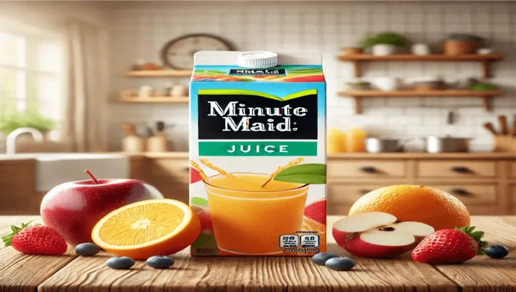
Did you know the Coca-Cola brand Minute Maid has more than 100 flavors and a variety of juices, lemonades, and fruit punches?
Singer Bing Crosby helped to get national recognition and promote the Minute Maid in their morning show at 10:15 a.m.
It may be surprising to know you Minute Maid Park won three major awards. Good Brick Award in 2000, Green Building Initiative’s Recognition and the American Institute of Architects Award.
Conclusion
In the Coca-Cola brand logos, Minute Maid juice is a valuable and prominent product. It evolved its logo design over the years, drawing inspiration from fresh juice and citrus logo designs.
The brand’s natural logo design reflects its commitment to offering fresh, high-quality beverages, with a focus on soft drink packaging that emphasizes both function and visual appeal.
Through innovative minute-maid marketing and branding, the company continues to create beverage logos that resonate with consumers, reinforcing its identity as a leader in the industry. The logo evolution of Minute Maid is a prime example of how soft drink logos can evolve to communicate a brand’s message of freshness.
