Subway Logo Symbol, Meaning, History, Evolution, Slogan, Story, Png, Brand
Subway logo is an iconic symbol and, like the McDonald’s logo became successful in the world due to its quick convenience and customized fresh sandwiches. No matter how the logo has changed over time, its defining feature has consistently been the arrows on the ends of the letters “S” and “Y.”
Meaning And History
Subway is the world famous and biggest fast food brand. Located at 44000 locations in more than 110 countries. It has multiple meanings, but in Mandarin Chinese, the meaning is “taste better than others.” The journey of the subway began in 1965 as a small sub shop.
The original version of the Subway was made in the same year. Let’s start with complete details about the first and last old and new subway logos, symbol meaning, history, evolution, slogan, tagline and facts step by step.
1965-1968
The very first banner of the brand consists of two parts. The first part of the emblem was light blue, and the second part of the inscription was written in red above the white background.
The left part word “Pete’s” is larger with a traditional bold sans-serif typeface. While the second part of the word “Super Submarines,” is written in thin red lines with all the capitalized letters.
1968-1970
In 1968 the logo was just in black color instead of colorful. The logo creator made the second part of the inscription into “SUBS” shorter and written into bold caps lock. At the first word, “Petes,” asterisk and a single quotation mark between the letters “e” and “s.” Black logo shows the brand’s growth and confidence in the market.
1970-1972
in the 1970s version was changed. The wordmark is drawn into two parts; the first word, “Petes,” is at the top of the second word, “SUBWAY.” The logo color was black, and I made it stylish with the combination of white in the second word on the right part.
In this composition, two arrows are used. The second part, “SUbWAY” starts and ends with an arrow, which means to represent different subway locations worldwide.
1972-1973
Company again renamed the brand with a new stylized yellow color logo. The inscription was designed with a modern sans-serif typeface with elongated tails of “S” and “Y.” All the visual identity of the subway is based on this version. Word petes were removed from this logo.
1973-2002
In 1969 the lines of the logo in the new version were thick and created using the color palette white and yellow. The brand name is divided into two parts: white and yellow. The new inscription was horizontally placed above the black solid banner with rounded corners.
2002-2016
In 2002, the company made additions to the logo using more color palette. Wordmark was composed in bold and uppercase italicized sans-serif. White and yellow emblems are executed without a solid black background, but below the letters, thin green outlines are used. There is no additional space between the letters.
2015-2016
In 2015, a version of the brand was created with a simple italicized sans-serif font following the old logo. At this time, logo designs with only single green color lines are thinner and have some space between the lettering of the symbol. This green logo represents the bright smooth image and sense of eco friendly.
2016 – Today
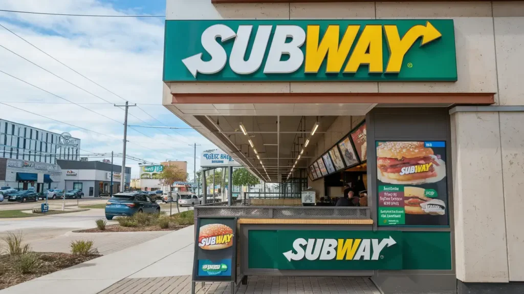
In 2016 subway design was modernized than all previous emblems. The inscription was a bold and rounded sans-serif typeface with half part in yellow and half right part drawn in green. Massive and sharp arrows represent the brand’s strength and progressiveness in the brand design. The same logo will still be in use from 2016 to 2024.
Logo Design Element
Subway Font

All the Subway fonts emphasize the sans-serif typeface. “Y,” “S,” and “W” are key features in the wordmark. Sharp angled version existed from 2002-2017. Fast food logos play a key role in brand identity. The Subway logo features green and yellow, symbolizing freshness, just like the bold KFC logo and Burger King logo, each with unique branding elements that appeal to customers worldwide
Subway Color
Subway colors include yellow, green and white in the emblem. These emphasize the healthier meal options, making them ideal for health-conscious individuals.
Logo Formats
Subway green and yellow logo is available in various formats like PNG, jpg, pdf, vector, svg and transparent for different company purposes.
Subway Slogan And Tagline
Several logos of Subway were redesigned and became iconic over the years. The very first and old slogan is “Eat Fresh.” Subway’s famous slogan is “Five Dollar Footlong,” and the new slogan is “Eat Fresh Refresh”.
Subway Facts
It’s surprising to know you subway subway sandwiches are more popular and serve 5300 sandwiches every minute.
This largest brand has 8 million menu options and food slightly differs in calories from the Mcdonalds.
Subway started as a very young boy at the age of 17 and on the first day sold 12 subs.
Subway is the largest fast-food chain globally, with more locations than McDonald’s. More than 410,000 people are working there.
Subway Story
Subway story started in 1965. A teenage boy named Fred Deluca gets advice on how to pay his college fees from the family friend Dr.Peter Buck, who was a professional nuclear physicist. Then he decided to open the submarine sandwich shop and Dr.Buck invested $1000 for this business as a partnership.
Their freshly customized sandwich became famous, and in 1964, they opened 16 new shops in Connecticut and expanded their business through franchises. To grow the brand, they follow only three principles.
Exceptional guest service, high-quality original subway menu options at great value, and constant improvement in their menus. Now, Subway supports 20,000 franchisees spread across the world, offering outstanding guest services.
Video
Conclusion
Fast food logos play a key role in brand identity. Subway logo image is not just a design. It represents the brand’s value and commitment to the product’s freshness. The arrow symbol represents its movement, and reflecting vibrant color shows health and energy. The logo captures the exact aim of a subway to deliver quick, customized and healthy fresh meals. Evolution into the elements over the years has made it more recognizable worldwide.