TurboTax Logo
TurboTax is a digital tax preparation program originally developed by the SoftView company. Launched in 1993 in the United States, the software quickly became a dominant force in the tax software industry. Today, TurboTax remains one of the most widely used tax filing solutions, offering versions compatible with major operating systems and providing comprehensive support for both individual and business tax returns.
Meaning and history
This tax preparation software was created by Michael Chipman and is currently owned by Intuit. During the 1980s, Chipman worked for Chipsoft, where he developed the TurboTax program to simplify income tax filing. In 1993, Intuit acquired Chipsoft, securing full ownership of the TurboTax application. Over the decades, TurboTax evolved from a small California-based software project into a leading tax software brand recognized nationwide.
What is TurboTax?
TurboTax is a highly respected provider of tax preparation software designed to streamline the tax filing process. Its solutions serve individuals, freelancers, and businesses by guiding users through federal and state tax return preparation. Featuring an intuitive interface and step-by-step instructions, TurboTax helps ensure compliance, reduce filing errors, and maximize potential tax refunds. Its combination of reliability, automation, and expert-backed tools has made it a preferred online tax filing platform.
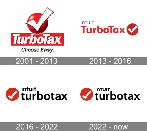
2001 – 2013
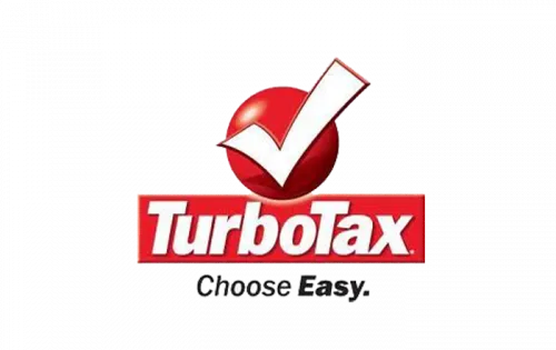
The 2001 TurboTax logo introduced a strong and recognizable identity. It displayed a horizontally extended red rectangular banner with a bold white wordmark placed across it. Above the banner sat a three-dimensional red circle containing an enlarged white checkmark. Beneath the banner, a slightly angled black tagline reading “Choose Easy” appeared, styled with varying letter thickness to create a dynamic and approachable look.
2013 – 2016
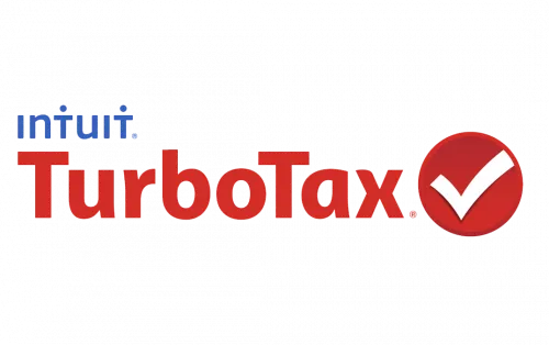
In 2013, the TurboTax logo underwent a modern transformation. The updated design adopted a clean red, white, and blue color scheme and shifted toward a flat, contemporary aesthetic. The wordmark appeared in red, written in a smooth sans-serif typeface with title case lettering. A solid red circle with a white checkmark was positioned to the right of the name, while a subtle blue “Intuit” inscription in lowercase was placed above the left side of the logotype, reinforcing brand ownership.
2016 – 2022

Between 2016 and 2022, the TurboTax logo maintained a minimal yet powerful visual identity. It clearly reflected the software’s primary purpose efficient and professional income tax preparation.
The logo consisted of a clean wordmark paired with a circular emblem positioned on its right. This emblem also functioned as the brand’s standalone icon and was frequently used independently across digital platforms.
The lowercase lettering was crafted in a classic bold sans-serif typeface with smooth edges. This typography conveyed authority, dependability, and innovation, positioning TurboTax as both stable and forward-thinking within the competitive tax software market.
The emblem featured a vibrant red circle marked by a white checkmark. This symbol represented accuracy, success, and the completion of tax returns with confidence. The bold red tone expressed energy and determination, highlighting the brand’s commitment to simplifying complex financial processes.
Overall, the TurboTax logo during this period was concise yet informative. It communicated clarity, speed, and expertise — assuring users that their tax filing needs would be handled correctly and efficiently.
The traditional red, white, and blue palette symbolized trust, professionalism, and adaptability. It reinforced the company’s progressive approach and its ability to evolve alongside constantly changing tax regulations and financial systems.
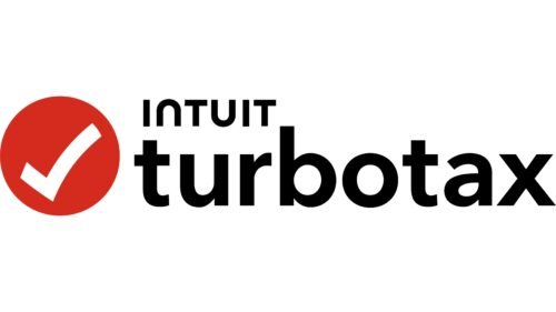
2022 – Today
In 2022, a subtle refinement was introduced to the TurboTax logo. The primary structure and visual elements remained consistent, but changes were made to the “Intuit” lettering following a broader brand update. The typography became more rounded, and the dots above certain letters were removed for a smoother appearance. This slight adjustment created a friendlier and more flexible visual identity, aligning both Intuit and TurboTax with modern digital branding trends while maintaining their established authority in tax preparation software.