Taco Bell Logo, Meaning, History, PNG, Slogan, Brand And Hidden Detail

Curious to know The famous Taco Bell logo history and evolution which is the fourth largest fast food chain according to the country’s top 500 chain restaurant report performed by “Technomic”. With its bold, vibrant color and unique bell shape, the logo has become a match with the flavorful “Mexican” inspired food and fun.
Meaning And History
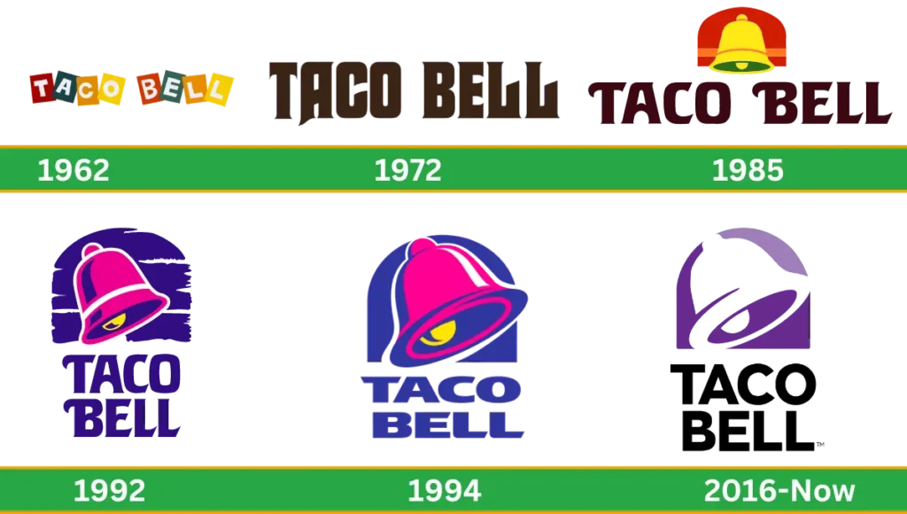
Taco Bell has two meanings: Taco refers to the Mexican dish central to the restaurant’s menu, and Bell represents the founder’s last name, Glen Bell. So, Taco Bell means to represent the place where you can enjoy the Tacos and honor the person who started the business. Let’s journey towards the old logo to the new, black and white Taco Bell log history original to the current one step by step detail.
Taco Bell Logo Evolution
Taco Bell was the first restaurant introduced in 1962 by Glen Bell in California (USA). Originally called Bell’s Drive, the brand underwent several name changes before settling on Taco Bell in 1964. The 90s logo featured a simple, stylized bell with a creative curve, which has continued as a core element of the design.
1962-1972
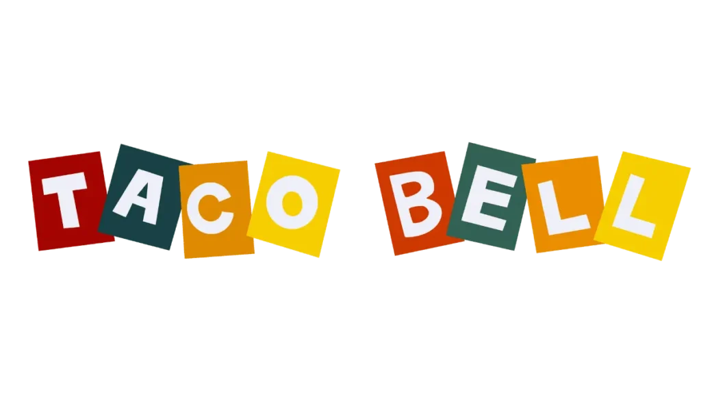
From the 60s logo of vintage was simple, bright and colorful. Word marks consist of eight different colored blocks written in white sans-serif. Uppercase spelling ‘TACO BELL’ blocks join with each other and slightly overlap, representing a bounce effect, a type of Mexican folk art.
1972-1985
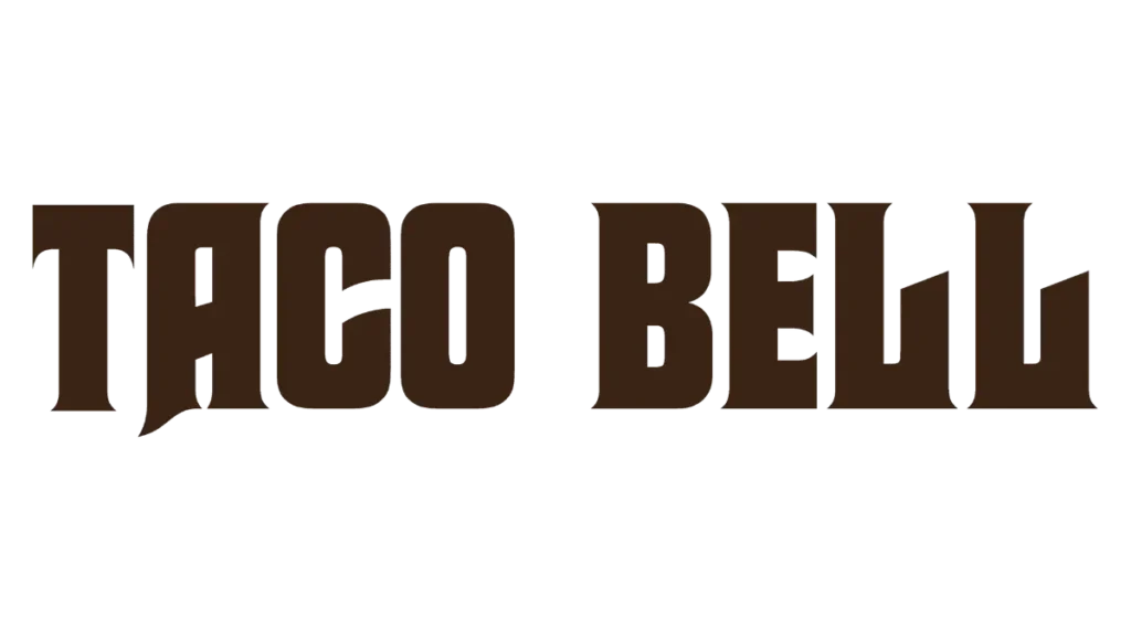
From 1972 to 1985, the logo was completely changed to create a new style to the wordmark The Graphic identity was bold capital words, diagonal cuts and small yet sharp serif colors edited to enhance the composition.
1985-1994
In 1985, the word mark “TACO BELL” in bold capitalized and brown letters were used in a stylish writing style. On the top of the word mark, a bell appeared in red, yellow and green colour
1992- 1994
This year, the logo was redesigned with different color patterns. The pink bell was settled on a purple background with a white outline. The secondary word mark is the same as the primary version, only the color changes from brown to purple and is placed text into two stages under the bell icon.
1994 – 2016
In 1994, word mark brought a change written in the form of an extended, bold sans-serif font in dark blue color with integrity cut letters used in the logo. The bell icon is also placed on the top of the wordmark in contrast to blue, pink and yellow colors.
2016

In 2016, the logo was again changed. The bell is placed in white on the purple background, and Taco Bell is written down in black colour under the bell into two levels. The typeface was neat and bold with traditional sans-serif. A combination of the Taco logo, black and white, was used in 2016.
2016 to 2024 Current
From 2016 to 2024, the logo was same. The old logo was still in use with slight changes in their elements, .
Design element
The drawing of the Taco Bell is a simple and bright iconic design that effectively conveys the brand identity.
Taco Bell Font
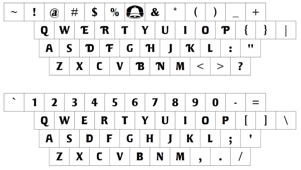
In the text of the word Taco Bell, a bold, sans-serif font is used to create a solid and memorable sight.
Color
Red and yellow colors are used to represent energy, excitement and warmth; they are connected with Mexican culture and cuisine.
Shape
Taco Bell creates the central bell shape to represent the interest and reinforce the brand’s identity. The iconic bell shape’s bold typography and simplicity helped to establish the Taco Bell business as a leading fast food emblem.
Logo Formats
Taco Bell Png, vector, svg, jpg, pdf and transparents formats are used for different purposes.
Hidden Message
The bell logo has a bright history and hidden meaning and message behind its design element. The iconic bell represents a Spanish mission. The purple and orange color of the brand shows its energy, excitement, creativity, playfulness, which also represents its transmitting and friendly servicing.
Taco Bell Slogan And Tagline
Like other fast food brands, McDonald’s, KFC and Sonic Taco Bell Slogans changed with the passage of time and introduce new slogan in their advertisement. ”The Fresh Food Place” is its first Slogan, while “Live Mass” and “Think Outside the Bun” are Taco Bell old and most famous Slogans.
Taco Bell Story
Let’s look at the Taco Bell story from small to grown, the biggest fast food chain globally. The Taco Bell founder Glen Bell opened his first taco Tia in 1954 and sold tacos for only 19 cents. In 1962, he decided to open the first Taco Bell in California, and the business grew quickly.
By 1967, Taco Bell had spread to 100 locations, and now it has 7000 branches worldwide. Taco Bell is famous for its classic tacos, Crunchchwrap, burritos, and nacho fries.
Taco Bell Facts
- In 1962, the first logo of this brand was introduced as a hot dog.
- The iconic bell shape is placed in the logo to abolish the restaurant’s fan-favorite, unique and secret menu and at the taco bell restaurant.
- Taco Bell launched the sports and youth education foundation program in Irvin, California. Taco Bell has a museum for fun for people.
- As for food, it’s popular with the collaboration of Frito-Lay. This icon was promoted in the ads of the series.
- The first Taco Bell emblem exterior in the United States in Canada.
- KFC Taco Bell and Pizza Hut are the products of the Yum! Brands that are global fast food corporations.
- Did you know Taco Bell participated in the Demolition Man movie in 1993? The logo is the modified version of the original brand’s logo. Taco Bell’s Symbol was more minimalist and fit the movie setting.
Conclusion
The iconic picture of the Taco Bell has a powerful role in the brand’s success in the food chain restaurants. The iconic Taco image is a familiar sight to millions worldwide, with the bounding of the team member’s energy, excitement and creativity of the service for the customers of Taco Bell.

