Visual Identity Of The Starbucks Logo: Meaning, History, Evolution, And Hidden Details
Hi, coffee lovers. Are you ready to know the famous coffeehouse chain Starbucks logo that is instantly recognizable in the world? The Starbucks mermaid is known as the Starbucks siren logo.
The Starbucks girl logo inside in the green circle with two tails and a ring with the company name around it is amazing. In this article, I will explain the Starbucks logo, meaning, the history, evolution, first, old, original and new, the Starbucks mermaid’s hidden story and some secrets.
It is one of the biggest coffee makers and retailers in the world. The world’s most famous coffeehouse was founded in 19971 in Seattle. Globally, it has 30k stores in 80 different countries. Starbucks sold 14 million cups of coffee per day.
In Starbucks’ success, one of the most important parts is its branding; its name, product, and logo become most popular when people think about coffee. Only one name arises in people’s minds, and that is Starbucks.
Evolution Of The Starbucks Logo
The starbucks meme logo and their packaging really look unique and cool. As we all know, logos play a crucial role in company success. The company took this into consideration and designed eye-catching logos that grab people’s attention and make it memorable. Starbucks’ new logo is a more minimalist design compared to all old logos.
This logo is very helpful for sharing on websites, designed on coffee cups and t-shirts. It is also easy and assists in sharing their messages and other promotions. Interestingly, Peet’s Coffee played a crucial role in Starbucks’ early days, influencing their logo aesthetics and coffee selection
Meaning And History
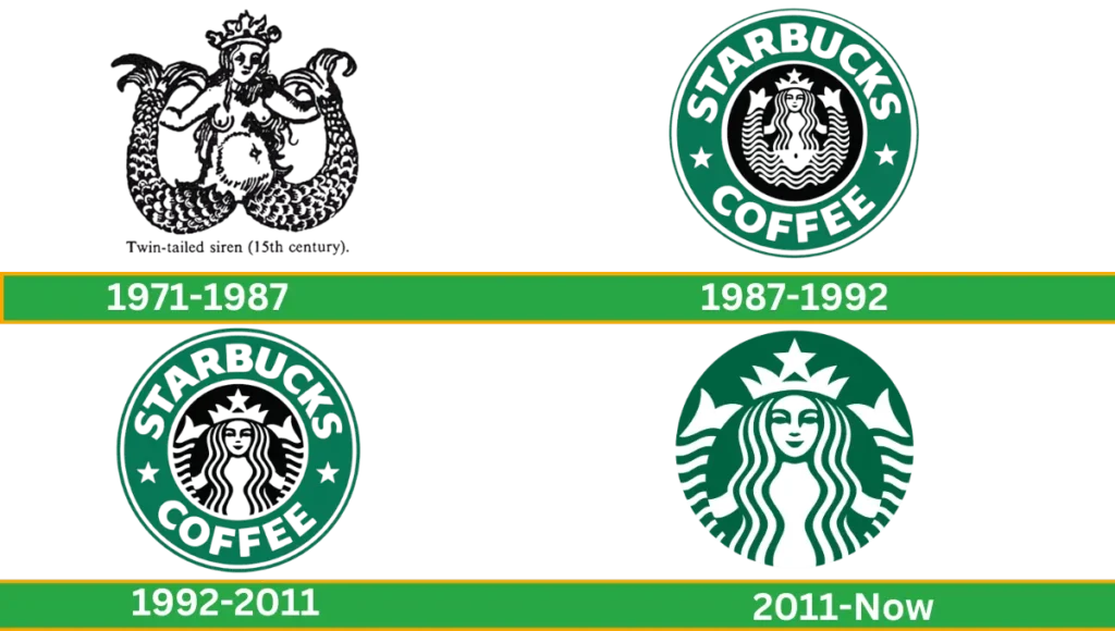
The hidden meaning of the Starbucks logo is quite interesting. It shows a twin long tail mermaid which is called a siren. Some interpretations of its siren are seducing and attracting customers for delicious Starbucks coffee. Let’s have a look at the Starbucks logo history step by step.
1971-1987
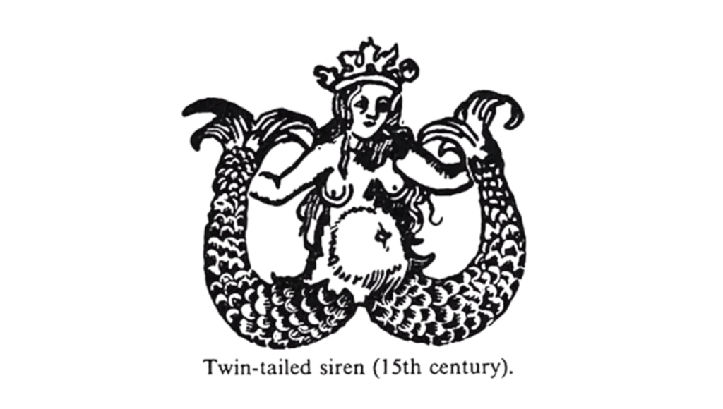
The first and original Starbucks logo was introduced in 1971. The logo is designed with a hot siren without clothes and a torso clearly visible with two tails holding both hands. This design was not as modern as the new version because wooden carvings inspired the idea of this design.
Siren was encircled, and the company name made the ring around it with the name of Starbucks coffee tea spices written in white and black colour. The colour of the initial logo used black and white (later on changed to coffee brown).
Simple and modern sans serif typeface used. The concept of designing this was for the Starbucks logo girl to seduce coffee lovers and let customers know about their product.
1987-1992
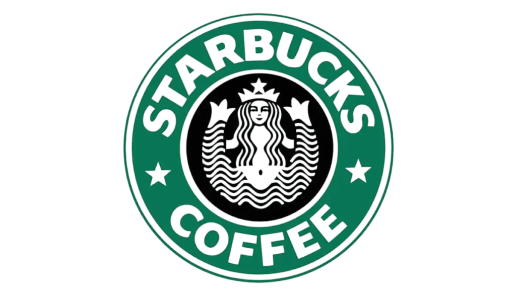
In 1987, the company refined and slightly modernized its logo. This badge came with some additions. The image around the siren was green with a white wordmark.
The lettering was simple and bold. Instead of three words, only two were complete company names like “Starbucks and coffee” at the rounded green frame of the siren.
The mermaid or siren of the image covered a bare body with flowing hair from the left and right sides. With a wordmark encircled, two dots are replaced with two five-pointed white colour stars.
The overall design was clean and more prominent. The navel of the mermaid and fishtail was clearly visible. The concept behind the logo is to introduce it in green colour to represent Starbucks’s growth, freshness, prosperity and uniqueness.
1992- 2011
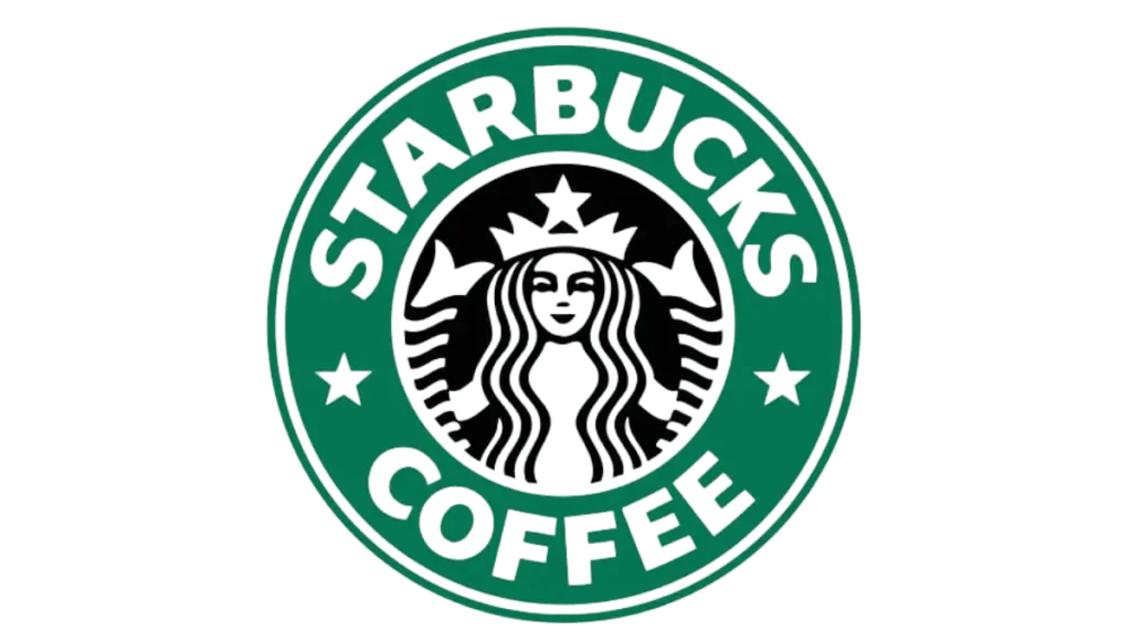
In 1992, the siren was enlarged and visible at the end of the mermaid’s curly tails. This logo mostly focuses on the sirens’ enlargement; the viewer can clearly see zoom-in sirens from far clearly.
The typeface was slightly modernized, and the lettering was wider, huge and more massive. The concept behind this logo is to make it cleaner, make it stand out more, and become more focused.
2008
At the 40 anniversary, the company decided to look back at their first original logo. Starbucks logo 1971 updated with some stylish twist. But this modified logo failed.
Their customers did not like this change because people loved their green signature simple logo, which was very popular publicly. So customers did not agree to accept the new modified logo because they loved the green logo.
2011

In 2011 the logo was redesigned again and made it brighter and cleaner compared to all previous versions. The white siren image is located on a solid green background.
No framing, stars or wordmarks are used around it. The contouring was similar to before, but the new colour combination makes it more attractive instead of a black siren.
In the new coffee logo, inside the siren is the main target. Her facelifted, and her hair and eyes were redesigned. The idea behind this logo is to make it more appealing and connect with more audiences through a new design approach.
Design Elements Of The Logo
Font
Starbucks logo fonts are used in all the versions. The priority of the font was sans serif. But in the new and latest logo the company name is not used.
Symbol Colors And code
Over the years, black, white, coffee brown and green colours have been used in various badges. The current logo colour is green and white. Green represents its wealth, healing and nature, while white shows its simplicity and cleanness.
| Color | Description | Hex Code |
| Main Color | 3425C | #00704A |
| Black | Supplementary Color | #000000 |
| White | Supplementary Color | #FFFFFF |
Shape
As we see, all Starbucks logos are created with circular shapes. It is most common in graphic design. This means logo appearance is simple, neat and easy to remember.
Format
For online and offline, companies use various formats of the Starbucks logo: PNG, Vector, PDF, JPG, SVG and transparent.
Facts Of Starbucks Logo You Did Not Know.
- Many coffee brands have unique identities. For example, Costa Coffee is well known in the UK for its handcrafted coffee, while Peet’s Coffee has a deep-rooted history in California, influencing Starbucks’ early days.
- Many people do not know the facts about the world’s biggest coffee company, Starbucks, logo.
- Starbucks uses a round shaped table to make the people less lonely. These tables occupied less space, looked more friendly and fit more people than square ones.
- Have you ever wondered why Starbucks coffee masters wear black aprons? They wear black aprons because they are coffee experts and know all the things about coffee. For any assistance, you can call them. The original Starbucks logo became more controversial because the siren was shown with a bare torso, and the nipple was visible.
- Did you know you can make 87000 drink combinations in Starbucks due to its customizable option and hidden secret menu? Its secret menu does not include its regular menus.
- Starbucks contributes to the hunger relief program and distributes its 100% old food among the hungry people.
- In 2008 Starbucks CEO said in an interview the company gives more priority to their employees and spends over $300 million on health care.
- Everyone in the world loves to drink Starbucks coffee. But did you know the CIA headquarters in Langley, Virginia, has its own Starbucks coffee store?
Video
The Hidden Story Of The Starbucks Logo
Starbucks’s story started in 1971 in Seattle’s Pike Place Market, at the beginning when Starbucks opened its first store and offered coffee beans and spices. The name was inspired by the “Moby-Dick,” which reflects the seafaring coffee trade.
After ten years, a young man, Howard Schultz from New York, fell in love with Starbucks coffee. Then, he joined the company in 1982 and went on a trip to Milan in 1983 where he was inspired by the Italy coffeehouses.
He returned in 1987 and helped to turn Starbucks into a coffeehouse. Starbucks quickly became famous and expanded into various cities like Vancouver, California, Chicago, Washington, New York and D.C.
By 1996 the first store opened in Japan and in China in the year of 1999. Over the last 20 years, Starbucks gradually expanded globally and served millions of customers every week. The mission behind Starbucks is to make a strong connection among the people through coffee conversation.
In making the best and perfect cup of coffee, many people are involved, like farmers, master roasters and baristas. Starbucks is committed to High-quality coffee and service. Honouring their tradition with new coffee experiences.
Conclusion
Twin-tailed mermaid symbolizes the brand’s connection to the sea and its rich coffee heritage. Over the years, the logo has a more minimalist design and maintains its modern identity and recognizable emblem. Its clean design represents Starbucks’s commitment to quality and service.
