Popeyes Logo

For more than four decades, the restaurant brand born in New Orleans has been carving out its place as a powerhouse in the fried chicken industry. What began as a local ambition has transformed into a global phenomenon. Today, the chain employs nearly 60,000 people across multiple continents. This remarkable rise can be credited to several strategic moves, including its instantly recognizable logo and strong brand identity.
Meaning and history

Popeyes is widely recognized as one of the fastest-expanding quick-service restaurant brands in the United States. The company originally launched in Louisiana in 1972 under the name “Chicken on the Run.” Its founder, Al Copeland, aimed to rival KFC, but the initial concept struggled and shut down within months.
Undeterred, Copeland reopened just days later with a revamped recipe and a bold new name: Popeyes Mighty Good Chicken. This relaunch proved successful, and by 1976 the brand had begun expanding through franchising, laying the groundwork for nationwide recognition.
Today, the chain ranks second in total sales among chicken-focused restaurant brands, trailing only KFC, which has maintained the top position for years.
The company now operates as a subsidiary of Restaurant Brands International. With more than 3,800 locations across the United States, Puerto Rico, and over 30 international markets, most outlets are franchise-owned. Notably, a few locations have even earned Michelin recognition—an uncommon achievement within the fast-food sector.
Its menu highlights include the iconic Chicken Sandwich, responsible for roughly 40% of total revenue, alongside spicy chicken, crispy shrimp, and regionally inspired dishes. The brand relies on proprietary spice blends and exclusive recipes crafted by its in-house culinary experts, reinforcing its distinctive flavor profile.
What is Popeyes?
Popeyes is an American fast-food chicken restaurant chain established in 1972 in New Orleans. Its authentic Louisiana-inspired cuisine has helped it grow into one of the world’s largest quick-service brands, with nearly 3,900 restaurants operating in 30 countries. Several locations have even achieved Michelin-star status, setting the company apart within the competitive fried chicken market.
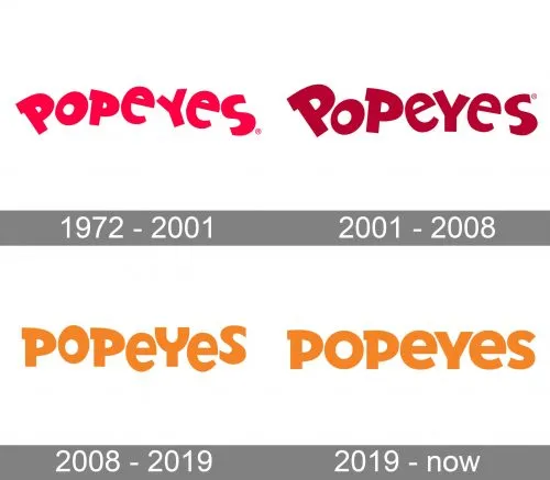
1972 – 2001

The logo journey of Popeyes began in 1972, the same year Alvin C. Copeland opened his first restaurant. Initially named “Chicken on the Run,” the business soon adopted a new title inspired by Jimmy “Popeye” Doyle, the central character from The French Connection.
Interestingly, unlike many brand names, “Popeyes” does not include an apostrophe. Copeland humorously claimed he couldn’t afford one when launching the business.
The earliest emblem featured a stylized house illustration with “Popeyes” written in white beneath a red roof. The phrase “Famous Fried Chicken & Biscuits” was also incorporated. The palette combined red, white, orange, and yellow, establishing a warm and energetic tone.
Soon after, the company introduced its well-known “dancing letters” wordmark. The name appeared in bold red lettering with blue outlines, paired with “Chicken & Biscuits” in blue on a yellow ribbon. This playful, colorful design reflected the lively personality of the brand.
2001 – 2008

In 2001, the company refined its visual identity while maintaining its recognizable structure. The typography was subtly polished, and the color shifted from bright pinkish tones to a deeper burgundy red. This darker shade added sophistication and gave the logo a more established, professional appearance.
2008 – 2019

The 2008 rebranding marked a comprehensive transformation for the chicken chain. Beyond updating the logo, the company refreshed its menu and modernized its overall image to resonate with younger audiences.
A key element of the campaign was highlighting its Louisiana roots. The design firm Pentagram, particularly its Austin office, spearheaded the development of a new brand identity. The outdated blue-and-red visuals were replaced with a more cohesive and contemporary look.
That same year, the company officially adopted the extended name “Popeyes Louisiana Kitchen, Inc.,” reinforcing its cultural heritage and culinary origins.
2019 – Today

Currently, the brand utilizes three primary logo variations:
- The horizontal “dancing letters” Popeyes wordmark (main version);
- The horizontal Popeyes Louisiana Kitchen logo featuring fleur-de-lis symbols;
- The circular Popeyes Louisiana Kitchen seal containing fleur-de-lis icons and the signature dancing “P.”
The fleur-de-lis elements symbolize New Orleans, serving as a tribute to the brand’s birthplace. Whether displayed on storefront signage or packaging, each Popeyes vector logo delivers strong visual impact.
Font
To preserve its friendly and approachable feel, the 2008 redesign retained the signature “dancing letters” typography. While the typeface was updated to appear cleaner and more balanced, the playful essence remained intact. The refined letterforms express youthfulness while maintaining brand consistency.
Colors

The dominant hues red, orange, and white echo the restaurant interiors and packaging design. These warm tones also subtly reference the bold spices and seasonings that define the Popeyes menu.
The vibrant color scheme reinforces optimism, energy, and appetite appeal. It enhances brand visibility and supports recognition across global markets.
Notably, in 2011, the refreshed Popeyes logo was listed among the 15 most successful brand redesigns of recent years.
Beyond its visual branding, the company continues to attract customers through strategic promotions. Discount campaigns, digital coupons, and special Pay Day deals play a significant role in sustaining consumer engagement and driving consistent sales growth.
