Pepsi Logo (Soft Drink) Meaning, Symbol, Evolution And History| All Years
Hi, Thirsty Buddies! Do you want to know the Pepsi Logo’s hidden Meaning, facts, slogan, symbols, or some hidden secrets? Let’s start a journey towards a global, refreshing world together. Well, get ready to cover its interesting story, various logo evolution, history shape, colors, font format, and much more.
Pepsi Logo
One of the most famous beverage competitors of Coca-Cola is Pepsi, which has an iconic logo. Its logo is made with a combination of white, red, and dark blue and has a spherical shape. The color idea for the old Pepsi logo came from the American flag. To grow more in the world, Pepsi changed its logo over time. Let’s have a look at how Pepsi Company changed its logo and history through the years.
Meaning and History
Pepsi Logo Meaning
According to PepsiCo, the hidden meaning of the logo is the globe, and the wave of the letter “e” represents refreshing taste and smiles and conveys a sense of happiness and enjoyment. But the designers reported it is now connected to things like the theory of relativity, feng shui, the Earth’s magnetic field, and more than that.
Evolution
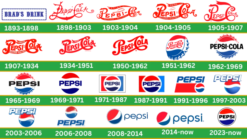
Pepsi Company changed its design over the years based on its original logo. To make their logo unique and modern compared to the original logo. These modifications help Pepsi to stand out from its competitors and still stay up to date to make it trendy and maintain its classic feel.
History Bradshaw (1893-1898)
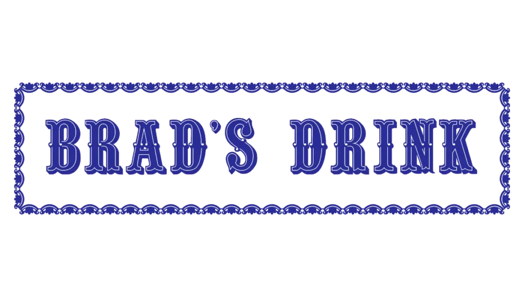
This logo was introduced by an American businessman. His name was Caleb Bradham, and he owned a pharmacy in North Carolina. Pepsi production used two main ingredients enzymes (helpful in digestion) and cola nuts.
In the logo, serif lettering was made in blue color. All the letters were in Captical in smooth curves. This era’s logo had a white background and rectangular frame to enhance its beauty.
1898-1903
The name of this soda was changed to Pepsi Cola, which represents its ingredients. The look of the brand was changed with the new brand identity. Red coloring wordmarks and long curved lines make this logo a favorite beverage for everyone. Lettering on the upward shows its motion and energy. This iconic logo is a beloved drink around the whole world.
1903-1904
This logo remained for a very short time, and that soon changed within a few months. The lettering color of this logo is red, with wishbone detail hidden in its characters, and elongated lines turn it into thick ribbons. The concept of this logo in the Pepsi history is to inform more people of the brand type, taste, and impact on health.
1904-1905
In 1904, the logo was redefined, and each character used in the Pepsi logotype was countered. This logo was neat and clean, with bold letters close to each other. The redesigned logo was enlarged in size as compared to the previous one. The logo color remained the same red.
1905-1907

This year, the logo was again redesigned to try to beat the main competitor, coca cola. The new logo was made to keep the competitor’s logo in mind. Bold script lettering is used in red. To connect C and P, use the long tail curved line. The double loop pattern represents the underlying structure of the whole logo.
1907-1934
The previous idea of the logo from 1904 came back in 1907 with some changes. To be more confident, elements are made clean, contoured, and bold. The letters were thicker and written in red colors which looked more strong and powerful.
1934-1951
In this logo, the inscription was refined, and the Thin letter of drink was written above the Tail of “C.” This logo looks more confident than the earlier versions. The concept of this diagonally logo was moving forward and representing brand progress.
1950-1962
This logo has a more professional and modern design. Bold and neat make the logo attractive. All the extra lines and inscriptions were removed. A combination of red and white colors was used. Companies like this logo were again used in 2014. Today, we can see this logo on the back of the drink.
1951-1962
The idea of the next-generation logo came in 1951. This logo looks like a metal bottle with red, white, and blue colors. A red wordmark with a white background is located on the cap.
1962-1969

In this era, the Pepsi Company wanted to simplify and modernize its logo design. This logo was redesigned to follow the previous 1950s logo. The tricolored cap was turned straight. Red and blue cursive is designed on the outer side of the cap.
The lettering was made bold and written in uppercase with an inscription in Black sans-serif. The size of the wordmark was large, and it did not fit on the cap. This logo design has been used for over seven years.
1965 – 1969

The previous tricolor cap design maintained and continued the brand’s visual identity in 1965. Slightly modified version this year. Only black bold “Pepsi” lettering was used, and cola was removed from the last version. On the white background, a sans serif typeface was used and changed to “S” in this logo.
1969 -1971

To follow the previous badge, this logo was again redesigned in 1969. At this time, try to make it simple and modernized, with a reduction in the lettering. The Pepsi globe counter was cleaned and made with a “Pepsi” inscription in a deep blue color. Red, white, and deep blue are the only three colors used to design it. Letter countering was refined, thinner, and slightly outer from the batch of the 1960s.
1971-1987
To make the logo more versatile and continue the visual identity of the company, we designed this colorful logo in 1971. The white frame rectangle circle was designed with a thick white outline.
The rectangle on the left side attached to the circle was in red, and the right side was in blue color. Copy the bottle cap pattern from the previous logo and place a wordmark in bold blue with a white background.
1987-1991
This time, the logo frame was removed, and the lettering was in big size with trademark addition. For the first time, the trademark was used in the logo, which means the company was legally protected. This changed the typeface to look smoother and seeker. The letter “E” corner was rounded instead of sharpened.
1991-1996
In 1991, the logo was completely changed. A wordmark with the trademark was placed above the circle. Below the inscription and on the left side of the circle, a rectangle was made of red.
A circle was designed on the right side of the rectangle, followed by red and blue colors. A thick, white curve in the middle divides the circle into two parts.
1996-2003
In 1996, an additional logo was designed with a blue background beneath the inscription to make the design more attractive and create a geometric pattern. In this logo, a white color wordmark is designed with a bold sans serif typeface.
Capital letters Italicize to make it more stylish and use a thin blue outline shadow. The inscription was located at the tricolor sphere-type circle. This logo points out a globe and indicates the brand’s popularity.
2003-2006
In 2003, the wordmark was located at the emblem in dynamic shape. The logo was made with gradient colors to make it look more shiny and classy. The company continued this logo for only three years; however, It is still in use in some countries around the world.
2006-2008
In 2006, a logo wordmark was placed below the emblem. The inscription was drawn in blue color and had a white outline. Space is used between the emblem and the wordmark. The water drop texture makes it real and illustrates the drink.
2008-2014
The logo was completely changed, and a new logo for Pepsi came in 2008. This logo was designed by the Arnell Group for more than $ 1 million. The concept behind this new shape was to make it more simple and digitally increase its visibility. The inscription “Pepsi” was drawn in lowercase letters by Gerard Huerta.
The wavy “e” reflects the famous Pepsi brand. This iconic globe is drawn with white and blue lines around it. People did not like this design more, but Pepsi believed in their rebranding and making a fun and energetic brand for youngsters.
2014-2023
One of the most minimalist ideal designs in company history. In this version, the line was removed around the globe. To make it look glassy, a solid emblem is placed on the left side.
It represents Pepsi brand elements smoothly and clearly. Letters are still in lowercase, and “e” is still in wavy shape. Sans serif typeface used this historical look, making it more iconic.
Pepsi Logo 2023
At the Pepsi 125 anniversary, the company did not make anything new. This logo was designed on the base of 1987. Around the emblem, a black outline is used, with an inscription written in black color on the white background in the middle of the globe.
The letters are slanted and don’t have serifs. The logo looked fantastic and blended perfectly. It combines brand history with modern design.
New Pepsi Logo 2024
Pepsi soft drink did not change the logo this year globally, still using the old logo and maintaining their visual identity.
Logo Desing Elements
Color
Pepsi uses three colors to represent the feelings, qualities, and values the company wants to convey to consumers. The dark royal blue symbolizes “coolness,” the light blue shade of Pepsi Max represents “coolness and freshness,” and the gold color symbolizes “balance and energy.”
Shape
This more recognized iconic brand has a sphere-like shape.
Fonts

The font used by Pepsi is a custom-made italicized Roman type called Pepsi Light. But if you want a related Pepsi font, you must try the Harry Plain font.
Format
Pepsi uses different file formats like SVG, JPEG, PNG, EPS, AI, and PDF. The logo presence of all these formats allows digital and print media to be used for different purposes.
Pepsi Slogan
Pepsi has tasty drinks and cool slogans over the years, like its logo. They made a list of Pepsi slogans that say what Pepsi is. The purpose of the new and old slogans is to make the brand more famous and liked around the world. The new Pepsi slogan is “That’s What I Like.”
Story Behind Pepsi Logo
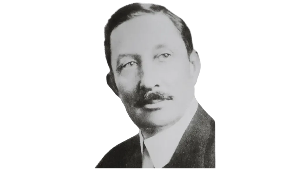
Let’s reveal the hidden story of Pepsi, which started with a small drugstore and went to how Pepsi became the number 2 biggest beverage company in the world.
On May 27, 1867, Caleb Bradham was born in Duplin County, North Carolina (state of America). He got admission to the University of Maryland and became a pharmacist. Caleb opened his drug store in a place where there were more people.
He prepared a delicious drink in 1893, and its name was “Brad’s Drink.” Ingredients in this beverage were water, sugar, caramel, lemon oil, nutmeg, cola nuts and a few others. After 5 years, in 1898, Bradham renamed it Pepsi Cola. He believed that, along with freshness, this drink was helpful with “dyspepsia.”
The real story of this brand starts here. At the end of 1902, he saw the growing popularity of Pepsi and founded it. By 1904, up to 20k gallons of Pepsi had been sold. In 1906, Pepsi had six franchises, and in 1907, the number increased to 40.
There were 240 large branches of Pepsi in 24 states in America. And ten thousand gallons of Pepsi were being sold every year. Pepsi is one of the few companies in the United States that prefers motor vehicles for supply instead of horse-drawn carriages.
During World War I, the price of sugar increased dramatically. He bought a lot of sugar, but unfortunately, his plan failed. In 1923, the company went bankrupt, and after 8 years, Pepsi cola bought The Loft Candy Company.
After a period of Caleb Bradham failure and bankruptcy, the company again got back on its feet. He died at the age of 58 years. Pepsi is ranked 21st among America’s 500 largest companies. Pepsico annual revenue is $ 86.4 billion and it has 267,000 employees.
Video
Pepsi Logo Hidden Message
Do you know the secret message of the Pepsi logo? Some people find it from the logo. When the wordmark was turned down, it read “isded” and sounded like it was dead. This discovery sparked many internet memes and YouTube videos on it.
Pepsi Fun Facts
- Pepsi competitors used 6 ounce bottles for nickels, while Pepsi used 12 Ounce bottles with the same price. This makes twice the profit to remind them that their prices were best when they used catchy jingles.
- In the 1970s, polyethylene terephthalate bottles were made for the first time by Nathaniel Wyeth. Credit goes to Pepsi, who used two liter bottles for the first time in the world, and in 1976, Pepsi sold their soft drink in a bigger bottle.
- Did you know that in 1932, Pepsi hired pilot Andy Stinis to skywrite in different cities in the United States? Over the 10 years, 14 skywriters worked with Pepsi, and in 1940, they wrote approximately 2225 messages across America for Pepsi Cola.
- In 1965, Pepsi partnered with Frito-Lay Company (Makes lays, Kurkure, Uncle Chips, and Cheetos), and their collective name became PepsiCo.
- Pepsi is not only famous for beverages; it also created its own game with the name Pepsi Man for the first time.
- Like Coca-Cola, Pepsi’s formula is kept secret to only a few people in the company.
Conclusion
This article concludes about; Pepsi logo. Logos are a very essential element of any brand’s history. If you want to create a logo for your business and get an idea, you must explore articles to see iconic brands like Pepsi and how to maintain their brand availability throughout the year. Get ideas and generate your logo from a free site or any. If you like this post, tell me which Pepsi emblem you like and why.

