Mountain Dew Logo Meaning, PNG, Evolution, Slogan, Story, Facts And History | All Years
Mountain Dew beverage brand is the product of PepsiCo introduced in 1940. This soft drink was invented in Knoxville, Tennessee, and its headquarters is in the United States.
Meaning and History
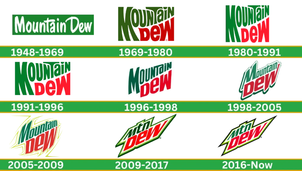
Mountain Dew is not just like TV ads or posters, even though it has some meaning and proper history over the years. The hidden concept of its logo is to encourage people to face their fears and accomplish the challenges. That’s why its logo design is bold, sharp and robust, representing a solid personality. Let’s talk about old and new, original to the latest Mountain Dew logo history step by step.
Mountain Dew Logo Evolution
This bold, energetic brand logo has a playful, cartoonish design, thin, sharp fonts, brightened colour and an edgy look today. Mountain Dew’s brand evolution highlights this brand image as full of adventurers.
Mountain Dew Logo History
1948 – 1969
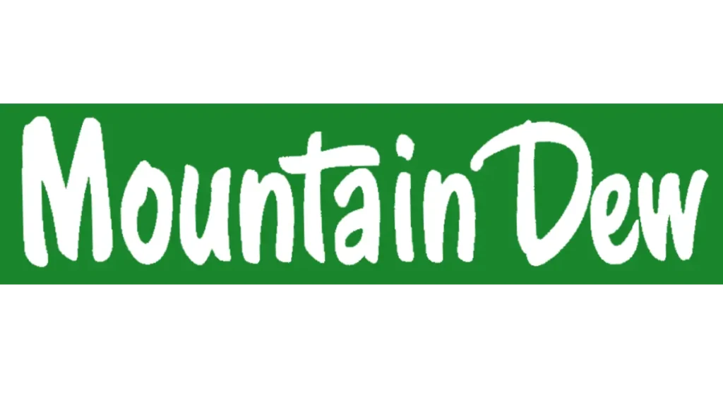
Mountain Dew’s visual identity is simple text-based with two colors: white and green. The first logo was created in 1948 by the Ming family in Virginia and the company used it for over twenty years. A white wordmark was placed above the green rectangular-type background. Clean and smooth lettering was narrowed and handwritten in a sans-serif typeface.
1969 – 1980
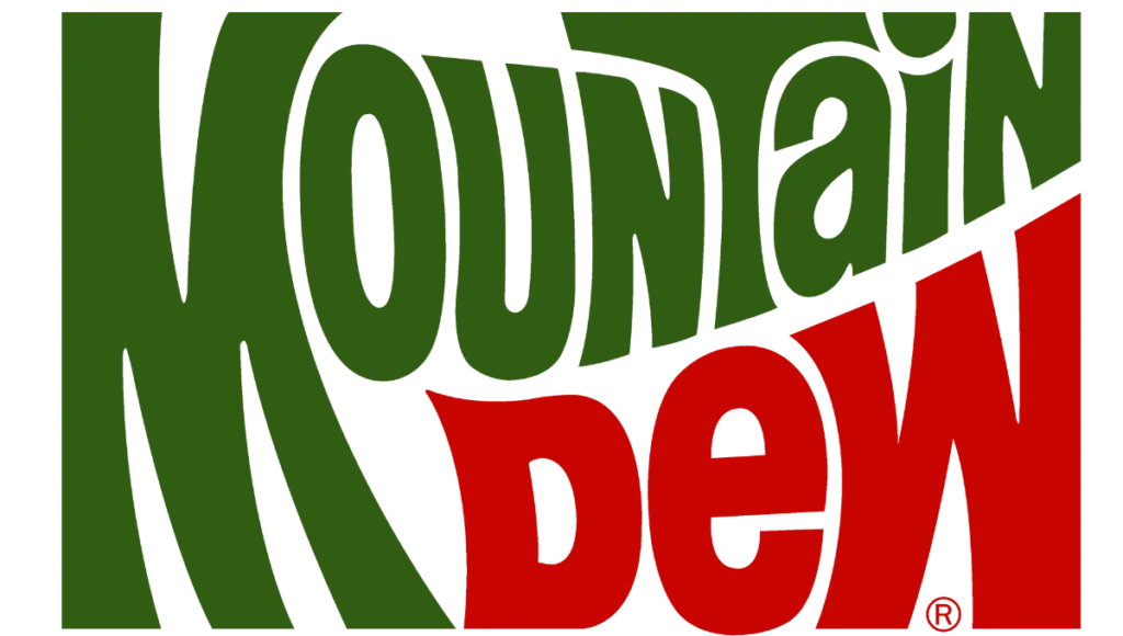
This emblem is more stylish than the previous version. The typeface is modernized, and Green and red contracts make it a more creative and artsy look. The word “Mountain” was in green with the Capital letter “M”, and the word Dew was placed under it in red colour.
1980 – 1991

Agin was redesigned in 1980. a delightful colorpalette shows the logo fresher and light. Lettering lines were refined and some curved lines. The overall look of the logo was the same as the previous one.
1991 – 1969

In 1991 Mt Dew logo design lettering was drawn narrowed, all the lines were taller, and the overall inscription looked lightweight and pretty. Shades of green and red were changed. Grass tone colours look more natural, making the brand’s product high quality and trustworthy.
1996 – 1998
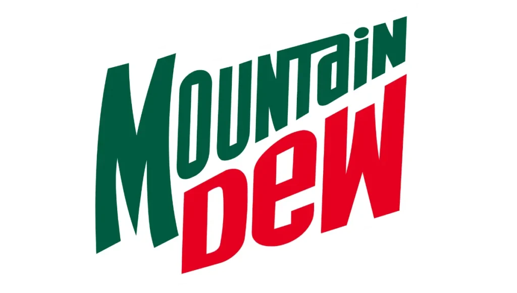
The inscription was diagonal at this time, and both lines were upward. The letter “M” remains curved, and the spell “T” is linked with “N” and “A”.
1998 – 2005
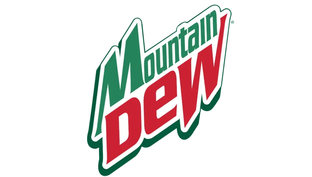
In 1995 white frame was refined, and a dark green shadow was added. The logo from the bottom is wide, and at the top, it is narrow. Line width and height were the same.
2005 – 2009
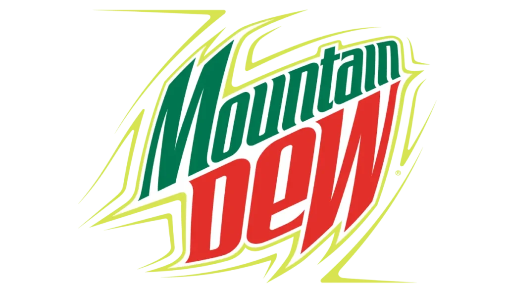
Finally 2005, on New Year’s Day, the logo was changed. Instead of a bold green outline, a thin lime outline was used around the image. This several-line frame is the composition of energy and vitality. This new shade makes the image more clean and fresh. Its contours arched, showing the bubble beverage as cool, and pointed to the youngsters.
2009 – 2017
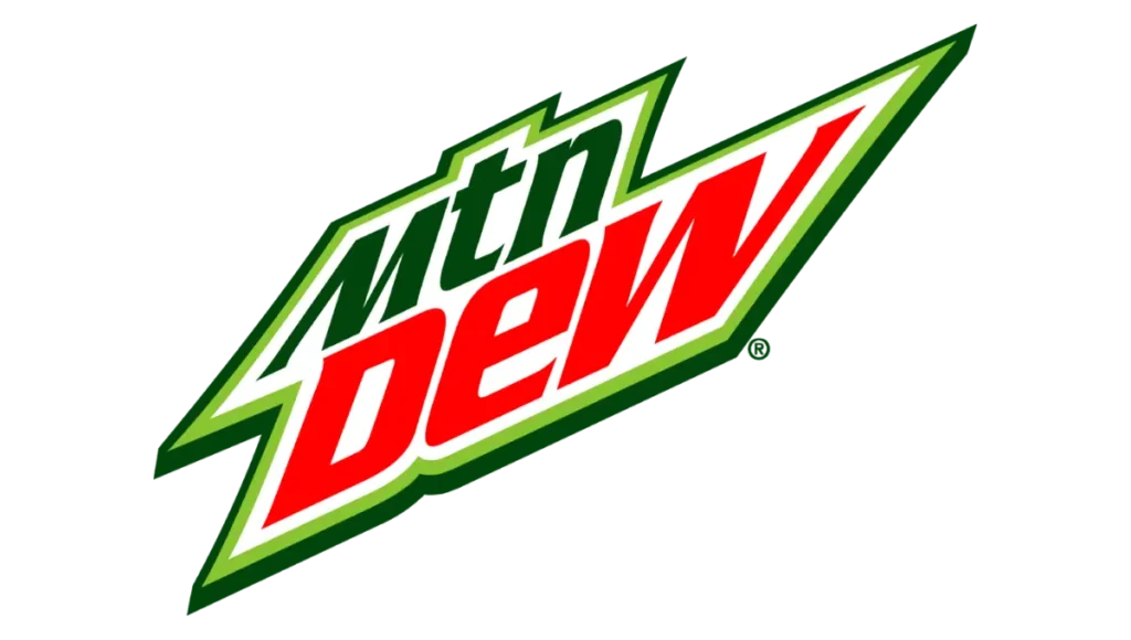
In 2009, this logo was started when the brand shortened its name to “MTN Dew”. In this emblem two bold dark green and light green frames were used with large red “Dew” lettering. Its sharp angles indicate the drink is energetic and powerful.
2016 – Today

The current logo uses two bold outer frames with black and light green outlines. Upper and lowercase letters are drawn in red and green above the white background. The bold typeface evokes a sense of energy, strength and excitement in this soft drink branding.
Logo Design Element
Color
The color palette of this iconic logo is composed of two shades of green, white and red. This combination makes the brand’s strength eyeching look indicate the professionalism of manufacturing.
Font
bold and bright letters from the early logo are mixed with big and small letters and customized in different contours. The straight lines of the letters make pretty massive serifs. Bar of M and W is longer and digonaly located.
Format
This Citrus Soda brand logo is available in formats like PNG, transparent, vector, SVG, and square.
Mountain Dew Slogan
Like its history, the Mountain Dew slogan is vital in branding and changing with time. In the 1940s its first slogan was “Ya-Hoo! Mountain Dew” was introduced. Later on, it was changed, and now its current and famous slogan is “Do the Dew.”
Mountain Dew Facts
- Did you know the original formula of this drink is not what we know today? Its flavour resembles other famous beverage brands, Sprite and 7UP, as lemon-lime.
- Mountain Dew sponsored many extreme sports events and athletes.
- Mountain Dew is a good choice for those looking for an energy boost drink because it has more caffeine than other sodas.
- In 2004, Mountain Dew Baja Blast was introduced exclusively to Taco Bell. After more fame, it was sold in stores for a limited time.
- The iconic citrusy flavour of the yellow-green colour Mountain Dew came in the 1960s.
Mountain Dew Story
At the grocery store shelves it catches your eyes and competes with famous drinks brands like Pepsi and Coca-Cola. Now, Let’s have a look at its story. In the late 1930s, Barney and Ally Harman moved to Knoxville, Tennessee.
The Harmans were big fans of whiskey drinkers, but unfortunately, they didn’t find a favourite mixer, so they decided to make their own carbonated lemon-lime drink. They named it Mountain Dew, which is a slang term for moonshine.
They wanted to sell it a few years later but faced rejection from local stores. So they thought of rebranding it with a playful slogan and cartoonish packing in the 1946 convention.
After all these efforts, sales remained low until the Tip Corporation bought their company in the 1950s, and the improved lemonade formula revived the brand.
In 1964, PepsiCo acquired Mountain Dew with its orange flavour and lime-green color to increase its popularity. By the 90s, it again rebranded and offered Code Red Flavour focused on sports and games. Partnering with famous fast food brand Taco. It is connected with gamers who need a quick energy boost.
Conclusion
Mountain Dew logo transformation reflects the brand’s evolution from its beginning to the modern, playful, cartoonish design associated with sports and gaming culture. Each logo redesign reinforced its adventurous brand identity, contributing to its popularity and iconic recognition in the beverage logos.

