KFC Logo (Kentucky Fried Chicken) Symbol, Meaning, Evolution And History | All Years
Are you curious and want to know the secret story behind the famous KFC logo? In this article, I will reveal the hidden message of these iconic symbols. So get ready to explore the KFC logo’s meaning, history, design, shapes, fonts, and secret of a smiley face with red and white stripes.
KFC Logo Meaning, History And Evolution
KFC is the best alternative to McDonald’s in the fast food industry. As the name shows, Kentucky Fried Chicken specializes in fried chicken. It has 20,000 restaurants across the world and has beaten McDonald’s logo in sales.
KFC (Kentucky Fried Chicken) is owned by the company of Yum! Brands, lnc. It also owns the famous fast food brands like Taco Bell, Pizza Hut, The Habit Burger Grill and WingStreet.
KFC Logo Meaning
Let’s talk about the famous fast food restaurant logo meaning. The KFC logo is not just a collection of shapes and attractive colors. The meaning of the KFC logo is to represent its brand history and Yum offerings. The KFC logo’s man friendly face is an invitation to the authenticity and tradition of finger clicking fried chicken.
KFC Logo Evolution
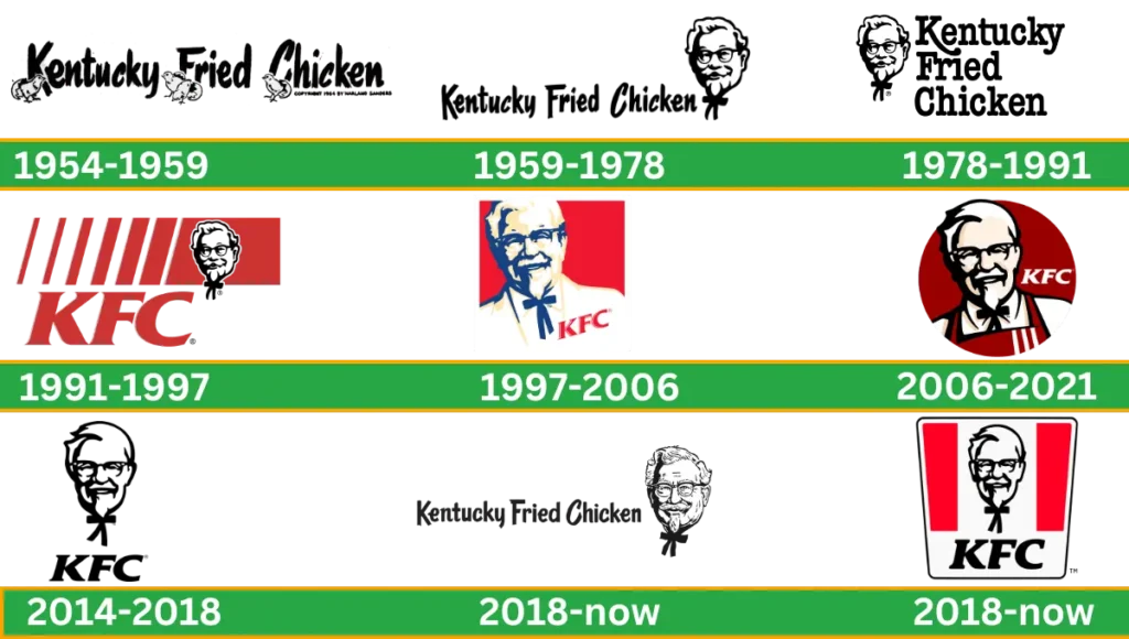
The picture of Colonel Harland Sander became the iconic symbol that reminds us of the KFC brand. How has the logo changed through the years? Let’s check out how The KFC brand remains the same with all these changes.
KFC Logo History
1954 – 1969
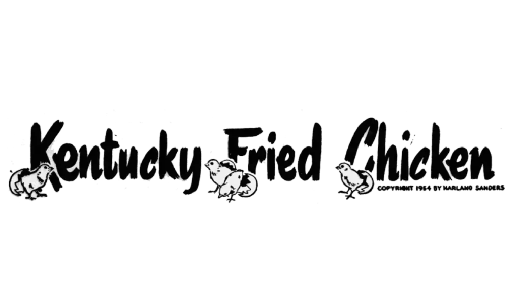
This logo is simply the name of the chain written in handwriting using brush strokes to stylize its letters. To make the logo attractive and unique, add the letter C in the inscription, which is italicized. In the whole logo, use four chickens that have popped out of their eggs.
These small chicks are placed below each capital letter of every word. The concept of this logo is to show creativity and the best approach to branding, as well as to capture the excitement of new things.
1959 – 1978
This year, the previous logo was modified. This logo used the wordmark Kentucky Fried Chicken. The first letters are in upper case, and chickens are below the capital letter.
Redesign it with the founder of KFC’s portrait on the right side of the wordmark. The concept behind this logo is to show the connection between the founder and the brand’s embodied value.
1978 – 1991
In 1978, again, the logo was redesigned. At this time, the wordmark is written in 3 parts vertically and is larger in size than previously. The emblem was located on the left side of the wordmark. To show more creativity, this logo is designed with an elongated tail.
The concept behind this logo is to create a sense of movement, catch attention, and make it more pretty. This KFC log is filled with rich lessons and adaptability.
1991 – 1997
In 1991, the logo was completely modified. For the first time, color was used and made using the abbreviation of Kentucky Fried Chicken. Portraits of the logo are created using blue and white colors. Six vertical, bold red lines are used with tin to create bold patterns.
Wordmarks start from the second thin line at the top and end at the half of a bold red rectangle laying at the top of it. The concept of this new KFC logo is to drive attention towards the powerful and energetic brand with big future plans and ambitions.
1997 – 2006
In 1997, the logo was redesigned by the London Associates Agency. In this logo, a square is used with a red and white background. This iconic colonel’s portrait and a bold red wordmark are located on his tuxedo.
When this logo is made at the same time, the interior and exterior design of the restaurant are changed. The roof design changed from a mansard to a flat one, and the tower became wider and thicker.
2006 – 2018
In 2006, again, the company decided to change the logo. At this time, the logo is redesigned with a deep red circle and a refined image of the colonel wearing an apron, the perfect replacement for a tuxedo.
The KFC wordmark with a white color appears on the left side of the Colonel’s face. In this period of time, the company pays tribute to the original logo (which was created in 1952) using a monochrome version of the emblem.
The concept behind this classic logo is to mix old ways with new innovations. The perfect merge of color and imagery in the logo shows the brand can change but stay true to its identity. It’s the best example of how things can change by connecting today’s audience while honoring the past.
2014 – 2018
In 2014, the KFC logo totally changed. This logo is very simple. Accomplished monochrome color and just used the colonel portrait without adding more detail. Only the colonel image and wordmark are used with a black, bold, serif typeface.
This logo does not have a colorful background or any frame around it.
The concept of this simple logo is concentrated on showing the brand clearly in a new way without adding extra detail. This simplicity means less is more.
2018 – Today

In 2018, the logo was not redesigned; it used an old logo that slightly changed the version of the 1959 logo by just changing the font. At this time, the image looks real and more detailed.
The concept of this logo is to bring back the old logo to show how the company preserves the value of the founder even after many years.
Logo Shape and Design
The last time the company redesigned its logo was in 2018. The shape of the logo is like a trapeze. White and red background colors are used with three vertical lines.
The portrait of the Colonel is placed in the middle of the lines, and the wordmark is italicized and located underneath it. The KFC logo is attractive and welcoming. It is the best example of the fast food industry evoking warmth and hospitality.
- Font

To make the style of KFC simple, we italicized it and used the same emblem since 1991. But the font of the Kentucky Fried Chicken inscription has changed a few times, making it simpler each time.
- Color
The color scheme of this brand, which used red, black, and white, stayed the same as the 1919 version of the logo. But if you look closely, you will notice that the modern and latest logo color is different from previous versions. The red shade is a bit darker and not as bright as before.
The Red Bag Ground nods to KFC’s past when the Colonial Center first served up delicious fried chicken. While the white stripes tell the secret of its crispy golden goodness
| Color | Hex Color | RGB | CMYK | Pantone |
| Pigment Red | #f40027 | 167, 30, 49 | 5, 100, 71, 22 | PMS Bright Red C |
| Black | #000000 | 0, 0, 0 | 0, 0, 0, 100 | PMS Process Black C |
Logo Formats
KFC logo png, vector, svg, jpg, pdf, transparent are available in hd results for various uses.
KFC Slogan And Tagline
Just like logo KFC’s tagline has evolved over the years, with its old slogan “Finger Lickin’ Good” changing to suit modern trends and may vary according to the region. The new KFC slogan in 2024 reflects freshness, replacing the KFC slogan from 2023 and aligning with the brand’s innovative approach. This shift in messaging is similar to how brands like Freddy’s update the Freddy’s menu to stay aligned with customer preferences, offering fresh choices while maintaining their identity. Both brands demonstrate that adapting over time helps them remain relevant, consistent, and appealing.
Colonel Sanders Journey toward KFC
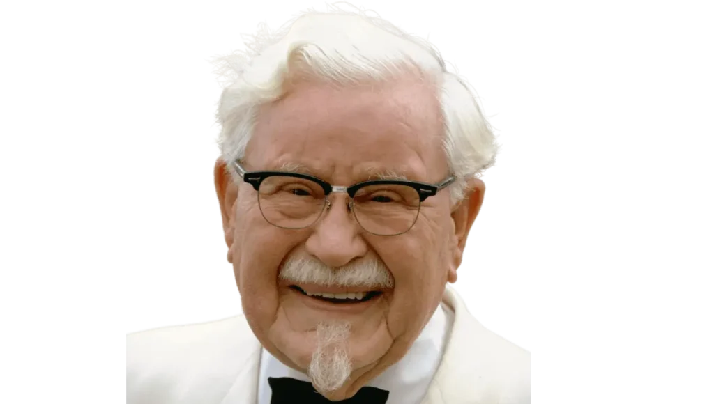
Colonel Harland Sanders faced many issues in his life. He belonged to a poor family. When he was 6 years old, his father died. He Dropped out of school at the age of 7 and started working in the fields. Then, he joined the army at the age of 16, increasing his age by one year.
But unfortunately got kicked out from there, too. He joined the railways as a laborer. While working in the railways, he taught law, but in law, he did not make his career because he had a fight with one of his friends. Then, he started selling life insurance.
Bose did not like his work, so he was fired. He did not give up and, In 1920, started a ferry board operation and started a business. In 1930, he started a restaurant in front of the gas station. The name of this one room was the Central Court And Cafe.
Governor Ruby Laffoon gave him the Karnal title because of their services. He maintained the principle that the work should be done honestly and that the quality of the work should be a priority. In 1939, a fire broke out in the restaurant, and all was lost. This time, he was worried but did not lose his heart.
Then, with the new vision, he decided to supply the chicken to all the American restaurants and introduce their delicious fried chicken. No one was willing to accept his recipe. People used to make fun of him and say how great chicken dishes were and how he was going to sell them all over the world.
Then, he met Patty Harman at a National Restaurant Association conference, where KFC was established. Patty Harman holds all the expenses, and Colonel Sanders starts to make the meal.
KFC has become more formal. Within a year, additional space had to be acquired, and KFC’s annual turnover had grown from $135,000 to $450,000. In 1955, Colonel Sander opened his first franchise. In 1960, he opened more than 600 franchises in America and Canada.
And in 1964, at the age of 75, Colonel sold his company and decided in the deal that the image of Colonel Sander would never be removed. In 1980, he died of cancer and left 3.5 million dollars. Now, his family’s net worth is more than 10 million dollars.
Video
True And Interesting Facts About KFC
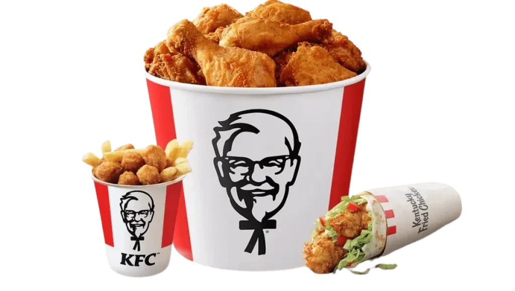
- Do you know? KFC is traditionally eaten in Japan at Christmas. Every year, millions of Japanese families visit KFC restaurants to enjoy their fried chicken. Amazingly, people wait and are excited for this day’s orders and payments to be done in advance.
- Another fact is that people are engaged in KFC in South Africa. KFC contributes to their wedding expenses. It provides wedding planners with honeymoon expenses.
- I am sure many people don’t know that the founder of the KFC brand has launched a video game called Colonel Quest. The purpose of this game is to collect more drumsticks as soon as possible.
- KFC fried chicken uses 11 orb secret recipes. And no one knows if this recipe is safely locked to keep it away from intruders.
- It’s shocking when you know who owns KFC not the man with a smiley portrait on the logo, instead of PepsiCo owning it. They bought KFC in 1986 for $ 850 million.
- Do you know the colonel used a magical cloak to hide their secret recipe, which made him invisible? Once naughty food lovers entered, their kitchen jar was knocked on accidentally, and species flew in the air. Colonel Sander whispered in their ears, to discover the magic, you must be kind and share joy with others.
KFC Hidden Message
Do you notice the KFC Colonel Sanders logo? This logo has a hidden message. Colonel Sanders wears a bow tie. This is not just a tie. It clearly forms the letters K, F, and C, which is the secret code of Kentucky Fried Chicken.
KFC Story
Do you know the colonel used a magical cloak to hide their secret recipe, which made him invisible? Once naughty food lovers entered, their kitchen jar was knocked on accidentally, and species flew in the air. He whispered in their ears, “To discover the magic, you must be kind and share joy with others.”
Conclusion
The KFC logo has changed a lot over the years, showing how the brand grew from a small local restaurant into a big fast-food chain. Each time the logo was updated, it went from simple handwritten letters to the famous picture of Colonel Sanders.
These changes helped KFC stay current with new trends while still honoring its roots. The mix of old and new in the logo demonstrates how KFC maintains its original style while also connecting with today’s customers. As the logo keeps changing, it still stands for KFC’s long history and its promise to deliver quality and real flavor.

