Jollibee Logo Symbol, Meaning, Design Evolution, PNG, Brand And History (All Years)
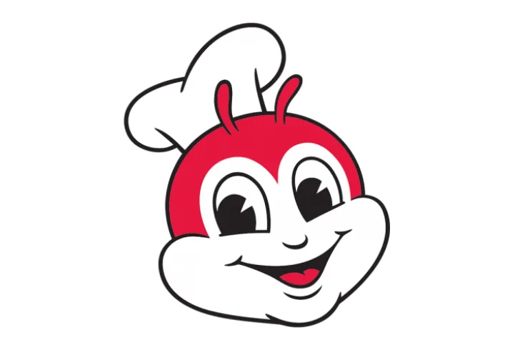
Have you ever wondered why the Jollibee logo features a smiling bee? This cheerful mascot is more than just a friendly face, it tells the inspiring story of how a small ice cream parlor in the Philippines became one of the world’s biggest fast-food brands. Today, Jollibee rivals McDonald’s and KFC, standing as a global symbol of Filipino pride.
In this article, we’ll explore the Jollibee logo’s meaning, history, design evolution, colors, fonts, and hidden symbolism, as well as some fascinating facts about this beloved Filipino brand.
Jollibee Logo Meaning and Brand Background
The Jollibee story began in 1975 in Quezon City, Philippines, when founder Tony Tan Caktiong opened an ice cream parlor called Magnolia. Just three years later, in 1978, the business shifted direction after realizing customers preferred hot meals over desserts. This led to the creation of the Jollibee brand, which quickly grew into a fast-food giant.
Today, Jollibee operates more than 1,500 locations in 12 countries, establishing itself as McDonald’s main competitor in the Philippines. The brand chose a bee mascot as its symbol because it perfectly represents hard work, joy, and the sweetness of life, reflecting both the company’s values and the warm, hospitable nature of Filipino culture..
Jollibee Logo History and Evolution
The Jollibee logo has evolved alongside the brand’s journey from a small ice cream parlor in 1975 to a leading global fast-food chain. Introduced in 1978, the smiling bee mascot was chosen to symbolize hard work, joy, and community spirit. Over the years, the logo has been refined for a cleaner and more professional look while keeping its friendly charm. Today, it remains one of the most iconic and recognizable fast-food logos worldwide.
1975 – 1978 (Magnolia)
From 1975 to 1978, when the brand was still known as Magnolia, the logo reflected its beginnings as an ice cream parlor. It featured a blue-and-white handwritten script, giving it an elegant and icy look that matched the store’s focus on frozen desserts.
1978 – 1980 (Jollibee Yumburger)
Between 1978 and 1980, after the shift to fast food, the logo changed to red handwritten lettering with a white outline and green shadow. This version also introduced the first bee mascot, dressed as a waiter or cook, cheerfully holding a hamburger to represent the brand’s new identity.
1980 – 1983
From 1980 to 1983, Jollibee embraced a bolder design with a sans-serif font in two lines—white on top and yellow on the bottom. The smiling bee was shown flying with a hamburger, while the bright red background made the logo eye-catching and energetic.
1983 – 1996
The period of 1983 to 1996 marked a major step in brand recognition. The logo was simplified to show only the bee’s head, complete with a hood and bow tie, giving the mascot a friendlier personality. Beneath it, the word “Jollibee” appeared in a creative script, and this version was widely used in ads, packaging, and restaurant decor for over a decade.
1996 – 2011
Between 1996 and 2011, Jollibee underwent a complete redesign, modernizing its look. The bee’s face became more lively, tilted slightly with a wider smile, while the bow tie was removed for simplicity. The lettering switched to a rounded, cleaner font, creating a more compact and professional appearance.
2011 – Today
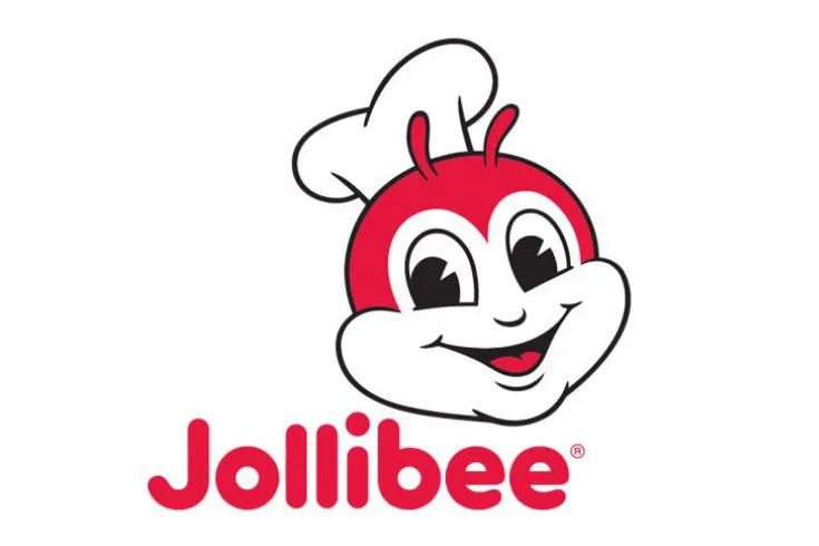
From 2011 to the present, the logo has remained familiar, undergoing subtle refinements. The bee’s nose, antennae, and facial details were slightly adjusted, and the lettering, particularly the “b” was refined. The trademark symbol was also repositioned, resulting in a design that maintains consistency while appearing more polished for a global audience.
Font
In its early years, the Jollibee logo used script-like handwriting fonts, which gave the brand a playful yet handcrafted look. Over time, the design evolved into a rounded sans-serif typeface, closely resembling VAG Rounded Pro Black. This choice of font, with its smooth and curved edges, conveys a sense of playfulness, friendliness, and joy, aligning perfectly with Jollibee’s family-oriented and cheerful brand identity.
Colors
Since 1978, the Jollibee logo has consistently used a red, black, and white color palette that has become central to its identity. The bold red symbolizes energy, appetite, and happiness, making it an ideal choice for a fast-food brand. The use of white conveys purity, simplicity, and trust, balancing the vibrant red with a clean and approachable feel. Meanwhile, black provides contrast and authority, giving the overall design a sense of strength and clarity. Together, these colors create a friendly yet professional image that resonates with customers worldwide.
Color Codes
| Color Name | Hex | RGB | CMYK | Pantone |
| Jollibee Red | #D6001C | 214, 0, 28 | 0, 100, 87, 16 | PMS 186 C |
| Jollibee Black | #000000 | 0, 0, 0 | 0, 0, 0, 100 | Black C |
Why is the Jollibee Logo So Effective?
The effectiveness of the Jollibee logo lies in its balance of simplicity, consistency, and emotional connection. Its design is simple and easy to recognize, making it highly memorable across different markets. Since 1978, the smiling bee mascot has remained at the core of the brand, creating a strong sense of consistency that customers instantly associate with Jollibee.
Beyond visuals, the mascot carries a cultural connection, symbolizing Filipino values of hard work, joy, and community, which resonate deeply with its local audience. At the same time, the logo’s friendly and family-oriented appeal allows it to transcend borders, giving it a strong global presence and making it one of the most effective fast-food brand logos worldwide.
Conclusion
The Jollibee logo has evolved from an ice cream parlor’s elegant script into a global fast food icon. With its smiling bee mascot, vibrant red identity, and rounded font, the logo reflects the brand’s joyful, hardworking, and community-driven spirit. If you’re inspired by Jollibee’s branding journey, explore how a well-designed logo can shape your own business identity. A thoughtful logo doesn’t just represent your company it tells your story and creates lasting impact. Would you like me to draft a guide on how to design an effective logo for your brand?