Golden Corral Logo, Meaning, Design Evolution, PNG, Brand And History

Golden Corral is a well-known American buffet chain that has been serving families since 1973. Famous for its all-you-can-eat meals and affordable dining experience, the brand has built a strong reputation in the restaurant industry. Over the years, its logo has played a crucial role in establishing a recognizable identity, symbolizing quality, comfort, and variety.
In this article, we will explore the history of the Golden Corral logo, its design elements, and how it reflects the brand’s values. We will also compare it with competitors and discuss its impact on the company’s branding.
Evolution of the Golden Corral Logo
The Golden Corral logo has gone through several changes since the company’s founding. Each redesign has refined the brand’s visual identity while maintaining a familiar look that customers recognize.
1973 – 1978 (The First Logo)
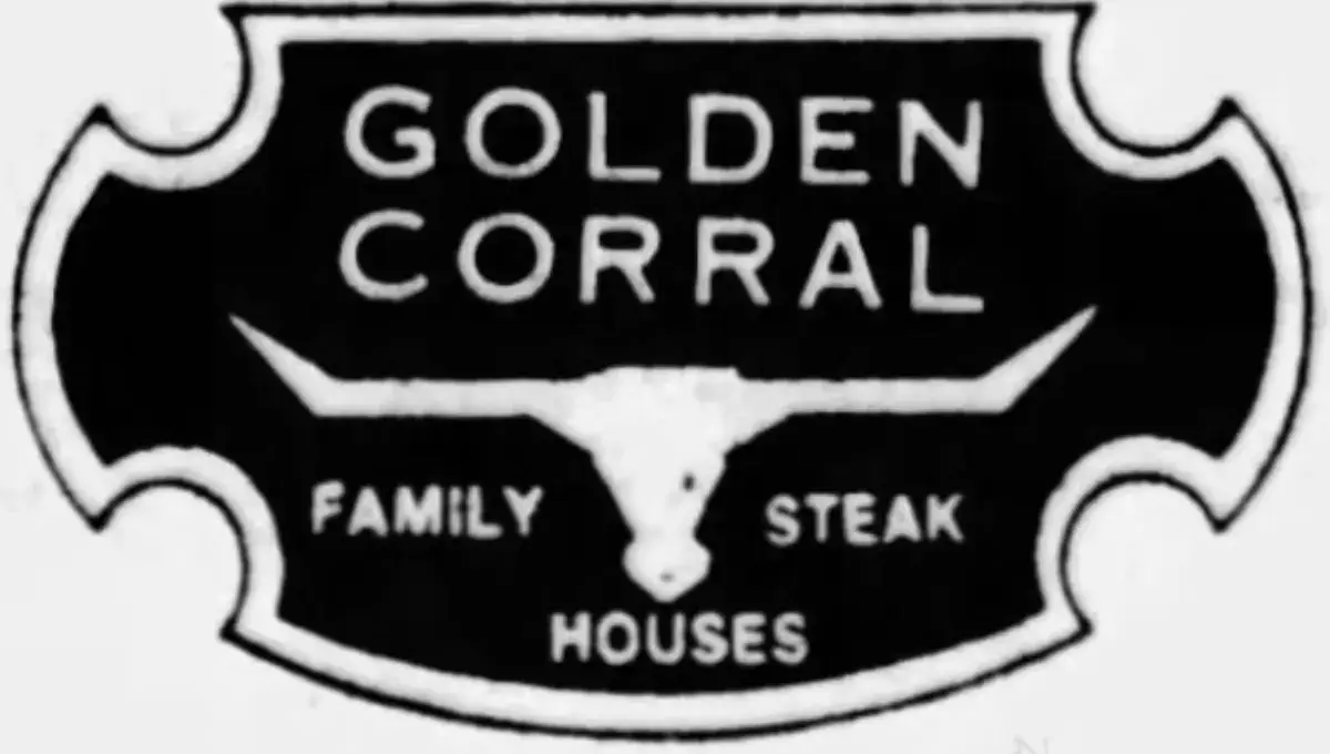
When Golden Corral first opened, its logo featured a simple and rustic design with an old-fashioned Western-style font. This reflected the brand’s focus on traditional American meals served in a family-friendly setting.
1978 – 1984 (A More Defined Look)
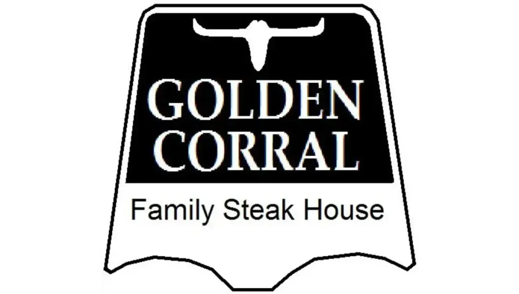
As the company expanded, the logo evolved with a more polished look. The font became cleaner, and the design elements were refined to create a stronger visual presence.
1984 – 1991 (A Bolder Identity)
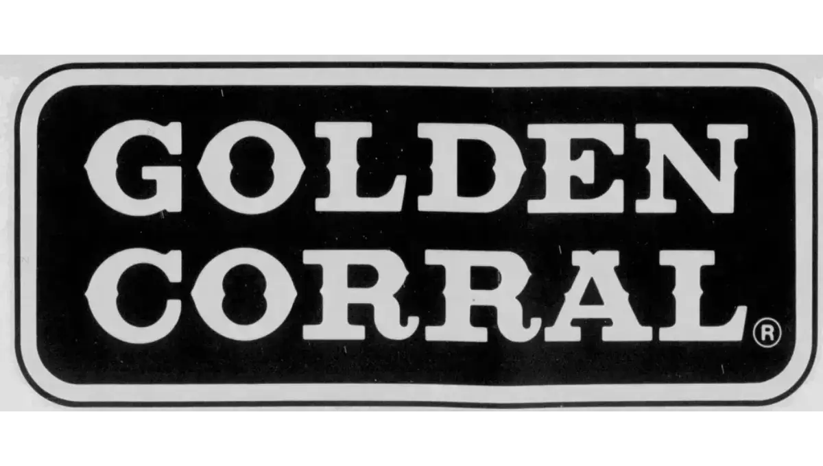
During this period, Golden Corral refined its logo further, emphasizing its name with a bold, red color scheme. This version of the logo became widely associated with the brand’s growing popularity.
1991 – 1995 (Modernizing the Brand)
The logo underwent slight modifications to enhance readability and brand recognition. The red and yellow color scheme became more pronounced, giving the logo a vibrant and inviting appeal.
1995 – Today (The Current Logo)
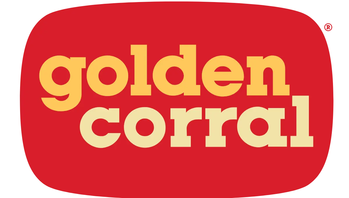
The modern Golden Corral logo features a simple yet striking design. The red and yellow color scheme represents warmth and hospitality, while the smooth, rounded font gives it a welcoming feel.
Golden Corral Logo Meaning
The Golden Corral logo is more than just a name on a sign—it represents the brand’s core values and mission.
- Hospitality: The warm color palette reflects the company’s commitment to providing a friendly and comfortable dining experience.
- Quality & Variety: The strong and confident lettering shows that Golden Corral takes pride in offering a wide selection of high-quality meals.
- Trust & Tradition: By maintaining a consistent design throughout the years, Golden Corral reinforces its image as a reliable and established brand.
The red and yellow color scheme is a common choice in the food industry because it stimulates appetite and conveys warmth, making customers feel welcome. The bold yet simple font reflects accessibility and friendliness, ensuring that the brand remains memorable.
Design Elements of the Current Logo
The current logo is designed to be simple, memorable, and inviting. Here’s a breakdown of its key design elements:
- Color Scheme: The red background symbolizes warmth and energy, while the yellow lettering represents happiness and friendliness. Together, these colors create a welcoming atmosphere.
- Font Style: The bold, lowercase font makes the logo easy to read and gives it a modern yet friendly look.
- Simple Layout: Unlike overly complex designs, the Golden Corral logo is clean and direct, making it easy to recognize from a distance.
Brand Identity and the Logo’s Role
A restaurant’s logo is a key part of its identity, and Golden Corral’s logo has played a major role in building customer recognition. The strong visual presence of the logo across restaurant signage, advertisements, and packaging helps reinforce the brand’s reputation.
Moreover, the logo creates an instant connection with customers, reminding them of the restaurant’s affordable and delicious meals. Many people associate the logo with the well-known Golden Corral prices, which are known for offering great value for unlimited dining. Whether you’re craving comfort food or a variety of dishes, the brand’s identity is closely tied to its ability to deliver a satisfying dining experience at an unbeatable cost.
Comparison with Competitors’ Logos
Golden Corral’s logo stands out among other buffet and casual dining chains. Let’s see how it compares with some of its biggest competitors:
- Buffet-style chains like Old Country Buffet: While Old Country Buffet uses a more traditional and formal design, Golden Corral’s modern and simple logo feels more inviting.
- Casual dining chains like Applebee’s or Chili’s: Unlike these restaurants, which focus on a more stylized brand identity, Golden Corral keeps its design straightforward, emphasizing value and family dining.
- Fast food chains like McDonald’s: Both McDonald’s and Golden Corral use warm color tones, but Golden Corral’s logo feels more homely and less commercial.
The minimalist yet bold design of Golden Corral’s logo ensures that it remains memorable while effectively communicating the brand’s values.
Public Perception and Reception
Customers often associate Golden Corral’s logo with a positive dining experience. It is widely recognized and appears in marketing campaigns, restaurant signs, and online platforms.
Some key factors influencing public perception include:
- Familiarity: The logo has remained consistent over the years, helping customers easily identify the brand.
- Association with Value: Many diners connect the logo with affordable and satisfying meals, reinforcing the restaurant’s reputation for great deals.
- Welcoming Feel: The warm color scheme and friendly font give off an inviting and casual dining vibe.
Additionally, the strong brand presence of Golden Corral prices helps attract families and individuals looking for a budget-friendly dining option. The combination of affordability and variety strengthens the restaurant’s image, making it a popular choice among buffet lovers.
Golden Corral’s Logo in the Digital Era
With the rise of digital marketing, the logo is now more visible than ever. From online food delivery platforms to social media advertisements, its presence is felt across multiple channels.
- Social Media Impact: The recognizable logo makes Golden Corral easily identifiable on platforms like Facebook, Instagram, and Twitter, helping the brand connect with its audience.
- Mobile App & Website: The logo is used across the company’s digital platforms, ensuring a seamless and cohesive brand experience.
- Advertising & Promotions: Whether it’s a television commercial or an online banner ad, the logo continues to reinforce the brand’s message of quality and affordability.
Golden Corral’s ability to adapt its branding across both traditional and digital mediums ensures it remains relevant in the evolving restaurant industry.
Conclusion
The Golden Corral logo is more than just a brand symbol, it embodies the company’s dedication to quality, value, and hospitality. Its evolution over the years has refined its visual appeal while maintaining the core elements that make it recognizable. With its bold colors, simple font, and strong brand presence, the logo continues to be a key part of Golden Corral’s success.
For customers, seeing the logo often brings to mind delicious meals at an affordable price. Whether it’s a family gathering or a casual dinner, the logo represents a place where everyone can enjoy great food without worrying about the cost. And with Golden Corral prices remaining competitive, it’s easy to see why the brand continues to thrive in the buffet restaurant industry.
