Burger King Logo, Symbol, History And Evolution, Slogan, PNG, Brand

In the fast food chain, Burger King logo is one of the most recognized and loved restaurant, alongside the Subway logo, and it was established in 1953 in the United States (USA). The chain is famous for hamburgers and french fries. Crispy, golden king fries making them perfect and flavorful for fry lovers. The most famous fast food brand spread at 18 locations across the world.
Bk restaurant is owned internationally, and its headquarters are in Florida, with almost 35 thousand employees. Let’s look at Burger King’s logo meaning and complete history, font and color, facts and slogan step by step.
Meaning and History
The logo has no hidden and curies meaning, but its attractive design and color combination make you hungry. The word King is written in uppercase and bold style, while the burger is in lowercase, which means it is pointed toward the grand, something like Burger Kings. So there is no secret message.
The Evaluation Of The King Burger Logo
The Burger King is a more recognized symbol in the fast food industry. The logo of Burger King is a simple, memorable, and effective company identity that adds value to tradition and legacy, and it maintains its visual identity over the years. Let’s talk about Burger King’s old logo history and their new logo design.
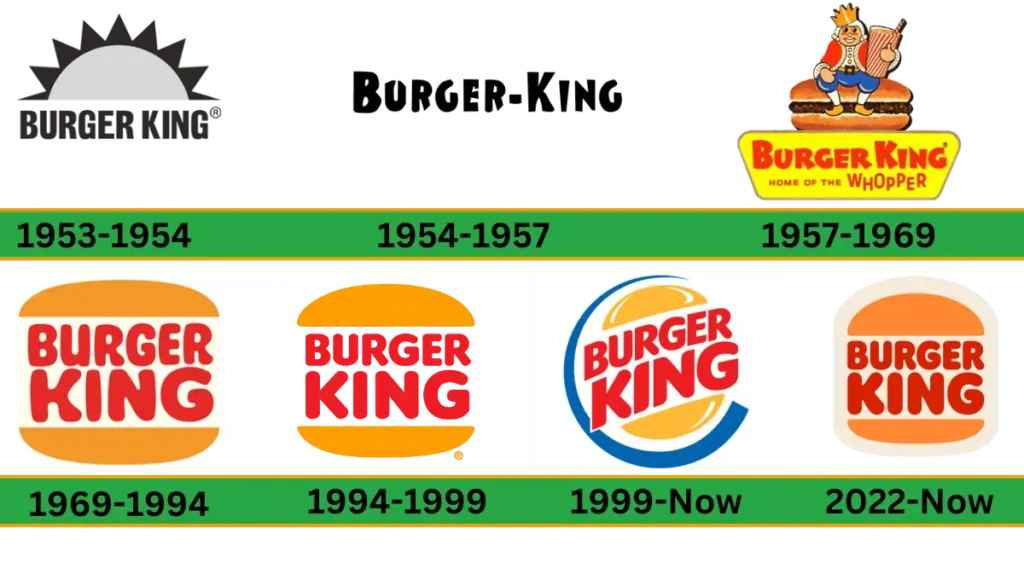
Its logo has been redesigned five times throughout the company’s history. It took 16 years to achieve the signature style. Three new logos were designed with different designs between the period of 1953 to 1969. But in 1969, after Burger King success, only small refinements were made to make its iconic emblem, but the design and color remained the same.
1953- 1954

Burger King started in 1953 for the first time, and its logo was designed in the same year. Initially, it was known as Insta Burger King. The logo shape is like the half of the rising sun.
The wordmark was bold, and all the letters were in capital form. The first logo evaluation was created using the black and white colors combo. This logo has remained with the company for only one year. Burger King’s logo has evolved over the years, just like its competitors, McDonald’s logo and KFC logo, each with a distinct brand identity.
1954 – 1957
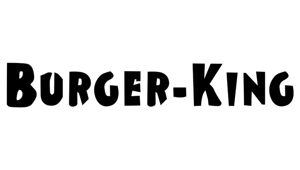
In 1954, the logo was slightly changed, and the logo was a minimalist bold wordmark using a sans-serif typeface with uneven letters on the edges. At this time, the logo was simple, and no additional detail was included. The company used this logo for three years to maintain its brand identity.
1957- 1969
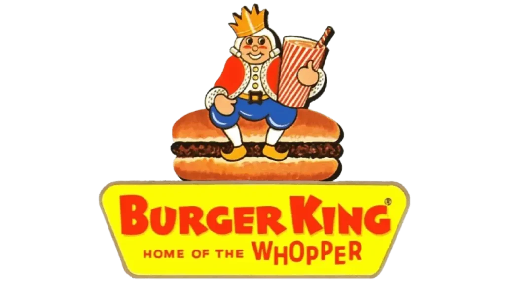
This was the era of colorful logos when the first time typefaces and palettes were changed and made bright using colors. In this logo, a happy clown is at the top of the burger while holding a big drink glass. The red wordmark is placed above the light-ochre background. The bold and neat title was designed using sans serif. Below the title, a tagline “Home of the Whopper,” All the letters are black in color instead of Whopper.
1969-1994
The iconic bun logo was designed in 1969. Its bold red letters were placed between the two parts of the bun. That makes it stand out and appealing. Its bright and smooth, sleek lines with San serif make it more eye-catching. No change in The logo style, color scheme and composition used the same as the previous version. The size of the “king” was enlarged to divide the layers into equal parts.
1994-1999
In 1994, the company decided to refine the logo slightly to make it more traditional and create a solid look. The bun was modified with a bright orange color that shows that more energy and company is more strong. The red and orange color palette in the logo means it shows passion and youngster spirit in front of a wide audience. The wordmark was designed in all the capitals with a rounded sans serif. This logo is still used across many countries.
1999 – Today
In 1999, the company changed the logo again to make it more attractive and modern. In the round shape logo, the wordmark was enlarged and located diagonally between the bun of the two halves. The bright yellow bun’s white color stroke makes it look more refreshing.
The lettering color was red and enlarged in size sans serif typeface, giving it a more modern and distinctive look. The “c” shape has a rounded frame, making it more professional and enhancing confidence. This visually iconic logo represents the core identity of the brand and makes it more welcoming and friendly.
2021 – today
In 2012 the logo was redesigned by Jones Knowles Ritchie. Red color bold lettering was placed among the two orange color buns. The color of the background was light creamy to make the frame for the emblem. This logo looks warmer and friendlier.
symbol
The logo is designed in three colors: red, blue, and yellow. These colors mix to make the logo more attractive and tempting. Seeing it makes you rush to the nearest Burger King restaurant, no matter who you are. It’s open to everyone, whether you are a boy or girl, young or old.
Logo Design Elements
Font
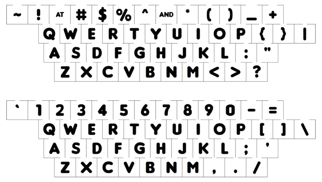
The Burger King text was designed in upper case with a bold style. These heavy sans serif typefaces, such as Corkboard JNL and Frankfurter Std Normal, are much closer to the font. Burger King color plates are designed with red and orange.
Color
The background color used light cream. The color scheme in the logo was bright and eye-catching. This makes the logo more attractive and stands out from the competitor restaurants. It gives energetic and dynamic feelings.
Format
The Burger King logo is available in PNG, JPG, SVG, vector, and transparent files, which are used for different versions for different tasks.
Video
Facts about Burger King
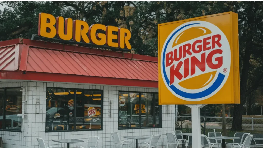
- Now, Burger King has 19,247 global locations in more than 100 countries. Did you know Burger King has this honour in the fast food world to promote movies? They collaborated in 1977 with the Star Wars movie, so Burger King launched a campaign for the movie, which included stickers, posters, and special drinking glasses.
- Did you know Burger King expanded into Australia with different names in 1971? With the trademark issue, it became “Hungry Jack’s” Now, this name is used in around 450 locations in Australia.
- The BK Crown card aims to offer free food for a lifetime by selecting 12 celebrities. Like Jennifer Hudson, Jay Leno and George Lucas. Unlike the regular card, this card is only for friends in the fast food chain. Like the other fast food chain, Burger King has a secret menu recipe.
- Burger King is the only fast food chain that introduced the plant-based burger “Whopper”, which became very popular.
- Did you know Burger king kids club is a best burger advertising idea started in the 1990s similar to the other fast food chains McDonald’s Happy Meal. Cartoon characters known as burger king gang engaging the kids with toys, games and birthday events.
Burger king slogan
Burger King slogan and tagline always prefer the customer’s choice, flavour and individuality. With the history of the logo, its slogans have always changed with time. From the old “Burger King, Where Kids are King” to the iconic new Burger King slogan “Have It Your Way”, now a modern twist of the slogan “Be Your Way” makes it more popular. All these slogans emphasize the burger taste, customization and Burger King experience.
Conclusion
The King Burger is a well-known fast food brand whose iconic logo recognizes the people who are towards the burger brand. The burger king logo redesign analysis highlights with the simple black and white wordmark and then moved towards the colored logo with buns. The company changes its logo when necessary to maintain its core values and make it look refreshing for new customers.
