Peet’s Coffee Logo Meaning, PNG, Slogan Evolution, History

Peet’s Coffee logo is the perfect blend of more than visual identity. Peet’s Coffee is a unique name in the world of Coffee. Starbucks Coffee is the strong brand competitor of Peet’s Coffee in The USA.
Starbucks has a global presence, while Peet’s focuses on specific regions in the United States. Both offer similar products, such as brewed Coffee, retail coffee beans, and espresso drinks.
On April 1, 1966, Alfred Peet introduced Peet’s coffee brand in Berkeley, CA and included this big name in the American Coffee drinkers list. Let’s look at its symbol, meaning, rich history, font, colour, and facts.
Meaning And History

Peet’s Coffee’s name is taken from its founder, Alfred Peet, and the word “Coffee”. However, it does not have any specific or hidden meaning. Honour wants to introduce the new blends, brewing methods, and modernity of This freshly roasted Coffee.
Evolution
Peet’s logo has changed over the years more than once, each reflecting the brand’s growth, evolution, modern appeal and commitment to Quality. Let’s detail old and new Peet’s logo history and evolution step by step.
1966-2000

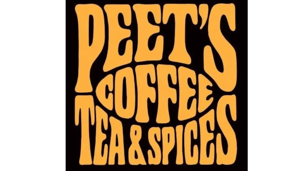
The first and original logo is a simple, hand-drawn, blocky typeface named “Peets Coffee Tea and Species”. All the lettering was in the capital and placed on a square-shaped background. This rustic logo represents the company’s focus on fresh, high-quality Coffee and tea.
2000-2017

In 2000, the logo was updated, and more elements were added. It looked modern and more polished, with a cleaner font and simpler design while keeping the handcrafted feel, making the logo more popular among coffee lovers. Refind typeface maintains the coffee brand’s old heritage.
A white colour wordmark with small capital letters was designed on the black rectangular bar with a brown colour frame. The letter “P” was created more and placed above the word “coffee” and connected the middle of the two corners of the frame.
2017-Today

In 2017, it rebranded Done. The current version of Peet’s logo is sleek and minimalistic. Shorten the logo name from “Peet’s Coffee and Tea” to just Peet’s Coffee. The wordmark was in black, and each Word’s first spell was in capital form.
The letter “P” was bold and designed with white lines. This creativity shows more focus on Preet’s name. Straight-edged and simple fonts have a direct and significant visual impact on brand recognition.
The logo is designed into three levels. Preet’s bold letter “P” is placed at the Word, and below is the word Coffee.
Design Element
Fonts
Peet’s logo uses a custom serif font with a classic traditional feel and is related to fonts like Caxton or ITC Berkeley Oldstyle, which has a handcrafted look.
Color
Peet’s logo uses black as a primary color, which means the brand emphasizes Quality and tradition. Sometimes it uses white and brown color to enhance its visibility so its color palette maintains an elegant appearance.
Format
Peet’s logo is available in PNG, vector, JPG, SVG, and transparent formats.
Slogan
Peet’s Coffee’s famous slogan is “Coffee First, Everything Else Second.”
Facts

- Alfred Peet was inspired by the founder of Starbucks Coffee. Did you know that both of these are the USA Coffee Brand’s and in the beginning, Starbucks bought its beans from Peets?
- Peet’s brand’s first priority is Quality. That’s why they use high-quality Arabica beans and roast them well to ensure freshness.
- In the 1960s, Peet’s offered the Coffee subscription service for the first time. So customers get fresh Coffee at home.
- Peet’s Coffee became famous due to its strong, rich, dark roast. This style makes it more recognizable, and people love to drink it.
- It’s surprising that JAB Holding company is the world’s biggest investment group buying stocks from Peet’s Coffee.
- The first iconic Peet logo was designed in Dutch style in Washington, D.C., which means the brand is growing outside of the West Coast.
Conclusion
Peet’s Coffee logo reflects the brand’s moderation and high-quality commitment. It’s simple, bold style maintains the tradition with an old font and iconic “P” symbol. This coffee brand is the best example to show that Peet’s Coffee has stayed true since the early days of modern coffee lovers.

