Fanta Logo Symbol, Meaning, Evolution, History | All Years

From the Coca-Cola family Fanta logo became the iconic symbol in the beverage industry. In 1940, it was introduced in America. Alongside Fanta, the Sprite logo has also gained worldwide recognition as a refreshing citrus drink. Let’s start to know the new and old Fanta logo’s meaning, history, evolution, font, shape, slogan, hidden secrets and some interesting facts.
Meaning And History
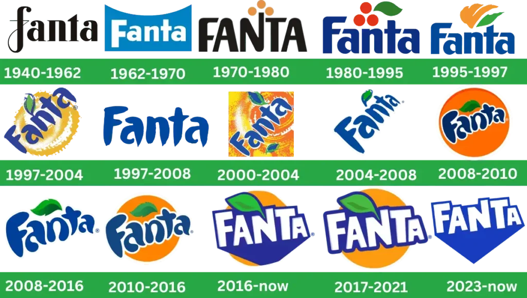
Fanta’s visual identity is bright, colorful and energizing in the present marketing history. However, all the time, it was not the same as many changes held and the change of every stage famous orange drink looks fresher and friendlier. Let’s talk about the complete history of the iconic logo step by step.
1940 – 1962

In 1940, the first and original Fanta logo was created by famous businessman Max Keith in Germany. This logo was designed with a bold black inscription and white background; all the letters used in lowercase and above the letter “F,” curly curved tail make the whole logo unique and fancy.
1962 – 1970

In 1962, redesign logo was redesigned with a combination of white and light blue color plates instead of black. Simple, bold white sans-serif placed on the rectangular blue background. Its top curve looks like a smile. This logo shows how simple graphic design can still be creative and elegant.
1970 – 1980

In 1970, the inscription was redrawn with a simple, bright, and bold style black wordmark that looked confident. At the top of of letter ‘’N,’’ three orange circles are created, which represent the main drink’s flavor. All the letters were in uppercase, bright and smoother. This logo shows us how color, typography and shape make the Fanta branding inspiring and memorable.
1980 – 1995

In 1980, logo was redesigned from black to intense blue and orange to red, with the addition of a neat and smooth green leaf of the oranges to represent its flavor. The all-caps lettering was replaced by the title case inscription, and the red and green icon was slightly moved from the right to left above the two letters “a” and “n”. It was the first colorful logo.
1995 – 1997

In 1995, three oranges were changed into abstract orange leaves. Blue color letters were used bold and neat with cuts and roundel shapes. A total of four diagonal lines are placed above the “n” and “t.” Three lines in orange were different in size, and one was in green that was various in design from the other three. The creativity of this design was showing how the brand changed and grew?
1997 – 2004

A logotype with a dark blue wordmark was diagonally placed on the bright orange background. Stylized bright orange and yellow background having green leaf with a blue outline coming out from the letter “n” to show its freshness.
1997 – 2008

In 1997 this logo was updated with simple bold letters without any additional elements. The Blue wordmark was redrawn, modern and stylish with a small circle artistic font.
200 – 2004
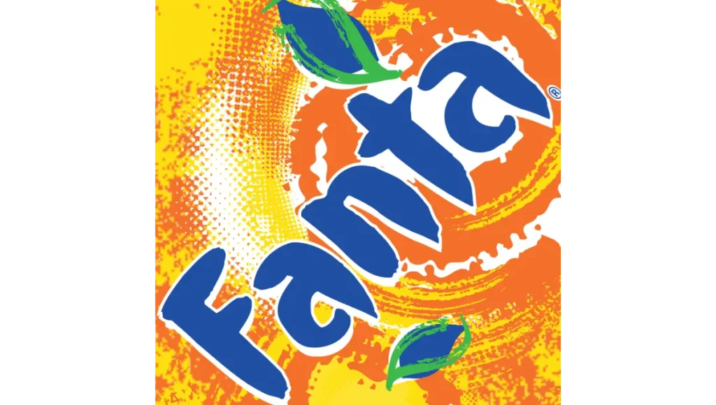
In the 2000 version, bold blue wordmark featured a white outline. On the detailed contrast background, diluting orange ingredients makes it brighter and stronger.
2004 – 2008
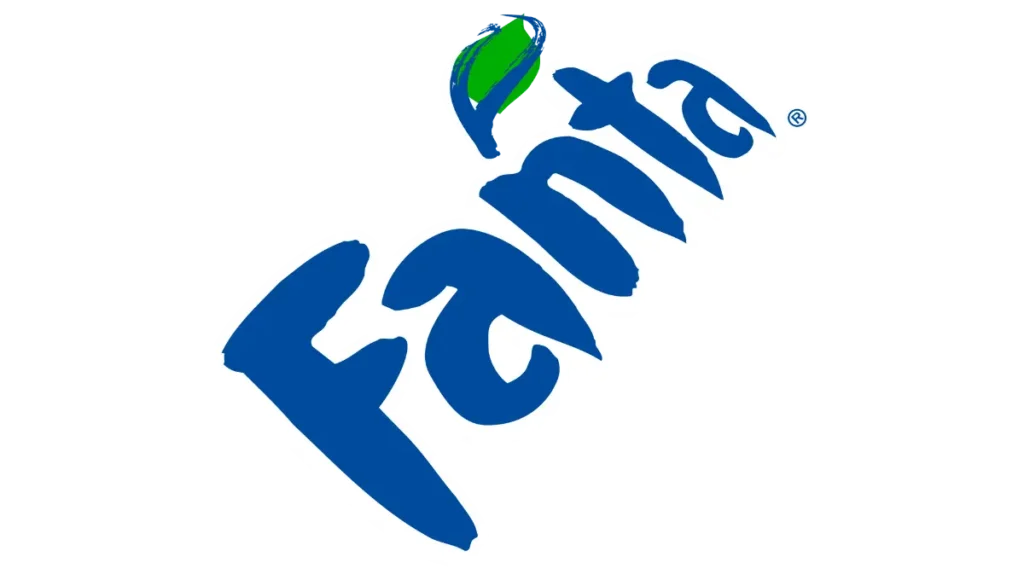
Fanta’s company decided to simplify its logo again. Blue wordmark diagonally placed with white background. At this time blue outline green leaf was drawn above the letter “n,” which makes the design more elegant.
2008 – 2010
In the 2008 version, the inscription was composed of neat and dark blue with a white outline. The background was solid orange in a rounded shape. A green leaf was placed above the “an” letters. All letters, bold and heavy, contoured the old logo.
2008 – 2016
It was the time when Fanta spread their brand globally and offered more than 70 flavors. The San Francisco-based Office designed the new identity logo. Designers created all branding elements like colors, shapes and letters. Green leaf was designed at the wordmark to show the company’s positive impact. So, the company uses them according to their flavors.
2010 – 2016
In 2010, the logo got little change. The orange circle-type background became smaller than the previous logo, but the wordmark was enlarged. So the new logo looked stylish and bright, instantly recognizable all over the world.
2016
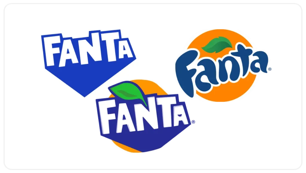
In 2016, the logo was totally changed. The wordmark was square-shaped with bold sans-serif. All the letters were in the capital, featured with a purple outline. The green leaf was redesigned with a heavy blue outline and enlarged in size coming out from the letter “N.” UK Koto Agency designers cut out the letters from the paper and assembled them to make a vector logo.
2017 – 2021
In 2017 Fanta brand again redesigned its emblem with the same elements, just removing the heavy blue shade background to reveal the orange color. White lettering was slightly thick with a blue outline. Brands still use this version in 2021.
2023 – 2024
In 2023, the logo removed all the other elements and made it neat. All the letters are composed in bold and capital form. A thick blue outline uses a massive shadow similar to badge 2016, and the shadow makes a triangle shape. This minimalistic design shows the company’s new angles, brightness and progressiveness.
Font And Colors
All the bold caps of the original logo are written in sans-serif font. These two closest fonts are used, P22 Nudgewink Bold and Surfer Shop BTN Bold, for minor changes to the logo.
Fanta Color Code
| Color | Hex Code | RGB |
| Orange | #FF5800 | 255,88,0 |
| Dark Blue | #002E6D | 0,46,109 |
| Light Blue | #57AFFF | 87,175,255 |
| White | #FFFFFF | 255,255,255 |
| Green | #&EC845 | 126,200,69 |
Shape
Fanta Hidden Story
After World War II Coca- Cola soda drinks were not imported into Germany due to trade restrictions, however, the Coca-Cola team in Germany made a drink with the available fruit ingredients.
So, in this way, Fanta was introduced. Joy Knipp thought of the name of Fanta during the meeting. The name was derived from the German Word “fantastisch,” which means Fantastic. In the 1950s, Fanta became a famous cold drink worldwide.
Now, Fanta has franchises in more than 190 countries and is spreading day by day. Initially, Fanta started with an orange flavor, but now it has over 100 various flavors. Fanta is the strong competitor of another famous soda drink 7Up.
Video
Fanta Facts
- Did you know Fanta is the very popular beverage and oldest second brand of the Coca-Cola company?
- Fanta is more than a drink in many countries and has participated in music and movies to create fun and make it more famous among young people.
- Fanta soft drink plays with new flavors and bottles, and the first PET plastic bottles credit goes to Fanta.
- Fanta has an incredibly vibrant range of fruit flavors world wide, like strawberry, grape, pineapple lychee, kiwi and chocolate.
- Fanta sponsored sports and fun events every year.
- Brazil is the world’s largest consumer of Fanta and sells millions of cases annually.
Conclusion
Fanta logo design evolution is the best example of strong branding. Over the years, from word simple design to colorful, fun versions now, it has stayed consistent, simple and connected with people. The brand shows freshness and interest through thoughtful design. If you are a graphic designer or want to create the logo, Fanta design can help you to be more creative.

