Sprite Logo (Soda Drink) Symbol, Meaning, Evolution, Brand History | All Years

Hi, soft drink lover’s Sprite logo is not just like a picture. It has hidden secrets and fun facts. Let’s have a look at the logo’s meaning, history, slogan, color, font, format, shape, evaluation, slogan, and hidden message. Get ready to dig into its hidden story.
Meaning And History
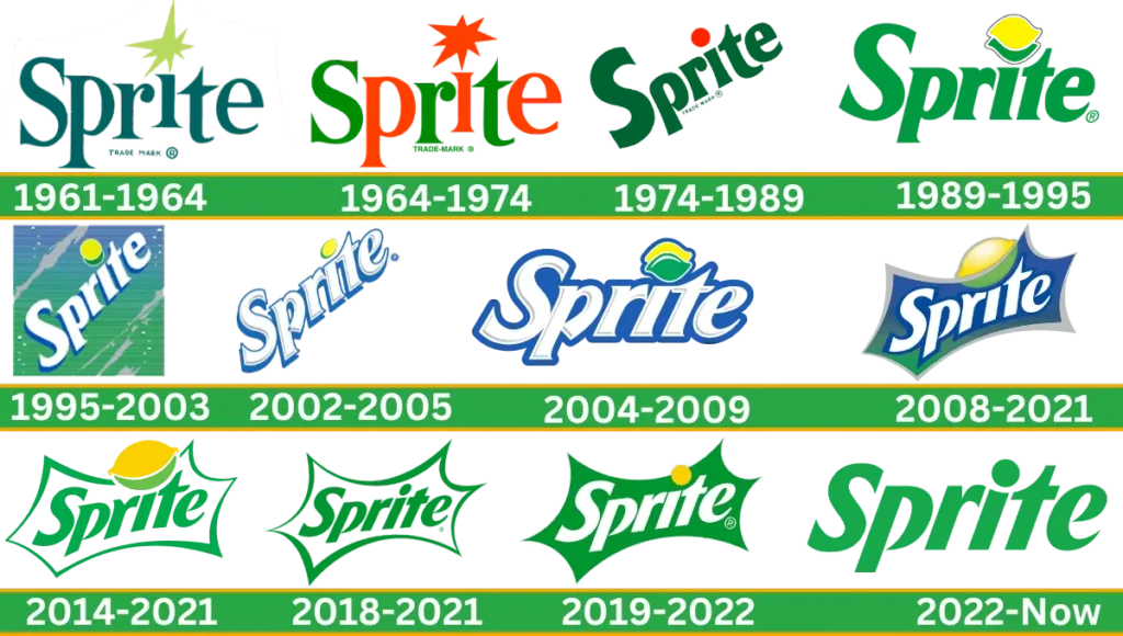
Sprite emblem hidden meaning represents its freshness and its vibrant features of green, blue, and yellow represent the citrus flavor of the iconic drink same like Fanta soft drink. At the same time, the Bubbles and Splash effect symbolizes the soda’s effervescence. The color palette and its graphical elements show the company’s focus on being modern and successful.
Its refreshness and flavors are the same as popular beverages like the Chick-fil-A milkshake, which is known for its rich taste and made with high-quality ingredients. Just like Sprite branding, this drink has a unique visual appeal and flavor consistency that makes it memorable.
Sprite Logo Evolution
The evolution of the beverage logo showcases the brand’s ability to transform the Sprite design with the comparison of the first logo many times. While maintaining the brand’s core identity. Now let’s have a look at the brand logo history step by step over the years and see how the company changed its old logo to the new.
1961-1964
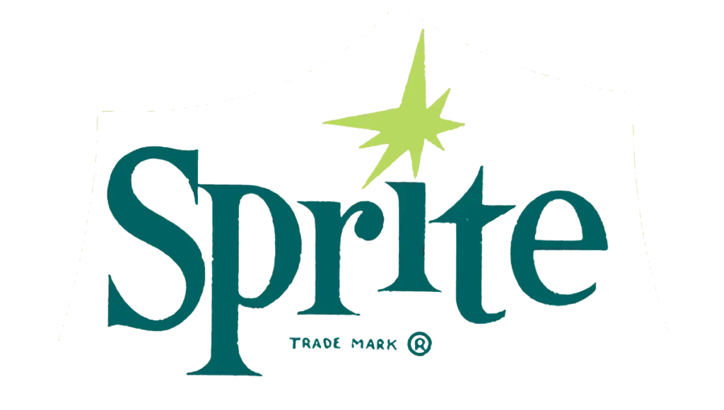
The original sprite logo was introduced in 1961. This refreshing beverage brand featured dark green. Jumping dark green letters composed with serif typeface. At the letter “i” designed 8 pointed stars with lime green color. The purpose of this star is to represent the soft drink flavor.
1964-1974
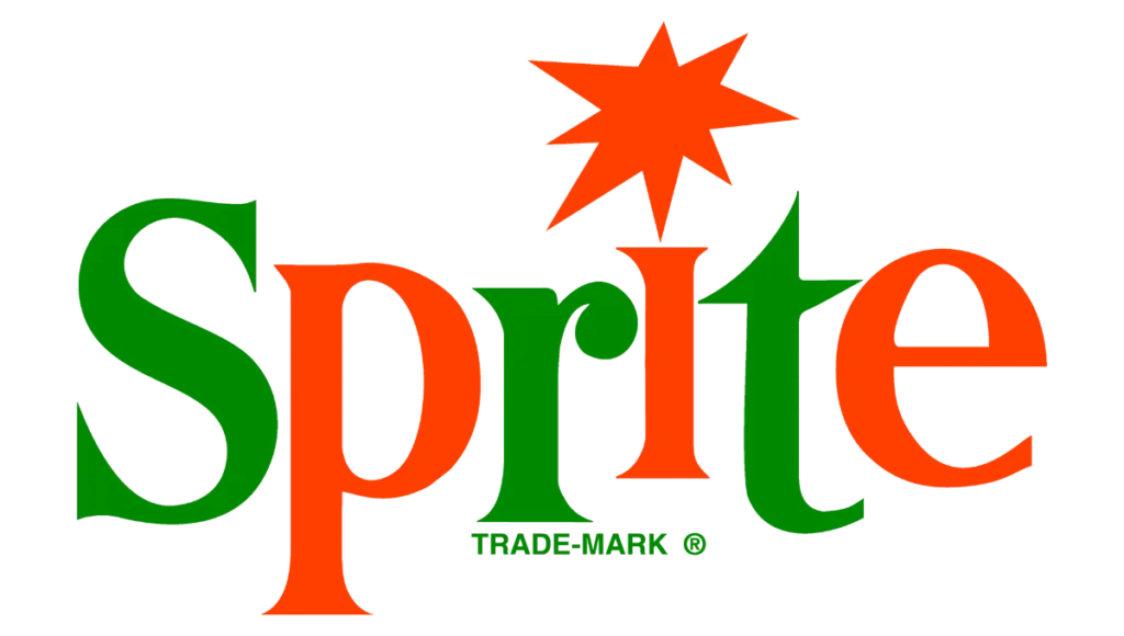
In 1964 the logo was redesigned with two color contrasts, red and grass green. In this version, big stars are made bold using red color and replaced above the “i”. Same as to letters’ color trademark replace using a grass green color and make the visual identity more attractive.
1974- 1989
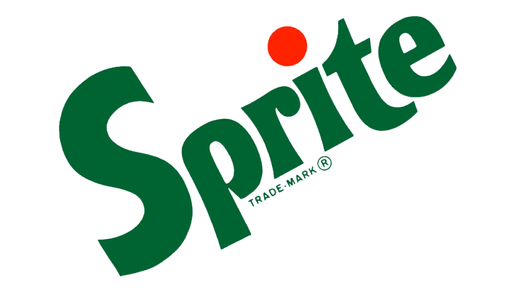
This year a new look of the Sprite branding was introduced. The wordmark of the brand is composed in dark green and placed diagonally. Letters are composed choosing sans serif font. Enlarged, bold, smooth, and designed with a thick outline. Again the logo was made with two color combinations but the color of the letters was green and the circle above the “i” was in red color.
1989-1995
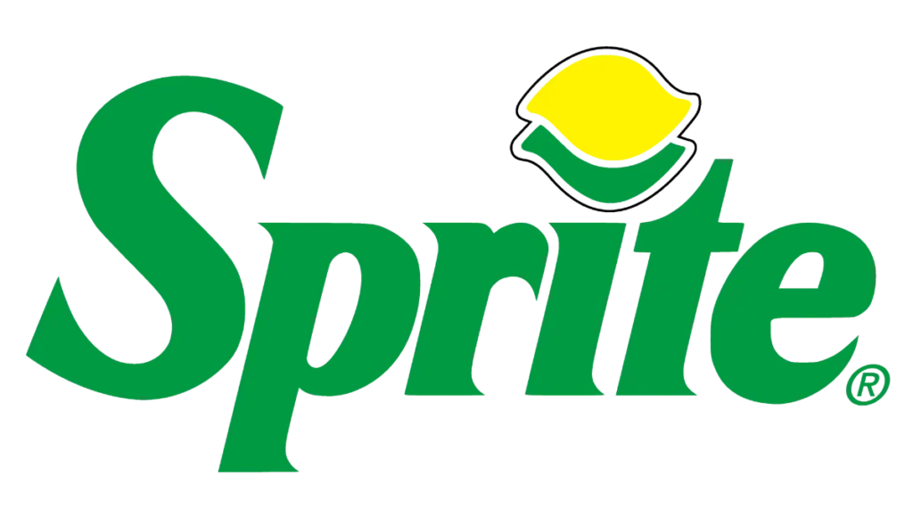
The 1989 logo is slightly stylish. In this logo top the letter “i‘ leaf of two-layered draws in lime and lemon instead of red circle. Wordmark was italicized neat and bold with elegant font. This is one of the most famous versions of the brand logo.
1995-2003
The logo was refined again. Two overlapping lime and lemon circles are placed at the top of the letter “i”. The wordmark was in white color and outlined with blue color diagonally placed. In the background, green and blue gradients are used. In some countries, this logo is still in use on bottles.
2002-2005
In 2002 again the style of the wordmark was updated to make it more modern. The letter was sharpening and the edges were more distinct. The white wordmark was thin blue outlined and the shadow was in the same color.
Two parallel circles from the “i” were removed and only one smooth and sleeker lime lemon circle. The logo of this version was created again horizontally.
2004-2009
In this rebranding move the badge in a horizontal position. White letters outlined in thicker blue lines. The basic idea of the logo again implements lemon overlapping by a lime above the “i”. However, the typeface of the inscription was the same as previous versions.
2008-2001
In 2008 the logo came with a few more distinct features. White lettering was designed with a blue outline placed gradient-type background. Above the letter “i” lemon was drawn with yellow and green color. The wordmark is enclosed in a silver frame making the 6 corners refer to the star from the original logo.
2014-2021
The previous logo in 2008 was just simplified in 2014. Silver frame and back gradient type background removed. The wordmark was in flat green placed on the white background. Lemon yellow color increases at the top of the “i”.
2018-2021
In 2018 the logo was slightly modified. Lemon was taken out from the logo but all the elements remain the same which is continuously repeated in all previous versions.
2019-2022
In 2019 a new look of the brand logo came to be seen. White coloring letters are placed on the green badge. A single yellow dot placed at the top of “i. Which represents the refreshing taste of the Sprite drink.
2022- today

In this era of logo designing history, the first time used only one color on the whole logo. The logo typeface is horizontally placed using a solid green color. The letters “i” and “to cut out making a smiley curve and shortened the letter “r”.
Logo Design Elements
Font
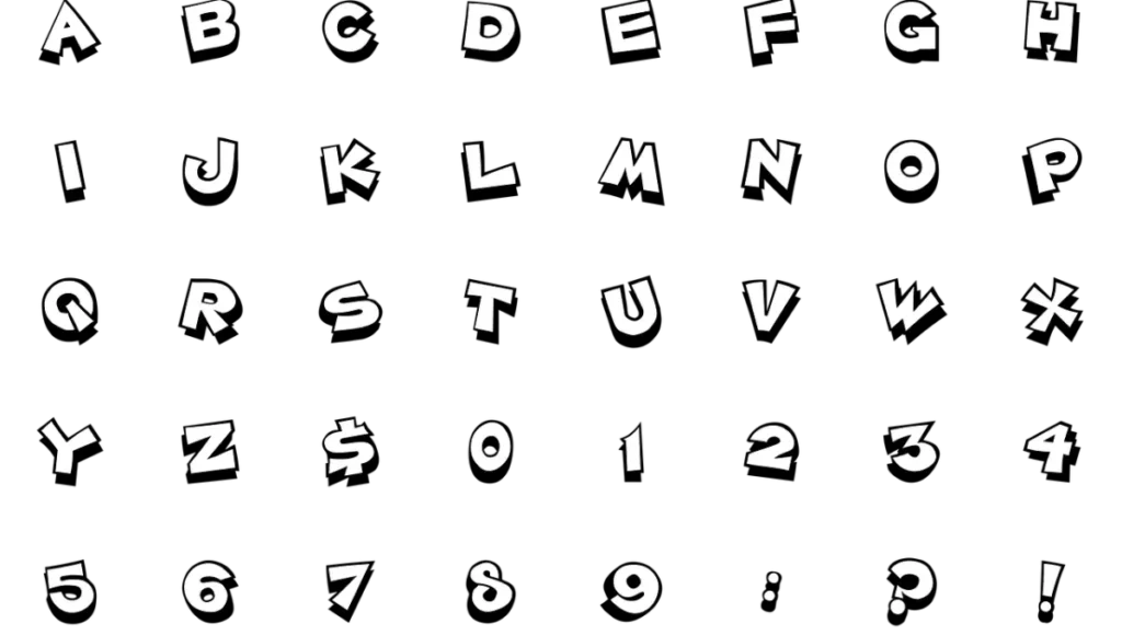
The company does not use any specific font in its logo design but through the years of ogo history, the brand follows the basic style. Font used Sans-serif fonts with a slight italic slant in all the versions.
Color
To maintain visual identity green, and yellow colors are used along with symbolic representations of lime and lemon.
Formats
As the brand was designed with different logos over time, its formats also changed. Sprite Beverage used its logo in different formats for different purposes like transparent logo, SVG, JPEG, PNG, EPS, AI, and PDF.
Hidden Message
According to Hoax, the logo of sprite has the hidden word “sex‘ in their logo. This rumour is widely spread in the social media through chain emails. After this many people try to find out if it is true or not. However, sprite’s hidden messages are simply a myth. There is no hidden message or word like “sex” in the logo. The rumour began like a prank and purpose to grab attention and controversy around the brand.
Video
Slogan
Over the years companies have used various slogans to make emotional connections with consumers, marketing and advertising campaigns, convey the value of their products and brand recognition with consistency.
Some slogans were used for many years and some changed quickly. One of the most famous sprite slogans is “Obey Your Thirst.” However, the sprite slogan list changes like its logo history.
Facts
Did you know Sprite is not developed in the USA? First, it developed in West Germany in 1959 with the name of Fanta Klare Zitrone which means “Clear Lemon Fanta”.
Coca-Cola Company manufactured Sprite to beat the fast-growing competitor of 7UP. So they renamed and introduced the German soda Sprite in the United States in 1961.
Similar to Fanta, Sprite soda drink is the second brand of Coca Cola. Now it has become the most successful brand.
Lemon Lime soda sprite is available in over 190 countries and sprite is available globally in around 20 to 25 flavors.
Sprite generates approximately $6 billion in revenue annually and spends around $100 million to $150 million on sponsorship.
Conclusion
The evolution of logo design continually reflects the brand’s refreshing and vibrant identity. From its beginnings to its modern minimalist design Sprite brand logo maintains its core element, energy, and refreshment.
For graphic designers, the this logo is an example of how creativity and innovation combined to create a lasting impression design to become the globally iconic symbol.
