Coca-Cola Logo: Symbol, Meaning, Brand, Evolution And History | All Years
Have you ever thought about how the refreshing Coca-Cola curvy red letters became the most famous in the world? If you are working on a design project, seeking inspiration, or searching for historical context, then this article is only for you. In this article, I will cover the Coca-Cola logo’s history, meaning, hidden interesting story, true facts, Coca-Cola slogan, and much more.
Coca Cola Logo
Who does not know the name of Coca-Cola? Its American beverage maker, Soft Drink, is famous in every city, every town, and every village. The first time the Coca-Cola Company was introduced in 1886, and it became number one drink. In the refreshing world Pepsi is the big and strong competitor of Coca-Cola. Now it has other brands like sprite, Fanta, Barq’s (Root Beer), Fresca, Mello Yello, Surge and Inca Kola in the world.
Meaning and History
The meaning of this most recognizable logo is to convey the brand identity and create positive associations. It is derived from its two main ingredients: coca (leaf) and cola (nuts). The red color of the logo represents its strength, passion, love, and energy, while the white color shows its purity, youth, and nobility.
Coca Cola Logo History
(1886 – 1887)
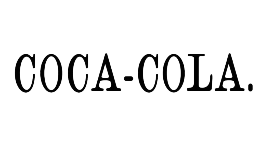
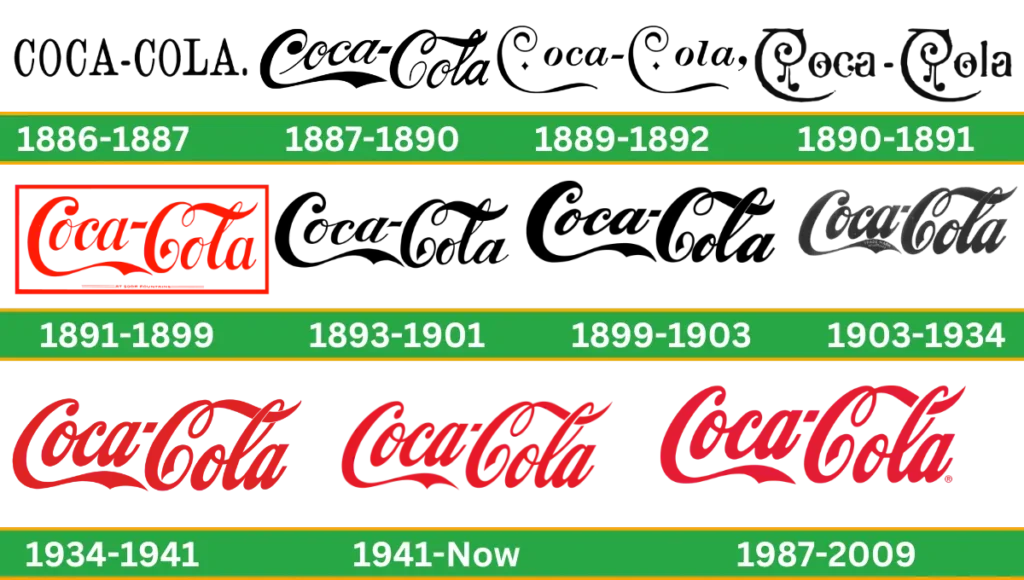
First, the old logo was very simple. This logo was simply displayed with three letters, all caps with sirf. Wordmark in black and white. The first time was advertised on May 29, 1886, in the Atlanta Journal.
(1887 – 1890)

After one year of the first logo, the company owner decided to change the logo to John S. Pemberton. He wanted to make it more distinctive and refined. This logo was designed by Frank M. Robinson.
He was known as a bookkeeper, not a proper designer. He created the logo using a penmanship style called Spencerian script (primary handwriting style). The overall concept of the logo was the same and slightly updated.
(1889 – 1892)

In 1889, the logo design was more stylish and elegant than the previous version. The letters “C’s have a longer and curved shape. Two little rhomboid diamonds are added inside the “C’s. Negative space is used between the coca and cola. A bold comma is used in the logo at the end of the words.
(1890 – 1891)

In 1890, the logo was completely changed. It was designed with new styles and extra fancy swirls. Elongated Cs hang musical notes. But this design lasted only one year.
(1891 – 1899)
In 1891, for the first time, the company introduced a colorful logo. The emblem was designed in red. A rectangular box is used outside the wordmark. The red color of this logo makes it unique and differs from all earlier versions.
(1893 – 1991)

This logo was designed in 1887 and came back as their main logo again. The red color of the letters and border were removed. The emblem was bold and clean. This logo represents the company’s confidence, and its sharp letter represents its strength.
(1899 – 1903)

In 1899, the logo was just refined. All the letters are equalized and balanced. This logo looks close to the iconic logo we all see today.
(1903 – 1934)
This logo was almost the same as the old logo of Coca-Cola but changed with the phrase “Trade Mark Register” located in the swirl of the big tail of the C. The purpose of this trademark is for the company to re-register their logos. To make the logo more refined, counter its letters and all bold lines.
(1934 -1941)
In 1934, there was no major alteration in the logo. This year, coca-cola got its iconic red color. The inscription was the same as in earlier versions. but its strong and bright red color makes it more powerful and attractive.
(1941 – 1987)
The design of the wordmark is more italicized and the core concept is the same as for earlier badges. The rectangular box was removed. Letters are enlarged as compared to all versions.
(1987 – 2009)
The design became sharper and bolder. Glyphs look more straightened up, and the overall design of the logo stays the same.
Coca Cola New logo
Coca-Cola’s new logo was introduced in 2021. It has not been completely changed or slightly updated. Classic curve letters are in words like holding an invisible bottle. This symbol of connection aims to share a Coca- Cola soft drink with friends. It is also called the hug logo. And start with Coca-Cola’s new brand, “Real Magic.”
- Symbol:
- This iconic logo is not a symbol in the traditional sense, but it has two classic color designs, which is proof of its simplicity.
- Swirly emblem:
- In 1890, the company adopted a new, unique logo style, which is very different from the iconic logotype. This company logo has an extra swirl that makes it incredible. But even this version did not last long and was changed.
- Shapes:
- The shape of the Coca-Cola image is swirly. It resembles 1887. This long-lasting design shows the creativity and talent of logo designer Frank M. Robinson.
Colors: Why is coca cola logo red?
The Coca-Cola logo is present in red and white color combinations, which expresses youthfulness, positivity, purity, simplicity, and purity. Some research shows that the company uses this red color in its logo to inspire Santa Claus’s suit, which is red.
- Font:

- Its distinctive font shows what the brand is. Its swirly design enhances its beauty and makes the brand’s visual identity stronger.
- Format: Companies use their logo in different formats. Similarly, caca coal logo formats in PNG, JPG/JPEG, and SVG companies use these file formats for many purposes.
Hidden Message
There is no hidden meaning in the logo. It just tells the brand history, value, and recognition of its iconic brand. But there are some interpretations and rumors, while the company aims to make it visually appealing and memorable.
Evolution of Coca-Cola Logo
Coca-Cola likes to experiment with new things to make it bold and trendy. Sometimes, companies lose their logo. Companies pay attention to what happens in the world. People of different nations exist in the world. Sometimes, they disrespect each other for their differences.
Coca-Cola just reminds people that it may be different, but it is a little bit different. That’s why sometimes company remove their labels during the celebration of certain countries and replace them with white stripes. Deliver the words, “Labels are for cans, not for people.”
Coca Cola Slogan
This famous brand has had many slogans throughout its history. The current slogan of Coca-Cola is “Real Magic,” but these slogans are not the same everywhere.
Coca-Cola Story
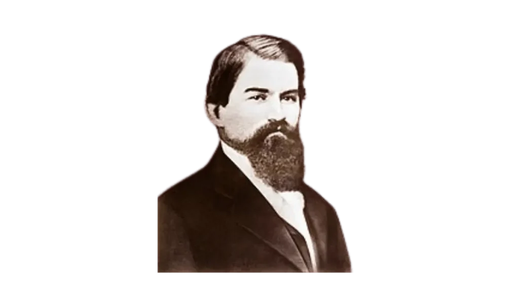
Here, I will share the most interesting story about the famous global beverage brand’s Coca-Cola logo. Coca-Cola was invented in 1886 by a pharmacist whose name was John Pemberton.
In Atlanta, he made a syrup using coca leaf, sugar cola nuts, and some secret ingredients. He decides to sell it as a medicine. John claimed that it would be beneficial to relieve headaches, depression, and anxiety.
But he failed in his decision. Then, he sold his formula to Asa Candler, who was a pharmacist. Asa Candler was very clever and had marketing strategies.
He included the soda in making it a beverage and started to sell it in his drugstore. Then he decided to advertise it in America, where people love to drink soda. It became popular among people in a very short period of time.
People just visit the Asa Candler Store and another medical store to buy Coca-Cola. However, Its popularity is increasing day by day. On the eve of World War I, soldiers in Europe expressed their desire to drink Coca-Cola.
Gradually, Coca-Cola became the universe’s most popular drink. When Coca-Cola became famous all over the world, its founder died.
The formula of Coca-Cola is one of the secrets of the world; its formula is written on paper and kept in a vault with a key.
Video
Coca-Cola Facts
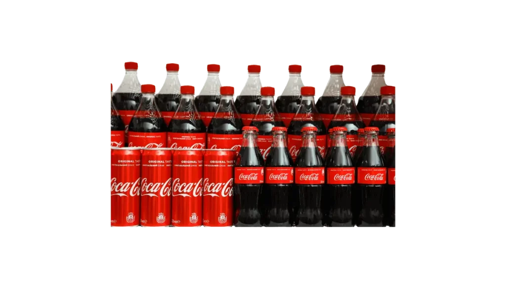
Like FCK 11 herbs, the recipe is hidden. Similarly, Coca-Cola’s formula is also kept hidden in the vault. Only two senior employees of the company know about his formula, and they never travel together.
- Coca-Cola is one of the largest beverage companies in the world. You will be surprised to know that Coca-Cola is not found in two countries Cuba and North Korea.
- In 1915, the first Coca-Cola bottle was made by the Root Glass Company in Indiana. They selected the cocoa pod shape which became the contour bottle in 1920.
- In the 1860s, Coca-Cola had a third ingredient, like a coca wine in France called Vin Mariani, mixing cocaine and wine, and even famous people like Queen Victoria and Thomas Edison liked it.
- In 1886, Coca-Cola cooked cookout wine but left it in stuff called coca leaf and kola nut. Pemberton’s original recipe had a strong 5 ounces of coca leaf per gallon, and 9 milligrams of cocaine were used in each glass.
- Coca-Cola has sponsored the Olympics since 1928, but that does not mean that it should hydrate the athletes.
- Coca-Cola became more prominent with the introduction of plastic coolers instead of metal ones. This change makes it easier for people to enjoy the drink while they move.
Conclusion
The Coca-Cola logo is super famous and easy to recognize with its red and white design. It first appeared in 1886 and has changed a bit over the years as the brand grew. The colors red and white are meant to show strength, passion, and purity. The fancy writing style, called Spencerian script, makes it stand out. The logo started as a simple black-and-white design, but now it’s a bright red symbol known worldwide. This change shows how Coca-Cola has become so popular. Along with its smart marketing and secret recipe, the logo helps Coca-Cola stay one of the most loved brands ever.

