The Jones Soda Logo: Bold, Quirky, and Instantly Recognizable
The Jones Soda logo is a reflection of the brand’s unique personality, playful, edgy, and visually striking. Known for its craft sodas, quirky flavors, and iconic personalized labels, Jones Soda has built a strong identity in the beverage industry, and its logo plays a key role in communicating that brand ethos. Unlike typical soda brands that rely on traditional or classic imagery, Jones Soda’s logo embraces modern, bold typography that immediately sets it apart on crowded shelves.
Origins of Jones Soda
Founded in 1995 in Vancouver, Canada, Jones Soda began as a small independent soda company aiming to break the mold of traditional soft drinks. The founders wanted a beverage that appealed to a younger, trend-conscious audience with bold flavors, fun labels, and a sense of individuality. From the beginning, the logo and packaging design were central to building this identity. The brand’s focus on creativity and originality is evident in every visual element, particularly its logo.
Evolution of the Logo
The Jones Soda logo has remained relatively consistent, maintaining a strong, blocky typeface with high contrast to create a bold impression. Unlike other beverage logos that may use cursive or flowing scripts to convey sweetness or tradition, Jones Soda opts for capitalized, modern lettering, emphasizing confidence and energy. Over the years, the logo has been paired with customizable labels and photography, which reinforces the brand’s playful and personal approach. While the typeface and design have seen minor tweaks to improve readability or modernize the look, the core aesthetic bold, simple, and instantly recognizable has remained intact.
Design Elements of the Logo
The Jones Soda logo focuses on clarity, energy, and individuality:
- Typography: The bold, all-caps font conveys confidence and modernity, aligning with the brand’s edgy and youthful image.
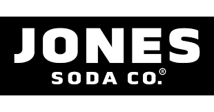
- Color: Often white text on black or bright-colored backgrounds, the logo maintains high contrast, ensuring it stands out on shelves and in media.
- Simplicity: Unlike heavily illustrated logos, Jones Soda uses minimalistic design to emphasize readability, allowing the logo to pair seamlessly with its ever-changing, photo-driven labels.
- Versatility: The clean logo design adapts to various label colors, flavors, and limited-edition series, reflecting the brand’s creative flexibility.
Cultural and Branding Significance
The Jones Soda logo is more than just a visual mark, it’s a symbol of creativity and self-expression. With labels featuring fan-submitted photography and limited-edition flavor campaigns, the brand positions itself as fun, unique, and slightly rebellious. In contrast to major soda brands that focus on traditional family-friendly imagery, Jones Soda appeals to a younger demographic and pop culture enthusiasts. Its logo communicates modernity, confidence, and boldness, making it instantly recognizable to fans worldwide.
Modern Branding Strategy
Today, the Jones Soda logo is used across bottles, cans, merchandise, social media, and marketing campaigns. The clean, bold typography ensures that the brand name is always clear, even when paired with busy, vibrant labels. By combining consistent logo design with ever-changing label imagery, Jones Soda maintains a balance between brand identity and creative experimentation, keeping the brand fresh and exciting.
Conclusion
The Jones Soda logo is a prime example of bold, modern branding that matches the quirky and creative nature of the beverage itself. Its strong, blocky typography and high-contrast colors make it instantly recognizable, while the flexible pairing with unique labels allows the brand to remain fresh and playful. For consumers, the logo signals fun, individuality, and a break from conventional soda branding. Whether on store shelves, in social media campaigns, or on fan-submitted labels, the Jones Soda logo continues to represent a brand that embraces originality, creativity, and boldness.
Frequently Asked Questions(FAQs)
What does the Jones Soda logo look like?
The Jones Soda logo features bold, all-caps lettering, typically in white against a black or brightly colored background. Its clean, blocky typography is designed to be instantly recognizable and pairs well with the brand’s vibrant, photo-driven labels.
Has the Jones Soda logo changed over the years?
The logo has remained largely consistent since the brand’s founding in 1995. Minor adjustments have been made to improve readability or modernize the font, but the core bold, blocky design has stayed the same, reflecting the brand’s strong identity.
What do the colors in the logo represent?
The logo often uses white text on black for high contrast and visibility. The simplicity of the color scheme allows it to stand out against the colorful, ever-changing labels while conveying boldness, confidence, and modernity.
Why is the typography in the logo bold and capitalized?
The bold, all-caps typography conveys strength, confidence, and energy. It aligns with Jones Soda’s edgy, youthful, and creative brand identity, making the logo stand out on crowded shelves.
Does the logo include imagery besides the text?
No, the modern Jones Soda logo focuses solely on the wordmark. The simplicity allows the logo to adapt easily to the brand’s constantly changing labels and flavor designs.
Why is the logo important to Jones Soda’s branding?
The logo serves as a primary visual identifier, making the brand instantly recognizable. Its bold typography and simple design help maintain consistency, even as label images and flavors change frequently.
What makes the Jones Soda logo unique compared to other soda brands?
Unlike traditional soda logos that may use cursive or ornate designs, Jones Soda’s logo is modern, blocky, and minimalist. This reflects the brand’s playful, creative, and slightly rebellious personality.
Can the logo be used for merchandise?
Yes, the logo appears on branded merchandise, including t-shirts, caps, and promotional items. Its simplicity and bold design make it highly versatile for different formats and products.
How does the logo reflect the brand’s personality?
The logo reflects Jones Soda’s playful, creative, and unconventional personality. Its bold typography communicates confidence, while the simplicity allows the brand to pair it with quirky, fan-submitted label photos, reinforcing originality.
Is the Jones Soda logo recognized internationally?
Yes, while Jones Soda originated in Canada, its distinctive logo and unique branding approach have made it recognizable in the U.S. and other international markets where the product is available.
Can the logo be adapted for digital platforms?
Absolutely. The logo’s simplicity ensures it is easily readable and impactful on digital screens, mobile apps, social media, and e-commerce platforms.
Does the logo appeal to a specific audience?
Yes, the bold and modern design appeals to a younger, trend-conscious audience that values creativity, individuality, and unconventional branding.
Why does Jones Soda use customizable labels alongside the logo?
The customizable labels allow the brand to maintain a consistent logo while giving each bottle a unique, playful identity. This combination reinforces brand recognition while keeping the product fresh and engaging.