Perrier Logo: Symbol, History, Meaning & Evolution
The Perrier logo is a bold and instantly recognizable symbol in the premium sparkling water industry. Known for its distinctive green bottle silhouette, elegant typography, and vibrant yellow accents, the logo reflects freshness, vitality, and French sophistication. Since its origins in the late 19th century, Perrier has maintained a strong visual identity that blends heritage with modern appeal, making its logo one of the most iconic beverage logos in the world.
The Story Behind the Perrier Logo
Brand Background
- Perrier was founded in 1863 in Vergèze, France.
- The brand is famous for its naturally carbonated mineral water.
- Perrier positioned itself as a premium yet energetic brand, often associated with lifestyle, art, fashion, and creativity—values clearly expressed in its logo design.
Logo Evolution: Timeline & Design
Late 1800s – Early 1900s: Early Identity
- Early Perrier branding featured ornate typography typical of European brands of the era.
- The focus was on authenticity, origin, and mineral water purity.
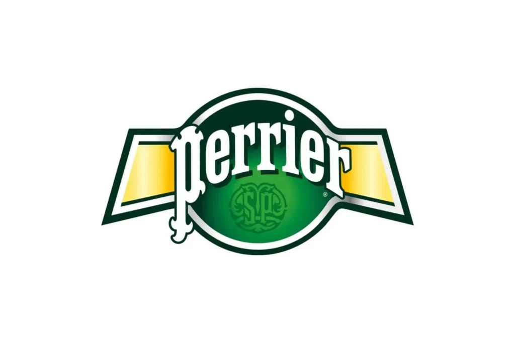
Mid-1900s: Defining the Bottle Shape
- The iconic green bottle silhouette became a central visual element.
- The logo adopted bolder lettering to improve visibility and recognition.
- The brand began emphasizing freshness and vitality over ornamentation.
1980s – 1990s: Modernization & Global Recognition
- Perrier introduced a more stylized, flowing wordmark.
- Bright yellow accents were added, creating high contrast against green.
- This era helped Perrier stand out on shelves and in global advertising campaigns.
2000s – Present: Contemporary Refinement
- The modern Perrier logo features clean, fluid typography inspired by motion and bubbles.
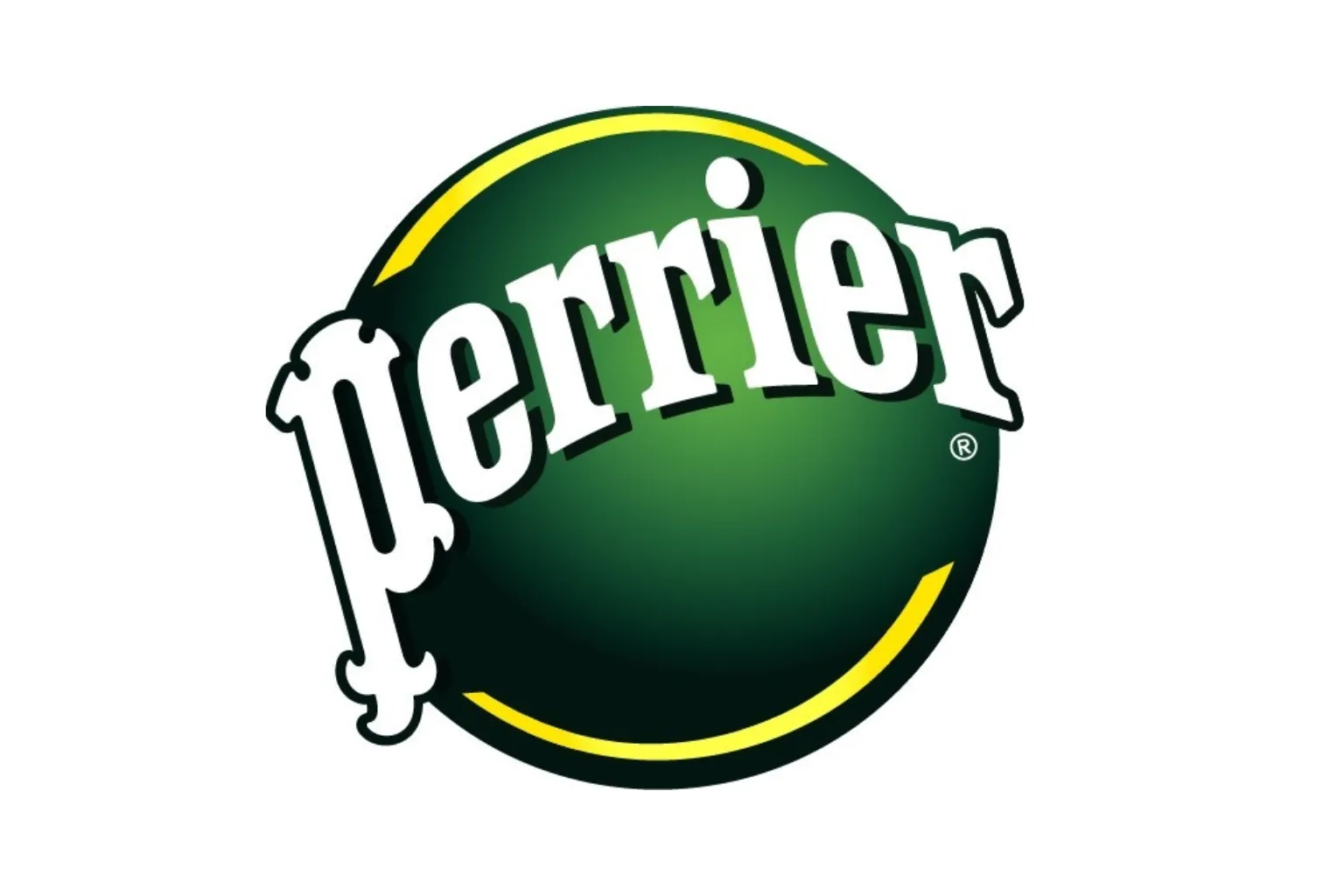
- The green color remains dominant, symbolizing nature and refreshment.
- Subtle refinements improved digital scalability while maintaining brand heritage.
Symbolism & Meaning
Typography
- Curved, energetic lettering represents movement, carbonation, and vitality.
- The flowing style reflects bubbles rising in sparkling water.
Color Palette
- Green: Nature, freshness, and mineral purity.
- Yellow: Energy, vibrancy, and optimism.
- White/Black accents: Clarity and contrast.
Bottle Silhouette
- The uniquely shaped bottle reinforces brand recognition even without text.
- Acts as a visual signature for Perrier’s premium identity.
Why the Perrier Logo Works
- Instant Recognition
- The combination of green, yellow, and flowing typography is unmistakable.
- Strong Lifestyle Association
- The logo aligns with creativity, fashion, and modern living.
- Consistency with Evolution
- Updates are subtle, preserving core brand elements.
- Shelf & Digital Impact
- High-contrast colors perform well in retail and online environments.
- Premium Yet Playful Identity
- Balances sophistication with energy and fun.
Lessons from the Perrier Logo
- Own a Signature Color: Perrier’s green is instantly recognizable.
- Design for Emotion: Movement and flow convey refreshment.
- Evolve Without Reinvention: Small refinements protect brand equity.
- Lifestyle Branding Matters: Logos can express attitude, not just product.
Conclusion
The Perrier logo is a masterclass in distinctive beverage branding. Through its iconic green color, energetic typography, and refined design evolution, it communicates freshness, vitality, and premium quality. Over more than a century, Perrier has successfully adapted its logo to modern trends while preserving its bold French identity. Today, the Perrier logo stands as a global symbol of sparkling refreshment and stylish living.
Frequently Asked Questions (FAQs)
1. What does the Perrier logo represent?
It represents freshness, vitality, natural mineral purity, and French sophistication.
2. When was the Perrier logo created?
The brand dates back to 1863, with the logo evolving over time.
3. Why is Perrier’s logo green?
Green symbolizes nature, freshness, and mineral water purity.
4. Has the Perrier logo changed much over time?
The logo has evolved subtly while keeping its core identity intact.
5. Why is the Perrier logo so recognizable?
Its unique color palette, flowing typography, and iconic bottle shape create instant recognition.