A&W Root Beer Logo: Symbol, History, Meaning & Evolution

The A&W Root Beer logo is one of the most iconic symbols in American beverage history. Known for its classic orange and brown color palette, rounded typography, and retro emblem, the logo evokes nostalgia, fun, and the refreshing taste of root beer. Since its founding in 1919, A&W Root Beer has maintained a strong brand identity, and its logo has evolved subtly over the years while remaining instantly recognizable.
The Story Behind the A&W Root Beer Logo
Brand Background
- A&W Root Beer was founded by Roy W. Allen in Lodi, California, in 1919.
- Originally a small root beer stand, it quickly expanded into a chain of soda fountains and fast-food restaurants.
- The branding emphasizes tradition, refreshment, and classic American nostalgia, all of which are reflected in the logo design.
Logo Evolution: Timeline & Design
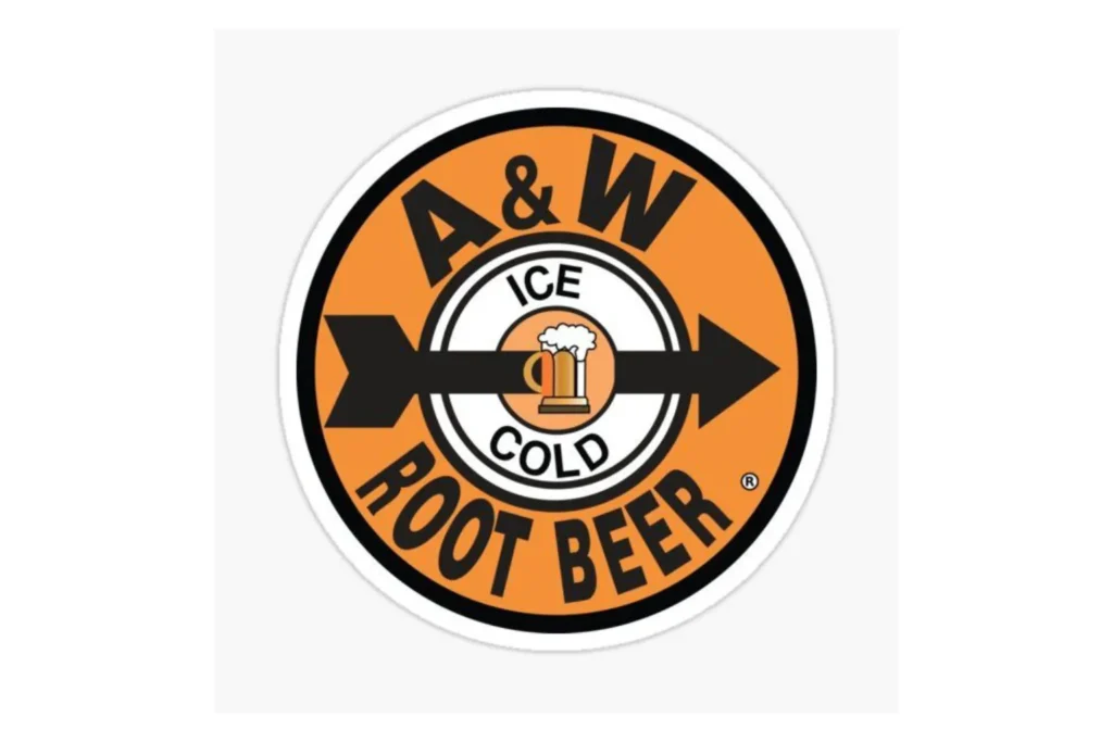
1919 – 1950s: The Original Logo
- The first A&W logo featured a simple, handwritten style with “A&W” prominently displayed.
- Brown colors represented the root beer, while orange added vibrancy and appeal.
- The design had a classic soda-fountain aesthetic, connecting to American roots and casual fun.
1960s – 1980s: Classic Emblem Style
- A rounded badge-style logo was introduced, often featuring a brown oval with orange border.
- Typography became bolder and more legible, making it easier to recognize on signage and packaging.
- This era reinforced brand recognition while maintaining the traditional color palette.
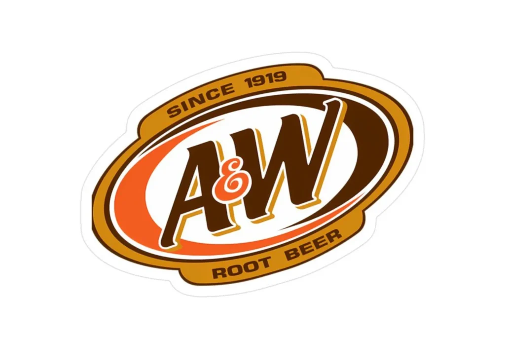
1990s – 2000s: Modernization
- A cleaner version of the logo emerged, simplifying the oval shape and refining the lettering.
- Shadows, highlights, and subtle gradients were added for depth on bottles, cans, and restaurant signage.
- Despite modernization, the logo retained its retro charm and color scheme.
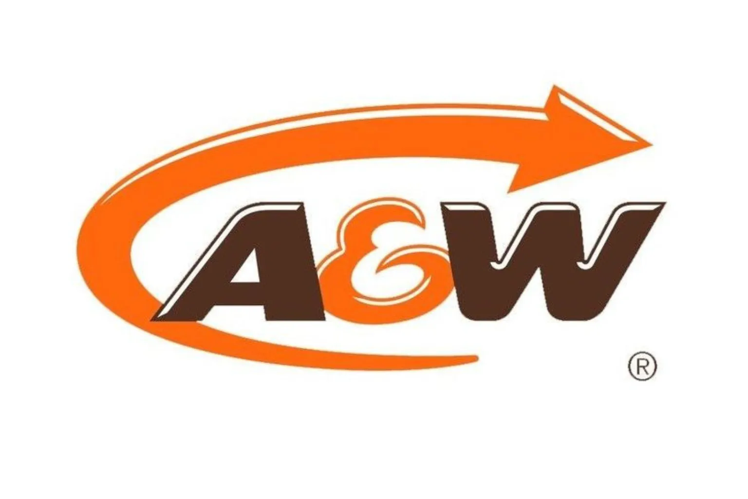
2010s – Present: Contemporary Yet Classic
- The current A&W Root Beer logo maintains the orange-brown palette and oval badge design.
- Rounded, friendly typography conveys approachability and nostalgia.
- Modernized versions work across digital media, packaging, and merchandising without losing their classic identity.
Symbolism & Meaning
Color Palette
- Brown: Represents the root beer flavor, tradition, and warmth.
- Orange: Adds energy, fun, and visibility.
- White accents: Enhance clarity and contrast.
Typography
- Rounded, bold letters communicate friendliness and nostalgia.
- The ampersand (“&”) connects the founders’ initials while remaining a distinctive design element.
Badge/Emblem Shape
- The oval/badge style reinforces tradition, heritage, and trustworthiness.
- Makes the logo instantly recognizable and versatile for packaging and signage.
Why the A&W Root Beer Logo Works
- Instant Recognition:
- The oval badge, orange-brown colors, and bold typography make it stand out.
- Heritage & Nostalgia:
- Maintains a classic look that connects with decades of consumers.
- Versatility:
- Works across bottles, cans, restaurant signage, merchandise, and digital media.
- Cultural Identity:
- Embodies classic American soda culture, aligning with the brand’s storytelling.
- Timeless Design:
- Updates modernized the look without losing heritage, keeping the brand relevant.
Conclusion
The A&W Root Beer logo is a perfect example of timeless branding. Its rounded typography, orange-brown palette, and retro badge design reflect decades of American beverage culture while remaining fresh and relevant. Over the years, the logo has evolved to meet modern design standards but has always maintained its classic identity, making it instantly recognizable and beloved by generations of root beer fans worldwide.
Frequently Asked Questions (FAQs)
1. What does the A&W Root Beer logo represent?
The logo represents tradition, classic American soda culture, fun, and the warm flavor of root beer.
2. When was the A&W Root Beer logo first created?
The original logo was introduced in 1919, at the founding of the brand.
3. Why are the colors brown and orange used?
Brown symbolizes the root beer flavor and warmth, while orange adds energy, visibility, and playfulness.
4. Has the logo changed over time?
Yes, it has been modernized for clarity, legibility, and digital use, but the core design elements remain.
5. Why is the badge shape important?
The oval/badge shape reinforces tradition and makes the logo versatile for packaging and signage.