
Lipton Logo: Symbol, History, Meaning & Evolution
The Lipton logo is one of the most recognizable emblems in the global beverage industry. Known for its bright yellow circle, warm red banner, and clean white lettering, the Lipton logo has become a symbol of refreshment, positivity, and natural goodness. Since its earliest versions in the late 1800s, the Lipton logo has evolved into a vibrant and modern design while staying true to its sunny and inviting identity. Today, it stands as a powerful representation of Lipton’s commitment to quality tea, hydration, and lively flavor.
The Story Behind the Lipton Logo
Brand Background
- Founded by Sir Thomas Lipton in the late 19th century.
- Originally a grocery business before expanding into tea production.
- Lipton became one of the world’s most successful and widely distributed tea brands.
- The logo reflects the brand’s emphasis on freshness, energy, accessibility, and optimism.
Logo Evolution: Timeline & Design
1890s – Early 1900s: The First Lipton Mark
- Early logos were typographic, featuring ornate serif fonts typical of Victorian-era branding.
- Designs emphasized Lipton’s identity as a high-quality tea merchant.
- Minimal color usage, often black-and-white.
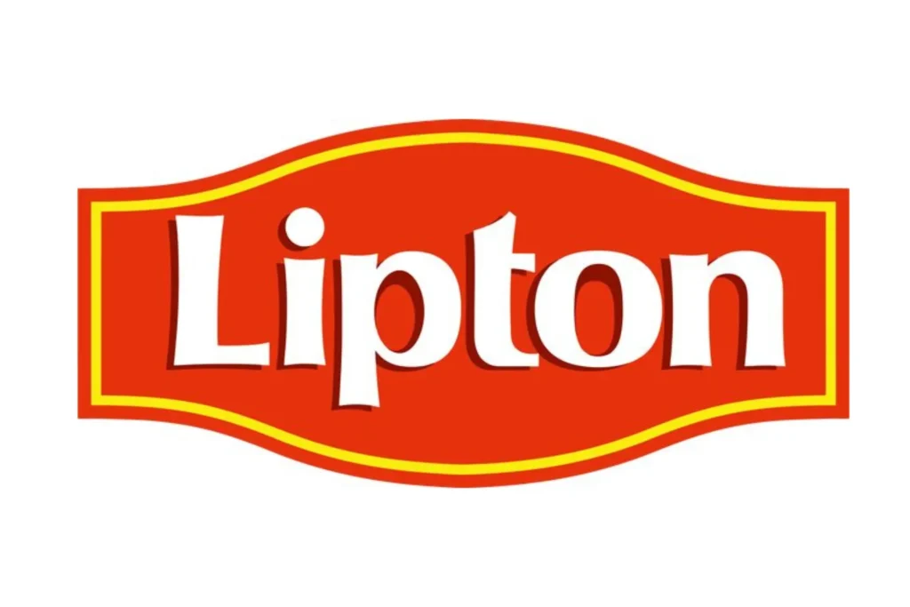
Mid-1900s: The Red & Yellow Identity Emerges
- Lipton introduced its signature yellow circle behind the brand name.
- Yellow symbolized sunshine, warmth, and natural brightness.
- A bold red banner appeared, making the logo highly visible on packaging.
1980s – 2000s: Modernization & Clarity
- The logo evolved into a cleaner, more refined version of the red-and-yellow theme.
- Bright gradients were added to create a sense of energy and freshness.
- Typography became more modern and legible.
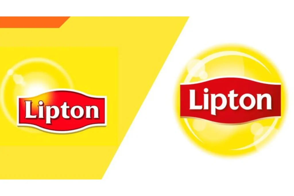
2010s – Present: The Fresh & Vibrant Look
- The modern Lipton logo features a bold red banner, crisp white lettering, and a glowing sun-like yellow circle.
- The gradient background adds depth, suggesting freshness and hydration.
- Designed to stand out across digital media, bottles, cans, and tea boxes around the world.
Symbolism & Meaning
Yellow Circle (Sun Icon)
- Represents sunshine, vitality, natural energy, warmth, and positivity.
- Reinforces the idea of tea as a comforting and refreshing beverage.
Red Banner
- Symbolizes strength, confidence, and bold flavor.
- Makes the logo highly visible on shelves.
White Lettering
- Clean and modern, reflecting purity, clarity, and trust.
- Ensures strong readability.
Overall Design
- Bright, cheerful, and refreshingpe, perfectly aligning with Lipton’s brand personality.
Why the Lipton Logo Works
- Instantly Recognizable
- The red-and-yellow combination is unique and stands out globally.
- Emotionally Positive
- The “sunshine” design sparks feelings of warmth, energy, and refreshment.
- International Appeal
- Works across all cultures, languages, and packaging styles.
- Consistent Yet Modern
- Core elements (sun circle + red banner) remain unchanged, building long-term brand recognition.
- Strong Versatility
- Effective on bottles, cans, tea bags, social media, and advertising.
Lessons from the Lipton Logo
- Use Color Strategically: Bold, meaningful colors can define an entire brand.
- Consistency Builds Trust: Keeping core elements over time strengthens identity.
- Simple Shapes, Big Impact: A circle + banner combination can become world-famous.
- Design With Emotion: Symbols like sunshine create powerful emotional connections.
Conclusion
The Lipton logo is a masterclass in bright, optimistic, and effective branding. Its glowing yellow circle, confident red banner, and clean typography make it instantly recognizable around the world. Over the decades, the logo has evolved to remain fresh and modern while preserving its core identity. Today, the Lipton logo stands as a global symbol of refreshment, warmth, natural flavor, and everyday positivity.
Frequently Asked Questions (FAQs)
1. What does the Lipton logo represent?
The Lipton logo symbolizes sunshine, warmth, energy, freshness, and the bright, refreshing qualities of tea.
2. When was the Lipton logo first created?
Early versions appeared in the 1890s, with the iconic red-and-yellow style emerging in the mid-1900s.
3. Why is the Lipton logo yellow and red?
Yellow represents sunshine and vitality, while red conveys strength, visibility, and bold flavor.
4. Has the Lipton logo changed much over time?
Yes, while modernized for clarity, it has always kept its yellow circle and red banner for brand consistency.
5. Why is the Lipton logo so recognizable?
Its bright color palette, simple shapes, and global consistency make it stand out instantly.