Panda Express Logo: Symbol, History, Meaning, and Evolution

The Panda Express logo is one of the most recognizable emblems in American fast-casual dining. Known for its bold circular design, red-and-black color palette, and signature panda icon, the logo reflects the brand’s emphasis on fresh ingredients, Chinese-inspired flavors, and family-friendly dining. Since its founding in 1983, Panda Express has modernized its logo while preserving its iconic identity, creating a visual brand that is both timeless and immediately recognizable.
The Story Behind the Panda Express Logo
Brand Background
- Panda Express was founded by Andrew and Peggy Cherng in Glendale, California, in 1983.
- The brand grew out of the family’s earlier restaurants, Panda Inn which inspired the fast-casual concept.
- Panda Express branding focuses on approachability, quality, and accessible Asian-inspired flavors, all reflected in its logo design.
Logo Evolution: Timeline & Design

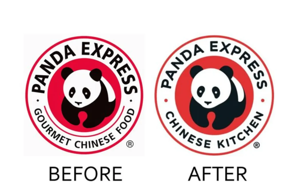
1983 – Early 2000s: The Original Panda Logo
- The first Panda Express logo featured a simple black-and-white panda drawn in a friendly, cartoon-like style.
- A red circular border surrounded the panda, with bold block lettering reading “Panda Express – Gourmet Chinese Food.”
- The overall design conveyed friendliness, freshness, and cultural inspiration.
2000s – 2014: Streamlined Modernization
- The panda illustration became cleaner and more polished, improving clarity for signage and packaging.
- Typography was updated to a more refined sans-serif font, while still maintaining the “Gourmet Chinese Food” wording.
- The circular badge format remained, reinforcing brand recognition.
2014 – Present: Sleeker, Contemporary Design
- The panda illustration was simplified with thinner lines, smoother curves, and more modern styling.
- The red ring was brightened to enhance visibility across digital and high-resolution platforms.
- The wording “Gourmet Chinese Food” was removed in many versions, allowing the brand name to stand independently.
- Today’s logo is crisp, minimalistic, and versatile, ideal for restaurants, mobile apps, packaging, and global branding.
Symbolism & Meaning

Panda Icon
- The panda symbolizes Chinese heritage and culture, while also representing friendliness and family appeal.
- The soft, rounded design communicates warmth, approachability, and a fun dining experience.
Red Circular Badge
- Red symbolizes good fortune, celebration, and prosperity in Chinese culture.
- The circle shape conveys unity, community, and harmony.
Typography
- Clean sans-serif fonts signal modernity, reliability, and simplicity—core pillars of the brand’s fast-casual identity.
Why the Panda Express Logo Works
- Instant Recognition
- The panda icon and red circle are unmistakable, even from afar.
- Cultural Relevance
- The imagery subtly reflects Chinese culture without being overly traditional, making it accessible to all audiences.
- Consistency with Modernization
- The brand has updated the logo while maintaining its core elements, keeping it familiar yet fresh.
- Versatility
- Works seamlessly across menus, packaging, stores, digital platforms, uniforms, and advertising.
- Friendly and Approachable
- The panda design appeals to families, young diners, and regular customers alike.
Lessons from the Panda Express Logo

- Balance Culture with Accessibility: Cultural symbols can be modernized to appeal to broad audiences.
- Use Friendly Mascots: A warm, simple mascot enhances emotional connection.
- Maintain Core Elements: Evolve design without losing the essence of the brand.
- Bold Colors Matter: Strategic use of red and black strengthens visibility and meaning.
Conclusion
The Panda Express logo is a prime example of effective brand identity in the fast-casual restaurant world. Its combination of bold color, cultural symbolism, and a friendly mascot makes it timeless and widely recognizable. Over the years, Panda Express has refined its logo while staying true to its heritage, showcasing a powerful balance of tradition and modern branding. Today, the logo stands as a symbol of quality, consistency, and flavorful Chinese-inspired cuisine enjoyed across the world.
Frequently Asked Questions (FAQs)
1. What does the Panda Express logo represent?
It symbolizes Chinese culture, friendliness, and the brand’s heritage through its panda icon and red circular design.
2. When was the Panda Express logo created?
The original panda logo debuted in 1983, at the launch of Panda Express.
3. Why is a panda used in the logo?
The panda is a widely recognized symbol of China, representing cultural roots while conveying warmth and approachability.
4. Has the Panda Express logo changed much over time?
Yes, but the core panda icon and red circle have always remained, with updates focusing on simplification and modern styling.
5. What colors are used in the Panda Express logo and why?
Red (luck, prosperity), black (strength, clarity), and white (cleanliness and simplicity).
6. Why is the Panda Express logo effective?
Its combination of cultural symbolism, consistency, bold colors, and friendly mascot creates strong brand recognition.

