Energy Logo, Symbol, History And Evolution
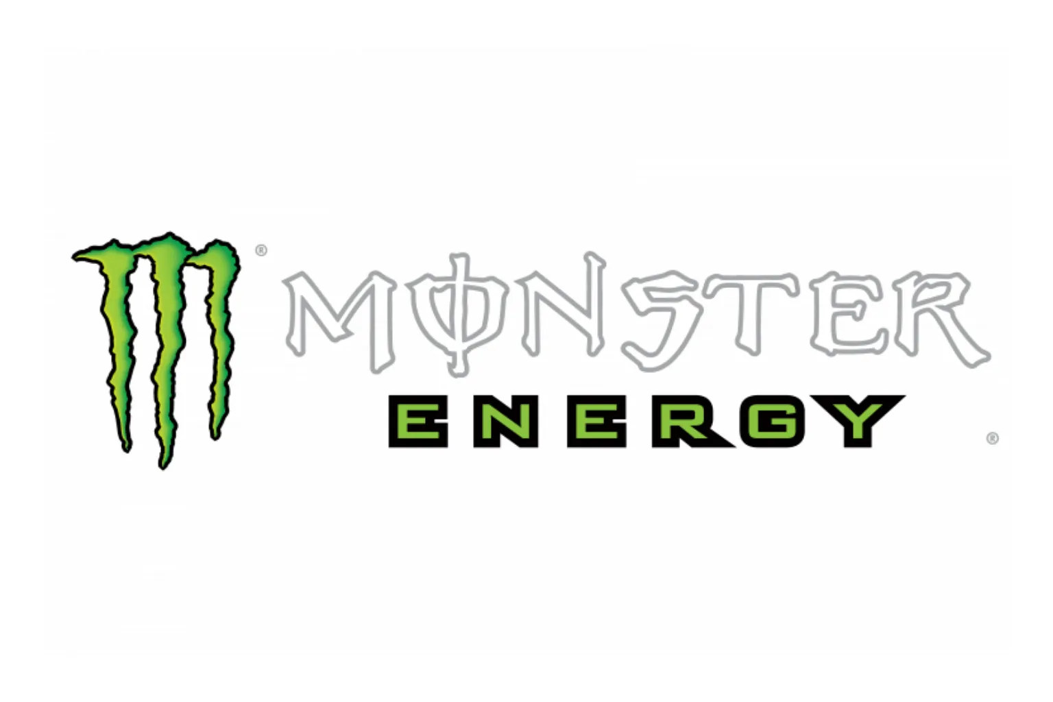
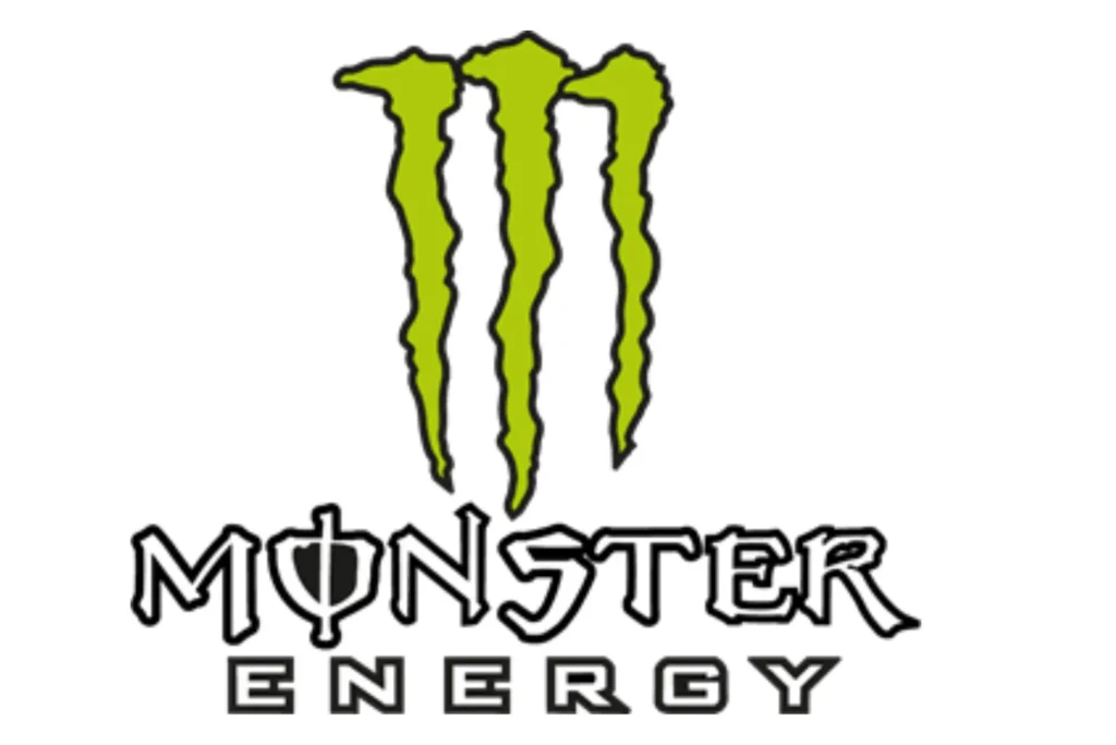
Since its launch in 2002, the Monster Energy logo has become one of the most recognizable symbols in the energy drink industry. Featuring a jagged, neon-green “M” resembling claw marks on a black background, the logo perfectly captures the brand’s ethos of raw power, intensity, and extreme energy. Designed to appeal to thrill-seekers, gamers, and extreme sports enthusiasts, the Monster logo has remained largely unchanged over two decades, making it a striking example of consistency, symbolism, and effective branding in a competitive market.
Origins & Brand Background
- Monster Energy is a flagship energy drink brand introduced in 2002 by the Hansen Natural Company (now Monster Beverage Corporation).
- From the beginning, Monster positioned itself for a high-energy, edgy audience: extreme sports, gaming, music, and youth culture.
- The brand slogan “Unleash the Beast” aligns closely with the visual identity, the logo conveys a sense of raw power and unleashed energy.
Logo Evolution: Timeline & Design
Unlike many brands, Monster Energy’s logo has been remarkably consistent since its launch in 2002.
- 2002 – Present: The core logo (three jagged neon‑green marks forming an abstract “M” on a black background) has remained virtually unchanged.
- The logo was created by McLean Design, a strategic branding firm based in Walnut Creek, California.
- Below the “M” symbol, the wordmark “MONSTER ENERGY” is usually rendered in a bold, sharp-edged typeface, “Monster” in a jagged, aggressive font, and “Energy” in a smaller, simpler font.
Symbolism & Meaning
Three Claw Marks as “M”:
- The green “M” isn’t just a letter, it’s designed to appear like claw scratches, as if a beast has clawed its way out.
- This visual metaphor ties directly into the brand’s promise: unleashing a powerful, untamed energy.
- From a functional perspective, the claw-mark “M” is also a very distinctive icon: it’s abstract enough to be cool and memorable, but still clearly suggests “Monster.”
Color Palette:
- Neon green: Suggests energy, vitality, and something electric or “otherworldly.”
- Black background: Creates high contrast, conveys power, intensity, and a bit of mystery or danger, which fits the brand’s edgy image.
Controversy & Misinterpretations
Over the years, some people have claimed the Monster logo contains hidden or occult symbolism, especially that the three green claw marks represent “666”, the biblical “number of the beast.”
- Hebrew “Vav” Theory: The claim is that each of the three vertical strokes in the “M” looks like the Hebrew letter vav, which some interpret as the number six. Three vavs = 666.
- Fact-Checking & Denial: According to fact-checkers (like Snopes), this conspiracy theory is false.
- Official Explanation: Monster and its designers have stated that the logo simply represents claw marks from a monster, no religious, satanic, or occult meaning was intended.
- Other Theories (Debunked):
- Some have suggested the “M” is based on Norse runes, but that’s not supported by the company.
- Alleged crosses or hidden religious symbols in the font have also been raised, but these interpretations are widely dismissed by experts and fact‑checkers.
Why the Logo Works (Brand Strengths)
- Instant Recognition
- The claw mark “M” is extremely distinctive and memorable. Even without the text “Monster Energy,” many fans immediately know what brand it is.
- Strong Emotional Resonance
- The imagery of claws tearing through something evokes raw power, aggression, and uncontrolled energy, matching what an energy drink promises.
- Consistency & Longevity
- Monster has stuck with the same core logo since 2002, which has helped build strong brand equity.
- Versatility
- The abstract “M” works well on cans, merchandise, event sponsorships (like motorsports), digital media, and more, it scales and adapts.
- Aligns with Brand Identity
- Because Monster is deeply linked with extreme sports, gaming, and youth subcultures, a fierce, “monster-inspired” symbol feels very on-brand.
Lessons from the Monster Logo
- Simplicity + Depth: A simple shape (three jagged strokes) can carry a deeper metaphor (claws, beast, energy).
- Cohesive Messaging: The logo + slogan (“Unleash the Beast”) + target audience all reinforce one another.
- Handling Controversy: Even when conspiracy theories arise, a strong and consistent brand story helps, Monster has publicly denied occult claims while staying true to its core design.
- Brand Longevity: If a logo is working hard and becoming iconic, there’s real value in keeping it. Monster’s designers didn’t feel the need to radically change the logo because it aligned so well with the brand’s vision.
Overall Evaluation
- Effectiveness: The Monster logo is highly effective, it’s immediately recognizable, emotionally powerful, and very “on brand.”
- Timelessness: Despite its edgy design, the claw mark symbol feels timeless in the energy drink category, it doesn’t rely on trendy fonts or gimmicks that date quickly.
- Brand Fit: Perfect match for an energy drink aimed at thrill-seekers, gamers, and action-sports fans, the logo visually communicates the “beast” inside, which is exactly the narrative Monster wants to tell.
Conclusion
The Monster Energy logo is a masterclass in brand identity and design. Its distinctive claw mark “M”, bold neon-green on black palette, and aggressive typography perfectly capture the essence of the brand: energy, power, and rebelliousness. Unlike many brands that frequently redesign their logos, Monster has maintained consistency since 2002, allowing the logo to become instantly recognizable worldwide.