Arby’s Logo, Symbol, History And Evolution
Since its founding in 1964, the Arby’s logo has been an iconic symbol of the brand’s identity and heritage. Instantly recognizable for its cowboy hat silhouette and bold typography, the logo reflects Arby’s roots in hearty, roast-beef–focused fast food while appealing to a broad audience. Over the decades, the logo has evolved through subtle refinements, from the original brown hat to the long-running red hat, the glossy 2012 redesign, and the streamlined modern version of 2013, demonstrating a careful balance between heritage, modernity, and brand recognition.
Logo Evolution: A Timeline
Here’s how the Arby’s logo has changed over time, and what those changes mean in terms of design and branding.
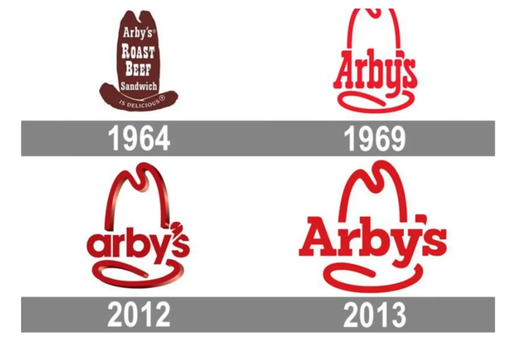
1964 – 1969: The Original Logo
- The very first Arby’s logo featured a dark brown cowboy hat (a “ten-gallon” style) as its central graphic.
- Inside the hat were the words “Arby’s Roast Beef Sandwich” in white, bold lettering.
- On the brim of the hat was the phrase “IS DELICIOUS”, reinforcing the product promise.
- This design linked the brand to the imagery of the American West. a rugged, classic motif.
- The hat had no deeper, hidden meaning beyond being a Western symbol; it was largely a marketing choice rooted in the popularity of cowboy culture at that time.
1969 – 2012: The Long‑Running Red Hat Version
- In 1969, Arby’s redesigned the logo into the form that many people came to recognize: a red cowboy hat silhouette.
- The detailed copy (like “Roast Beef Sandwich” or “Is Delicious”) was dropped; instead, the logo simply featured the name “Arby’s” in bold serif-style letters.
- The font felt hand-drawn and somewhat warm, giving the brand a friendlier, more personal identity.
- This version anchored the Arby’s brand identity for over four decades, becoming iconic.
- The cowboy hat symbolized hearty, traditional American fare, aligning with Arby’s roast‑beef–centric menu.
2012 – 2013: The Glossy Rebrand (Short-Lived)
- In 2012, Arby’s introduced a major rebrand as part of a campaign called “Slicing Up Freshness.”
- The logo kept the cowboy hat, but made it 3D and glossy, giving it a modern sheen.
- The wordmark changed: it switched to all lowercase (“arbys”), in a geometric, sans-serif typeface, a big shift from the old serif letters.
- One very playful detail: the apostrophe (“‘”) was redesigned to look like a meat slicer, a direct visual nod to the “slicing freshness” tagline.
- However, this redesign received mixed feedback. Some critics said the glossy hat clashed with the flat, modern type, making the overall logo feel disjointed.
- Only about a year later, Arby’s moved to change it again, clearly responding to how customers felt.
2013 – Present: A Return to Roots (Modernized)
- In late 2013, Arby’s reverted to a more classic look, re-embracing the 2D cowboy hat silhouette.
- The hat was made slightly shorter and more streamlined, and the wordmark was now in capital “A” with bold, slab-like serif letters.
- This font isn’t identical to the one from the ‘69–2012 version, but it feels familiar and nostalgic.
- The color is a solid red, sticking with the brand’s long-standing palette, red is bold, attention-grabbing, and a frequent choice in food branding.
- This design is more balanced: it honors Arby’s heritage while being clean, scalable, and modern, suitable for both digital media and physical signage.
Symbolism & Meaning
- Cowboy Hat: The cowboy hat is more than just a visual gimmick, it evokes Americana, the Wild West, ruggedness, and tradition. This helps ground Arby’s as a brand with roots and a no‑nonsense, hearty food philosophy.
- Red Color: Red is a highly effective color in food branding, it draws attention, evokes appetite, and is easily visible on signs and packaging.
- Typography: The serif typeface used in the current logo connects to tradition and solidity; its blocky character gives strength, trustworthiness, and legacy.
- Meat Slicer Apostrophe (2012): That playful touch tied into a campaign theme (“Slicing Up Freshness”), but was perhaps too quirky for long-term use.
Why the Logo Works (and What It Teaches)
Strengths:
- Consistent Brand Identity: Despite a few redesigns, the cowboy hat has remained a core part of the Arby’s mark. That continuity helps customers immediately recognize the brand.
- Heritage + Modernity Balance: The 2013 redesign managed to modernize the logo (flat design, clean lines) without abandoning its heritage cues.
- Scalability: The simplified 2D hat and bold wordmark make the logo easy to use across a wide range of platforms, signs, menus, digital, packaging.
- Memorability: The hat silhouette is distinctive and unusual in fast food, making Arby’s stand out from typical burger chains.
Challenges / Lessons:
- Design Risk: The 2012 glossy rebrand shows how even beloved elements (like the cowboy hat) can be misinterpreted when modernized without cohesion — the 3D effect didn’t sit well with the typeface.
- Consumer Feedback Matters: Arby’s reversed part of its rebranding after customer pushback, which is a powerful reminder that brand evolution must consider audience perception.
- Messaging Alignment: The 2012 meat slicer apostrophe was clever, but it risked overwhelming the core visual identity. Subtle symbolism works, but it must be balanced.
Brand Strategy & Context
- Around the time of the 2012–2013 rebrand, Arby’s was pushing to reposition itself more strongly, emphasizing “freshness” (especially with the slicing metaphor).
- By 2013, under leadership (like CEO Paul Brown), Arby’s leaned into its roots, restoring a version of the classic hat-logo to reinforce its legacy and reliability.
- This back-and-forth illustrates a broader branding strategy: innovation must be rooted in heritage. While modernization is important, compromising too much on what makes a brand unique can be risky.
Overall Evaluation
- Effectiveness: The current Arby’s logo is very effective. It’s simple, easily recognizable, and emotionally resonant with the brand’s history.
- Longevity: Because it uses timeless symbols (hat, serif typography, red), the logo is well-positioned for long-term use.
- Brand Fit: The design aligns very well with Arby’s positioning as a fast-food chain that’s “different”, not a burger joint but a place for hearty, roast‑beef–centric sandwiches.
Conclusion
The Arby’s logo is a prime example of effective brand evolution. Its signature cowboy hat and strong serif typeface have maintained a consistent visual identity while adapting to modern design trends. From its original 1964 design to today’s streamlined red hat, each iteration has reinforced Arby’s positioning as a trusted, hearty, and approachable fast-food brand. By combining nostalgia with a modern aesthetic, the logo remains both timeless and versatile, making it a standout symbol in the competitive quick-service restaurant industry.

